
Phantasmagoria: a 17th-century revival built for mood, not menus
Design style
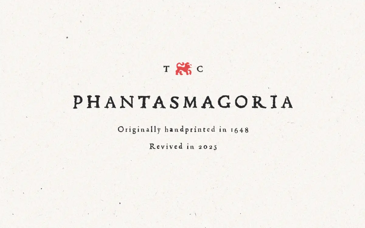
Phantasmagoria works from an old-print template rather than a contemporary drawing board. The letters carry the uneven ink traps, soft corners, and slightly wandering baselines you’d expect from a hand-pressed source, and the revival keeps that roughness instead of smoothing it out. Strokes vary in weight the way they do when metal type has taken decades of wear, and the serifs are stubby and irregular rather than crisp. It reads as a genuine period artefact rather than a modern serif with a grain filter applied on top, which is the usual failure mode for this kind of revival.
The overall texture sits somewhere between a woodcut and a worn letterpress proof. There’s real character in the way strokes taper and thicken unevenly, and the lowercase in particular has a loose, almost improvised rhythm. It won’t suit anyone after a clean historical serif; this is closer to a haunted-house playbill than a scholarly typeface facsimile.
Character set and features
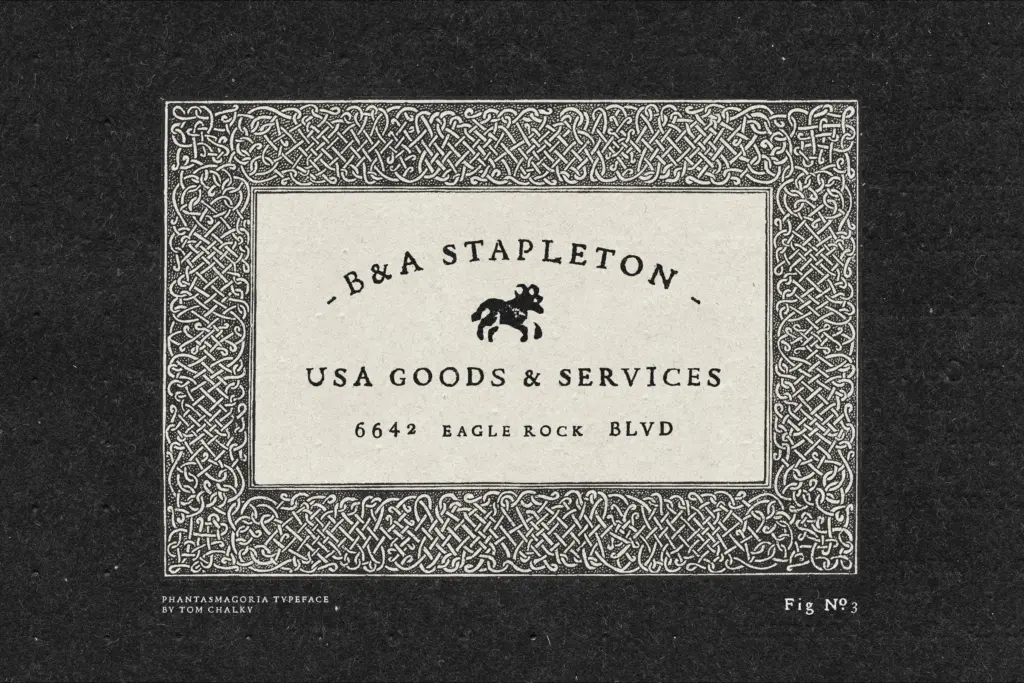
Each letter ships with three contextual alternates that cycle automatically, so repeated letters within a word or line don’t stack up looking identical. That’s the feature doing most of the heavy lifting here — without it, the distressed detailing would start to feel mechanical by the second paragraph. With it enabled, texture stays believable across a full line of text, which is the main technical achievement of this release.
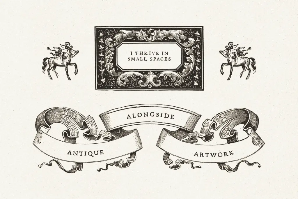
The set covers uppercase, lowercase, numerals, and standard punctuation, with Latin 1 support for basic multilingual typesetting. A bundle of bonus illustration glyphs rounds things out — ornamental marks and symbols pulled from the same period source, useful for filling corners or breaking up long stretches of text rather than for building anything structural. There’s no indication of a full diacritic set beyond Latin 1, so anyone typesetting outside that range should check coverage before committing a project to it.
Use cases
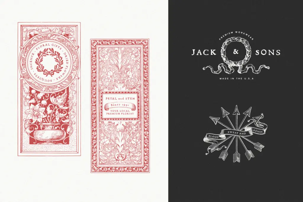
This is a display face, and a narrow one at that. It’s built for headlines, book covers, logotypes, and packaging where atmosphere is the point — folklore, fairy tale, horror, or anything trading on the idea of an old, slightly cursed document. Wedding stationery is plausible too, particularly for couples after something gothic-adjacent rather than conventionally romantic.
It is not a body-text font, and treating it like one at length will fight the very qualities that make it work at large sizes: the wandering baseline and inconsistent stroke weight that read as characterful in a title become genuinely hard to parse across a paragraph. Pair it with a plain, quiet serif or sans for any supporting copy and let Phantasmagoria carry the header, the cover line, or the wordmark. Used sparingly and set large, it does the job of making a page feel found rather than designed — which is exactly what it’s for.
What we liked, and what we didn’t
Strengths
- Three automatic alternates per letter keep the distressed texture from looking mechanical across a line
- The wear and ink-trap detailing feels genuinely period-sourced rather than filtered onto a modern serif
- Bonus illustration glyphs from the same source give designers extra atmosphere without hunting for separate ornaments
Trade-offs
- The irregular baseline and stroke weight make it unreadable at body-text sizes
- Only Latin 1 coverage is confirmed, so multilingual projects need to check character support first
Phantasmagoria commits fully to its period-print premise and the automatic alternates make the roughness feel alive rather than repetitive. It's a strong choice for headlines, logos and packaging that want a haunted, historical mood, but it has no ambitions as a text face and shouldn't be asked to be one.
Verdict

Tantype reviews typefaces in depth — every font is tested in real branding, editorial and screen layouts before a word gets written. 555+ fonts reviewed and counting.