
French Aperitif: a six-weight hand-drawn family for menus and messy branding
Design style
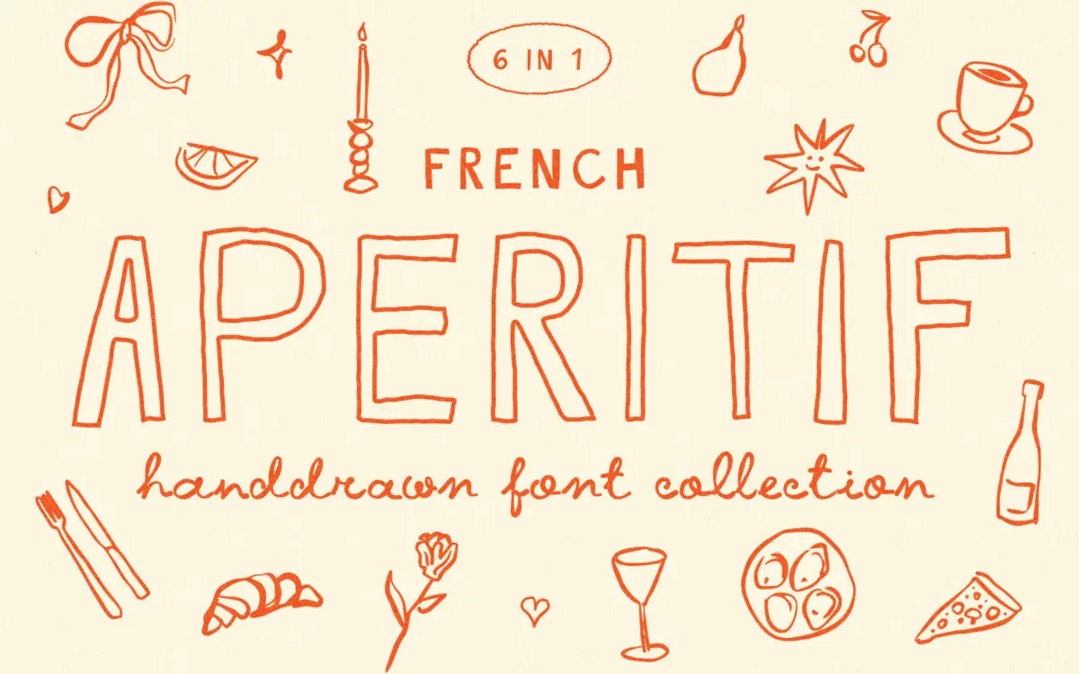
French Aperitif belongs to that loose, pencil-and-marker school of hand-drawn lettering that’s built to look like it came off a chalkboard outside a bistro rather than off a grid. The strokes wobble deliberately, baselines drift, and letters lean at slightly different angles even within a single word. It’s not trying to be a refined script — it’s going for the charm of imperfection, and mostly it gets there. The family covers six styles: a connected script, a regular hand-printed style, a bold version of that print, and three outline variants (thin, regular, bold) that read more like line-drawn labels than text faces.
The outline weights are the more interesting part of the set. Stripped of fill, the letters turn into something closer to doodled type — useful for layering over textures or colour blocks without losing legibility. The solid weights are cruder by comparison, with thick, uneven strokes that read as intentionally ‘ugly’ rather than sloppy, though the line between those two is thin and depends entirely on how it’s set.
Character set and features
Each style includes alternate letterforms, which is really the point of a font like this — swapping in different a’s, g’s, and terminal shapes keeps repeated letters from looking stamped out of a template, which is the usual giveaway with hand-lettered fonts. The script weight leans into ligatures and connecting strokes, while the print styles keep letters separate and blocky, giving you two very different tones from the same family. The bonus pack of 64 hand-drawn elements — flourishes, small marks, doodle-style ornaments — is a genuinely useful add-on rather than filler, since a font this loose almost always ends up paired with supporting graphics anyway.
Where it runs into trouble is consistency of texture. Because every glyph is drawn by hand rather than built from a shared stroke system, weight and roughness vary noticeably letter to letter. At small sizes this reads as noise rather than character — the wobble that looks charming in a headline starts to interfere with word recognition once you’re under about 20pt. This is a display family, full stop, and it doesn’t pretend otherwise, but it’s worth saying plainly for anyone tempted to set body copy in it.
Use cases
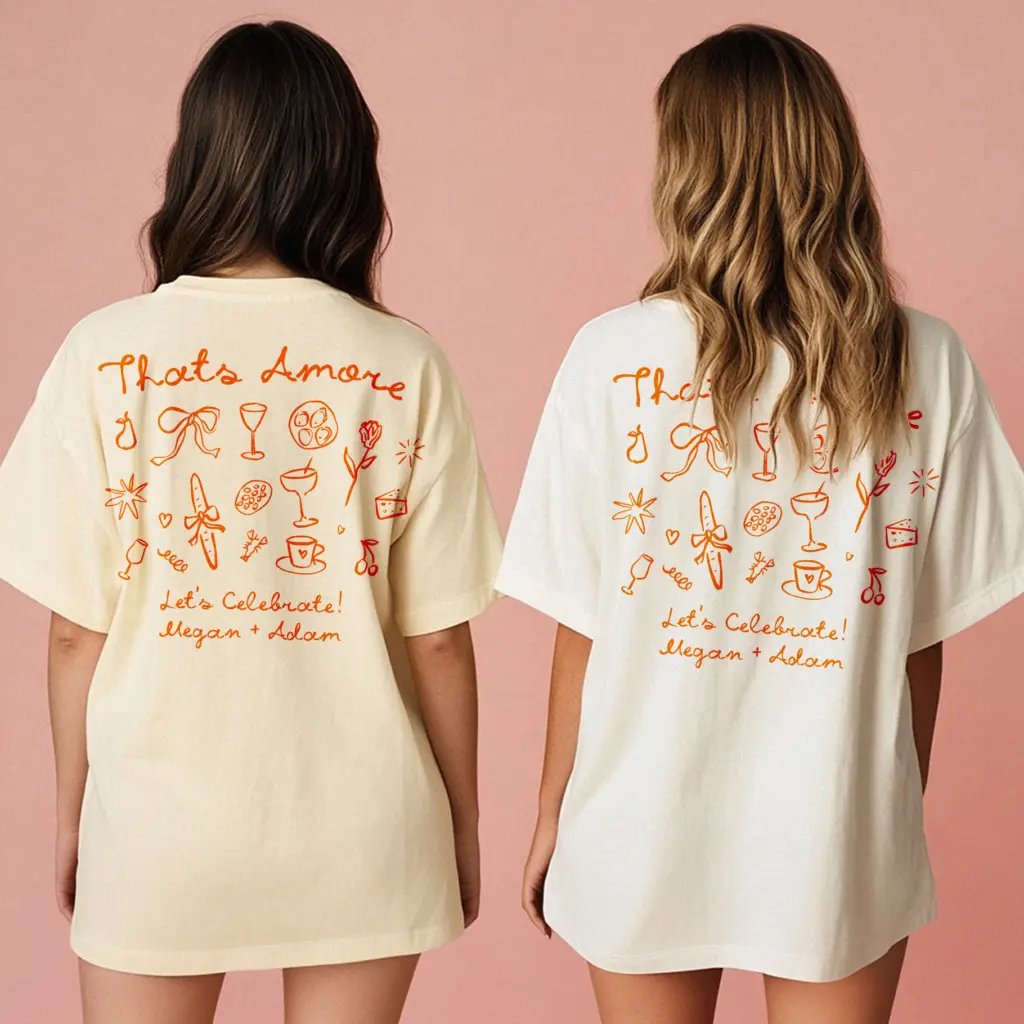
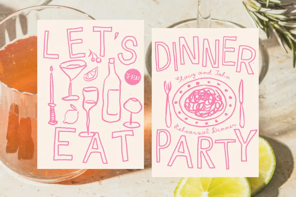
This is squarely a poster-and-packaging font. Drink menus, bar signage, market stalls, YouTube thumbnails, anything that wants a casual, slightly chaotic hand-drawn energy rather than polish. The outline weights work well for overlaying on photography or textured backgrounds, and the alternates give enough variation that a short menu or invite won’t look like it was typed rather than lettered. Wedding stationery is a stretch for the rougher weights — it’s better suited to casual engagement parties or rehearsal dinners than a formal invitation suite. Keep it to headlines, drink names, and short display lines, back it up with plenty of white space, and let the accompanying doodle set do some of the visual work. Ask it to carry paragraphs of text and it will fight you.
What we liked, and what we didn’t
Strengths
- Alternate letterforms across all six styles genuinely reduce repetition
- Outline weights work well layered over photos or colour blocks
- Bonus doodle elements pair naturally with the lettering instead of feeling like filler
Trade-offs
- Uneven stroke weight and wobble hurt legibility below headline sizes
- The rougher solid weights can look sloppy rather than charming depending on context
French Aperitif delivers real hand-drawn character across six styles and a useful bundle of doodle extras, but it's a display font through and through — legibility drops fast below headline size. Good for menus, posters, and casual branding that wants some visible imperfection; not for anything that needs to read cleanly at small sizes.
Verdict

Tantype reviews typefaces in depth — every font is tested in real branding, editorial and screen layouts before a word gets written. 555+ fonts reviewed and counting.