
HYPERWAVE: a triple-set marker font for logos and rowdy handmade lettering
Design style
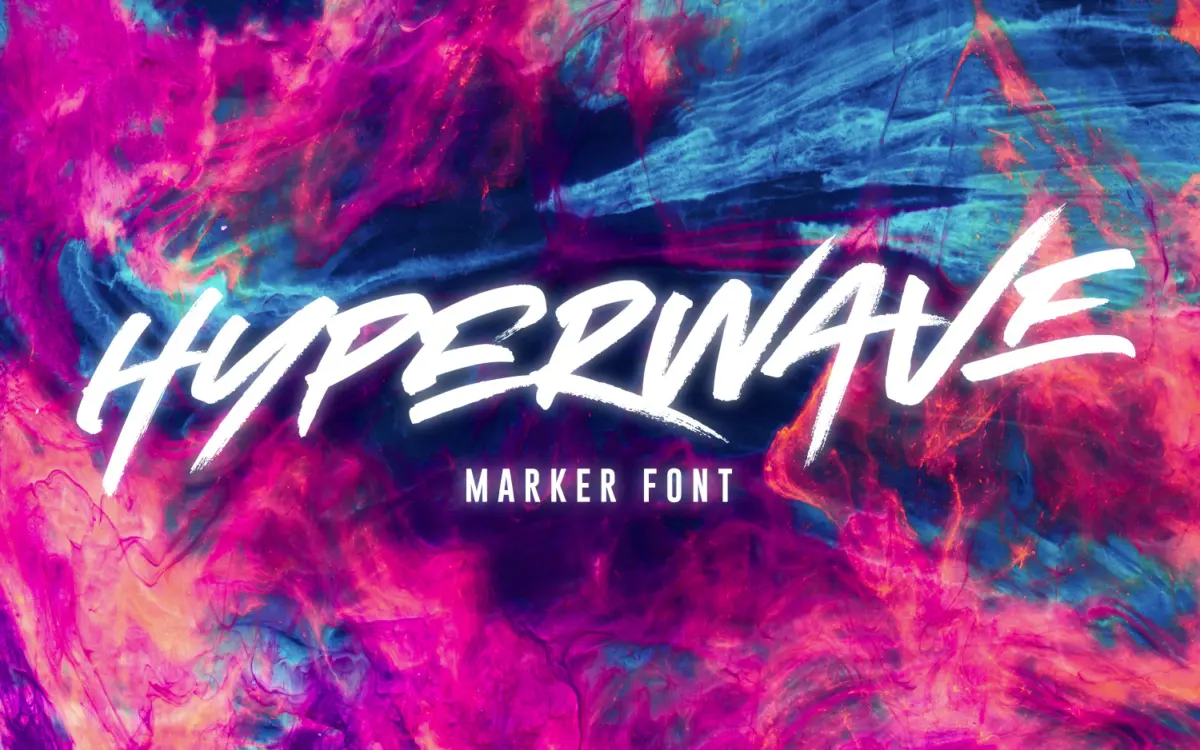
HYPERWAVE is a brush-marker face built around raw, fast strokes rather than any attempt at smooth calligraphic control. The letters look drawn in one go with a chisel-tip marker pushed quickly across paper: strokes taper unevenly, corners overshoot, and the ink pools slightly at direction changes. There’s no pretence of a controlled nib here — it reads as genuinely handmade, warts and all, which is the whole point of a font like this. Where a lot of marker fonts try to smooth out the roughness for legibility’s sake, HYPERWAVE leans into it. The result has energy but not much restraint, which is fine as long as you know what you’re using it for.
Character set and features
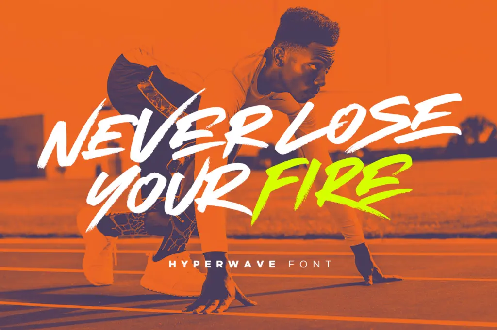
The set arrives as three separate font files — Hyperwave One, Two and Three — each with its own uppercase-only alphabet, numerals and a decent punctuation set. Lowercase isn’t part of the package, so this is a caps-only tool, not a full working typeface. The idea behind the three files is straightforward: mix them within a single word or headline so repeated letters don’t look identical, which is a real problem with most single-weight marker fonts. Swap the E in one word for the E from Hyperwave Two and the whole thing reads more like separately hand-lettered type than a stamped-out font. It’s a simple trick but it works, and it’s the strongest practical feature here.
Beyond that, there isn’t much depth. No alternates within each file, no ligatures, no small caps or numeral styles to speak of. The multilingual character support across a long list of European languages is useful if you’re setting text outside English, but it doesn’t change the fundamental limitation: three sets of caps, and that’s the whole toolkit.
Use cases
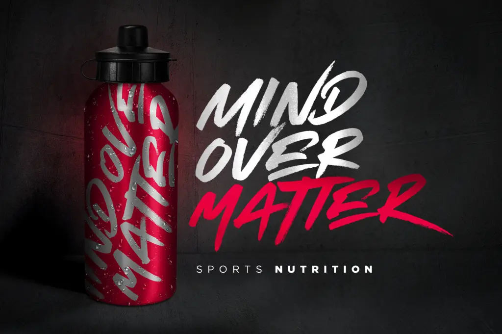
This is a font for short, loud bursts of type — a logotype, a badge on a hoodie, a stamp across product packaging, a headline on a gig poster. Anywhere you want type to look like someone grabbed a marker and wrote it in one take. Because it’s uppercase-only and quite textured, it stops working the moment you need body copy or anything read at length; even a full sentence set in one of these files starts to feel exhausting on the eye, all peaks and no rest.
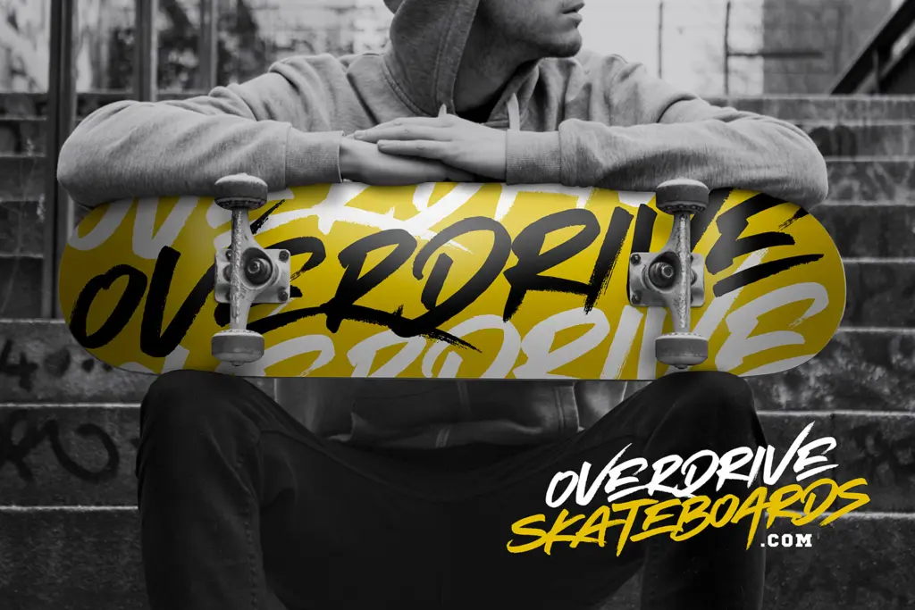
The best use is short word marks — a brand name, a single word on merchandise, a product name on a label — where you can lean on the three-set trick to make it look properly hand-drawn rather than templated. Pair it with a plain sans or serif for any supporting text, since HYPERWAVE has no interest in playing a quiet secondary role. It’s a shout, not a whisper, and it should be used sparingly and at size, where the roughness reads as intentional rather than illegible.
What we liked, and what we didn’t
Strengths
- Three separate uppercase sets let you avoid repeated identical letters within a word
- Genuinely rough, handmade brush texture rather than a smoothed-out digital approximation
- Wide multilingual character support across several European languages
Trade-offs
- Uppercase only, with no lowercase option for more natural word shapes
- Legibility drops fast beyond short headlines or single words
HYPERWAVE is a loud, uppercase-only marker font that earns its keep through the three-alphabet swap trick rather than any single set of letters. It's built for short word marks, not paragraphs, and knows it.
Verdict

Tantype reviews typefaces in depth — every font is tested in real branding, editorial and screen layouts before a word gets written. 555+ fonts reviewed and counting.