
ED Costa Montesa: a serif-and-script duo for wedding stationery
Design style
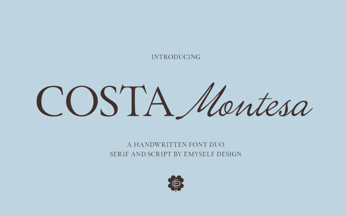
ED Costa Montesa is a two-part release: an all-caps serif and a handwritten script meant to be used together or on their own. The serif is the sturdier of the two, with narrow proportions, moderate contrast and small, understated serifs that read as editorial rather than decorative. It sits close to the classic condensed-caps style you see on invitation headers and masthead lockups, and it does that job cleanly without trying to be clever.
The script is the more expressive half. Strokes connect with a light, slightly inconsistent rhythm that reads as genuinely handwritten rather than smoothed into uniformity, and the letters lean forward with a casual, unforced angle. It’s not a formal copperplate; it’s looser, closer to a fountain-pen note than an engraving. Paired with the rigid caps, the contrast is the whole idea — one steady, one loose — and it mostly works, though the pairing depends entirely on you controlling scale and spacing, since neither face has much built-in flexibility on its own.
Character set and features
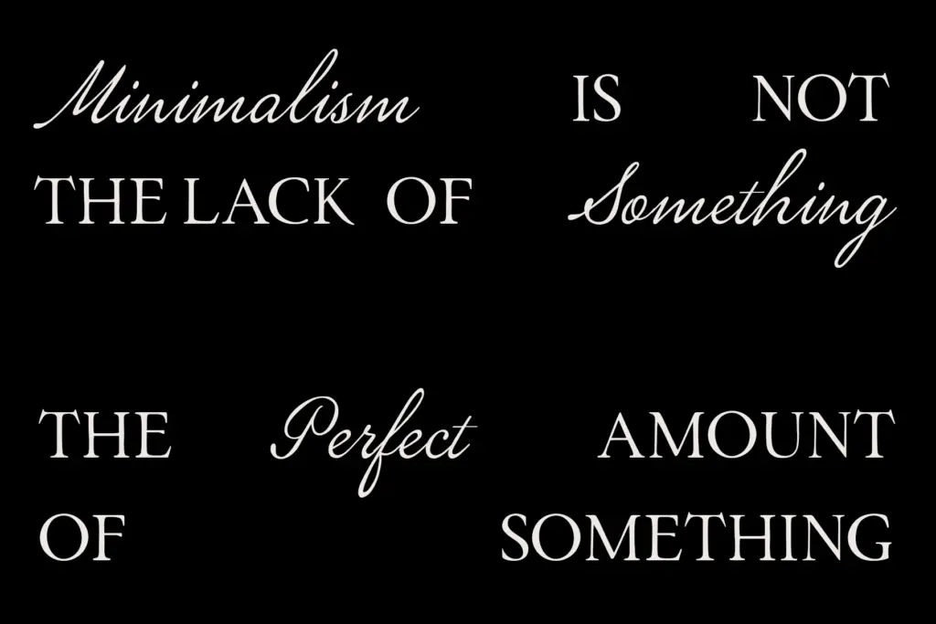
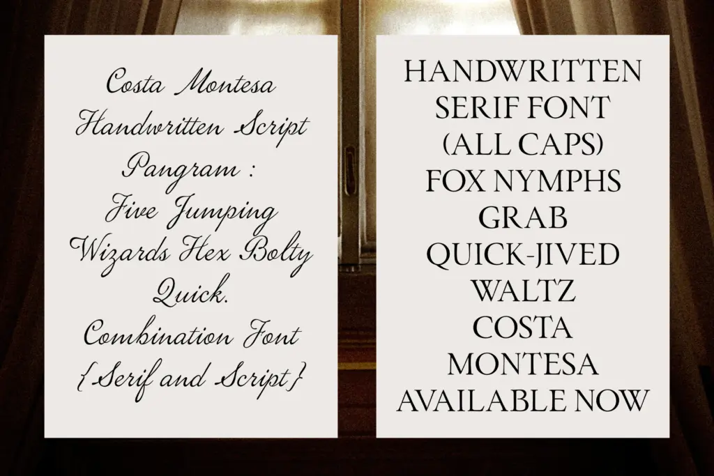
The serif is caps-only, which limits it to short bursts of text — names, single words, headline fragments — rather than full sentences. That’s a real constraint worth knowing before you buy: you can’t set a paragraph in it. The script covers upper and lowercase with connecting forms, and standard punctuation and numerals appear to be included, enough for names, dates, and short quoted lines. There’s no indication of extended language support or alternate character sets beyond the basics, so treat this as a Latin, standard-punctuation pairing rather than a font with deep OpenType features. If you need swash alternates or ligature variation to break up repeated letter combinations, this isn’t built for that — the script’s charm comes from its handwritten irregularity, not from programmed variation.
Use cases
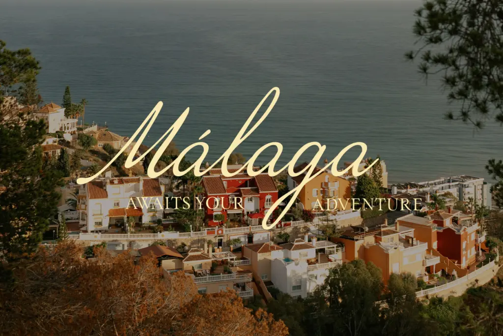
This duo is built for the invitation-and-branding space it’s marketed at, and that’s genuinely where it belongs. A couple’s names in the script over a location line set in the serif caps is the obvious, and probably best, use — it’s the layout the two faces were drawn to support. Logo lockups for boutique brands, bakeries, florists, small hospitality businesses — anywhere a
What we liked, and what we didn’t
Strengths
- The caps serif and script genuinely contrast in weight and rhythm rather than just being two scripts bundled together
- The handwritten script keeps a natural, uneven stroke rhythm instead of over-smoothing into a generic cursive
- Well suited to the specific invitation and small-branding layouts it's designed for
Trade-offs
- The serif is capitals-only, so it cannot carry body copy or full sentences
- No visible alternate characters or ligatures to vary repeated letters in the script
ED Costa Montesa does one job well: pairing a steady serif caps face with a loose handwritten script for invitation-style layouts. It's not a general-purpose text family, and buyers should know the serif is caps-only before they commit to it for anything beyond short lockups.
Verdict

Tantype reviews typefaces in depth — every font is tested in real branding, editorial and screen layouts before a word gets written. 555+ fonts reviewed and counting.