
Postcards From Portugal: a rough penned script with real range
Design style
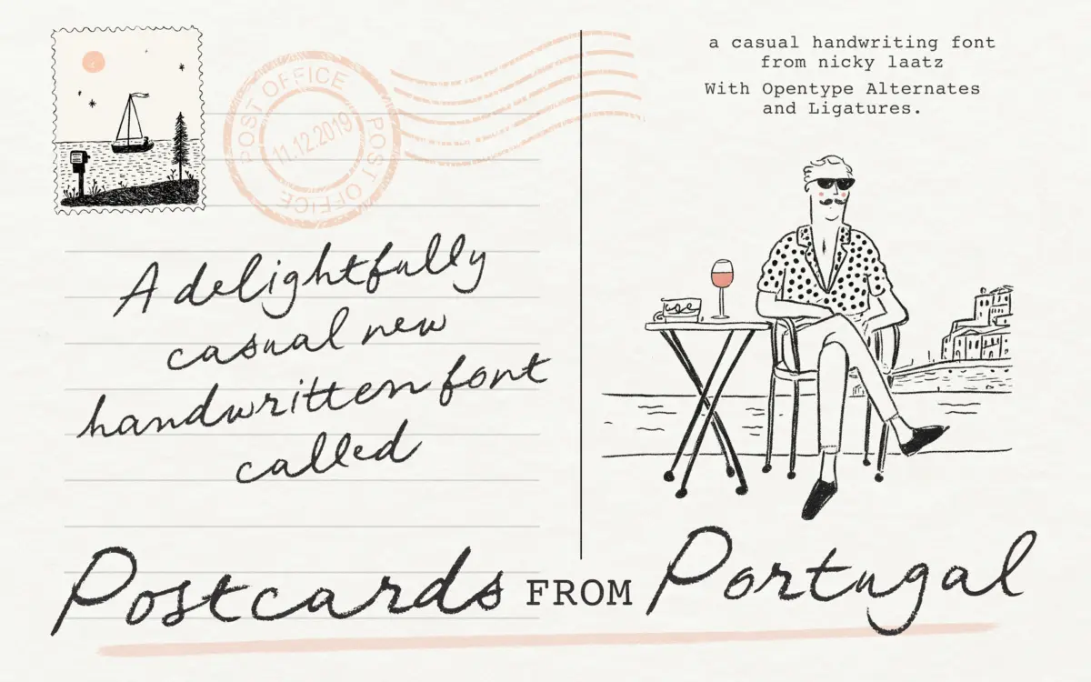
Postcards From Portugal is a monoline-ish script built from a felt-tip or rollerball gesture rather than a broad-nib calligraphic one. The strokes wobble slightly, terminals are cut rather than tapered clean, and joins between letters sit a touch loose, which is exactly what gives it its handwritten-in-a-hurry feel. It doesn’t chase the polished, ribbon-smooth look of a formal wedding script. Instead it leans into the imperfection: baselines drift, x-heights vary letter to letter, and the whole thing reads like someone actually wrote it on the back of a postcard, propped on a café table, sun in their eyes.
That said, there’s more structure underneath than the rough surface suggests. Letter proportions stay consistent enough that words don’t fall apart at a glance, and the connecting strokes are judged carefully — loose, but not so loose that legibility collapses. It’s a script with a point of view: casual, a little sunburnt, not trying to be luxurious.
Character set and features
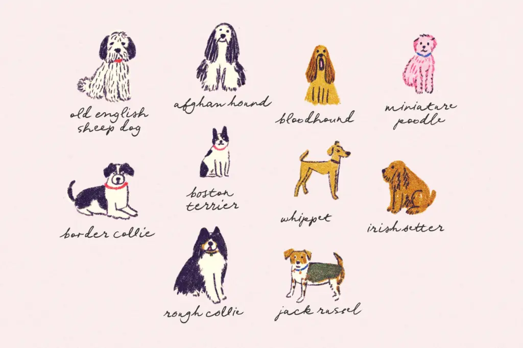
The family includes a lighter weight and a narrower, more compact cut, each with its own oblique companion. That’s a genuinely useful spread for a script — the compact version earns its keep in tight layouts like labels or narrow packaging panels, while the lighter weight softens the roughness for smaller-scale or more delicate applications. The obliques give you a second gear for the same voice without switching typefaces entirely.
OpenType alternates and ligatures are built in, and they matter more here than in a lot of scripts — this is the mechanism that keeps repeated letters from looking mechanically identical, which would undercut the handwritten premise fast. You do need an app that supports OpenType features and the discipline to switch them on; skip that step and the font reads flatter and more repetitive than intended, closer to a template than a hand.
Use cases
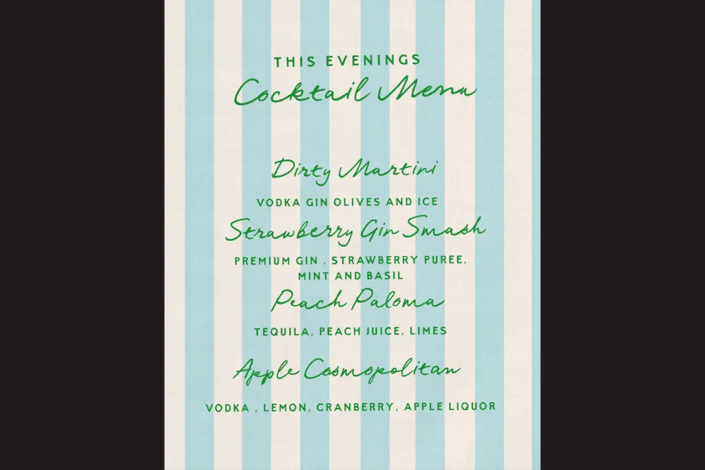
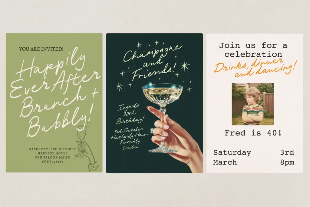
This is a font for warm, informal contexts: travel branding, postcards and packaging with a beachy or Mediterranean mood, greeting cards, journal covers, quote graphics, social posts that want a personal voice rather than a corporate one. It suits invitations too, but casual ones — a bring-your-own-bottle garden party rather than a black-tie affair. The compact cut works well on product labels where a script needs to fit a fixed width without losing character.
Where it struggles is anywhere that calls for restraint or gravitas. Long passages of body text will tire the eye — this is a display and accent script, not a reading font — and if a brand needs to look established or premium rather than breezy, the roughness works against it. It also won’t suit projects that need a script to look identical across every instance; the charm here depends on variation, so tightly controlled brand systems may find it harder to standardise.
What we liked, and what we didn’t
Strengths
- Compact and light variants with matching obliques give genuine layout flexibility.
- OpenType alternates and ligatures keep repeated letters from looking mechanical.
- The rough gesture feels considered rather than randomly distressed.
Trade-offs
- Not suited to long text or anywhere legibility at small sizes matters most.
- The casual roughness works against any brand wanting a premium or formal tone.
Postcards From Portugal is a well-judged rough script that earns its casual charm through careful, not sloppy, construction. It has real range thanks to its weight and width variants, but it's built for warmth and informality, not polish or long-form reading.
Verdict

Tantype reviews typefaces in depth — every font is tested in real branding, editorial and screen layouts before a word gets written. 555+ fonts reviewed and counting.