
Stellost: A Bouncy, Chunky Display Font for Playful Branding
Design style
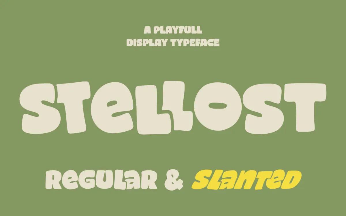
Stellost is a chunky display sans built around soft, rounded terminals and an organic, slightly irregular rhythm. The strokes are thick and even, with corners that swell rather than snap, giving each letter a cushioned, inflated look. There’s a hand-finished quality to the curves — nothing here is drawn with mechanical precision, and that’s clearly the point. Letters feel like they were shaped by hand and then cleaned up just enough to work as a typeface.
The Regular style sits upright and stable, while the Slanted companion leans the same letterforms into a livelier, more kinetic posture without changing their bones. It’s a simple but effective way to get two moods out of one design: steady versus bouncy. Spacing is generous, which suits the bulk of the strokes but means the face wants room to breathe — cramming it into tight measures undercuts the loose, easy feeling it’s going for.
Character set and features
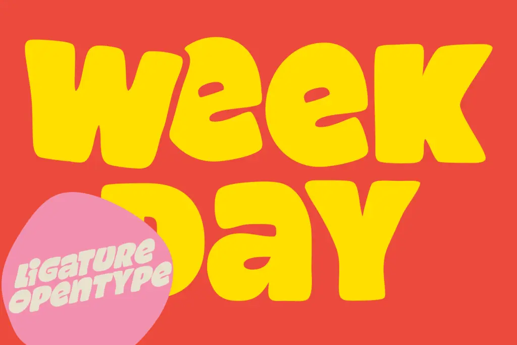
Stellost covers uppercase and lowercase, numerals and punctuation, and claims multilingual support, so international use should be workable, though the brief doesn’t specify exactly which languages or diacritics are included. The standout feature is a set of 38 ligatures, which swap out common letter pairs for combined forms that flow a bit more naturally and add some of the hand-drawn charm that individual letters alone can’t fully deliver. These are worth activating deliberately in a layout program that supports OpenType features, rather than relying on default rendering, since plenty of apps won’t trigger them automatically.
Both weights come as OTF and TTF, which covers most software without extra conversion. There’s no indication of a variable font, multiple weights beyond the two styles, or an italic in the conventional sense — the Slanted style is doing that job instead. As a display face, it isn’t built to carry body copy, and it shouldn’t be asked to; the chunkiness that gives it personality also means small sizes will muddy quickly, especially in tighter ligature clusters.
Use cases
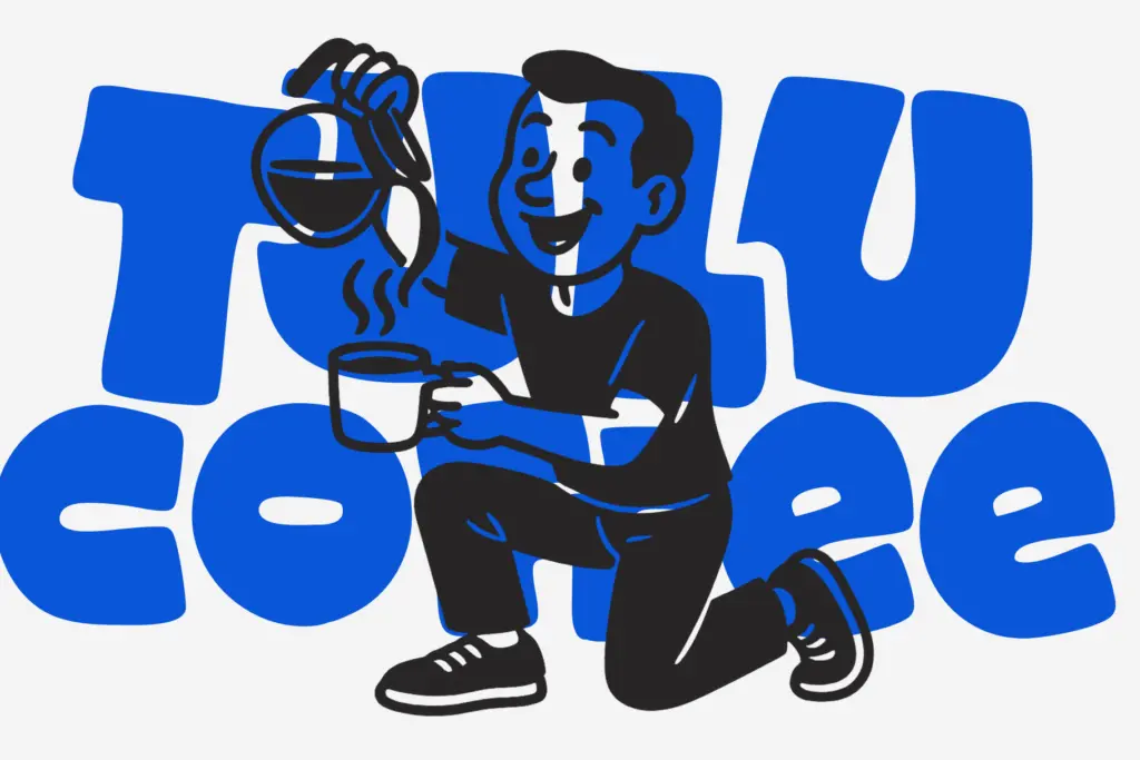
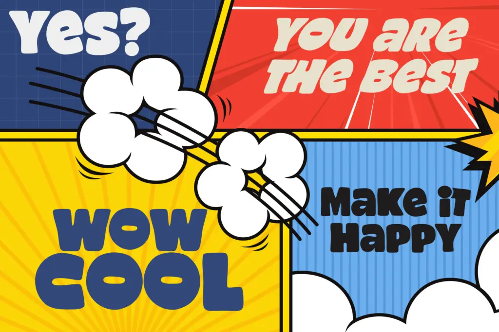
This is a typeface for moments where a design needs to feel friendly rather than serious: packaging for food or kids’ products, comic or cartoon lettering, social posts, event flyers, and branding for anything positioning itself as approachable or fun. The seller’s mention of cookie packaging and comic titles is a fair read of where it lands — it’s built for headlines, logotypes, and short bursts of text where the letterforms themselves are part of the decoration.
It’s less suited to anything that needs restraint: corporate branding, financial or medical contexts, or long-form editorial work where a lighter touch is needed. The two styles give some flexibility — Regular for a calmer statement, Slanted for more energy — but designers looking for a full family with multiple weights or an italic built specifically for pairing with body text will find the range limited. Used within its lane, on posters, packaging fronts, and playful logotypes, it does its job cleanly; pushed outside it, the charm turns into a liability.
What we liked, and what we didn’t
Strengths
- The rounded, chunky terminals give it an immediately recognisable, cheerful character
- 38 ligatures add hand-drawn flow to common letter pairs without extra effort
- Regular and Slanted styles offer two distinct moods from one consistent letterform design
Trade-offs
- Thick strokes and generous spacing make it unreliable at small sizes or in dense layouts
- Limited to two styles with no weight range, so it can't easily anchor a full brand system
Stellost delivers a specific, well-executed mood — warm, bouncy, hand-finished — and the ligature set adds real character beyond the basic letterforms. It's a display face with a narrow lane, best kept to short headlines and packaging rather than anything needing legibility at small sizes or a restrained tone.
Verdict

Tantype reviews typefaces in depth — every font is tested in real branding, editorial and screen layouts before a word gets written. 555+ fonts reviewed and counting.