
Desirable Calligraphy: a formal script for weddings and certificates
Design style
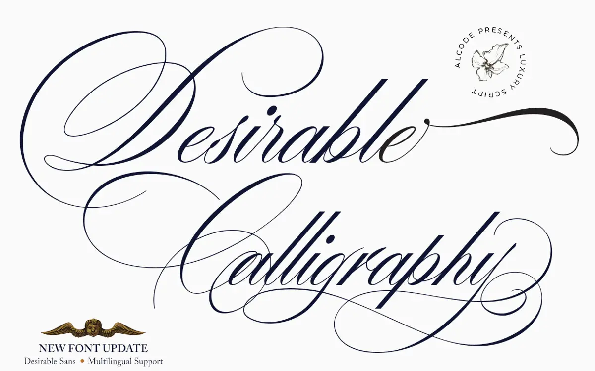
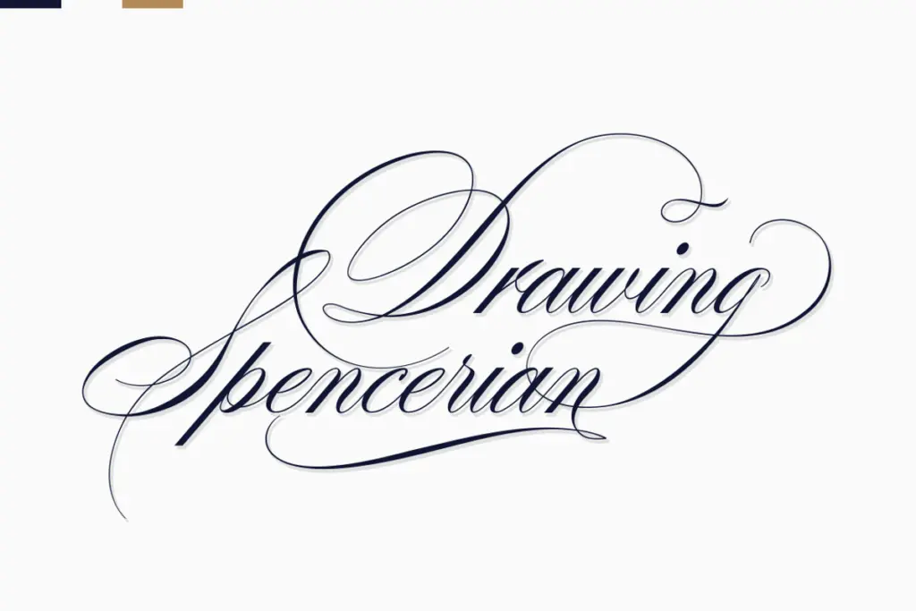
Desirable Calligraphy sits in the well-populated field of formal connecting scripts, the kind built for invitation suites and certificate headers rather than casual notes. The brief cites an inspiration from Italian handwriting and older manuscript forms, and that shows in the moderate slant and the way strokes swell and thin as if drawn with a broad-edged pen rather than a pointed nib. Contrast is present but not extreme, so the letters read as calligraphic without tipping into the very high-contrast, whip-thin style that some modern scripts chase.
The lowercase has a consistent rhythm: entry strokes taper in cleanly, loops stay fairly restrained, and the baseline holds steady even as individual letters lean. Capitals carry more flourish, with extended swashes on letters like the F, L and B that clearly want to open a name or a title rather than sit mid-sentence. It is a script with one register — formal — and it commits to that register fully. There is no attempt at a casual or playful alternate feel here, which is a point in its favour if that is what a project needs, and a limitation if it is not.
Character set and features
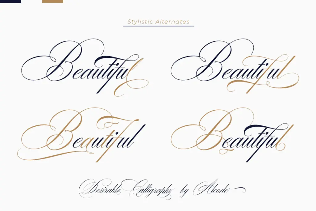
The font ships in OTF and TTF, with OpenType features including ligatures and what the foundry describes as multilingual support. In practice this means the connecting logic between letters is handled through OpenType substitution, so setting the font in an application that supports these features (Illustrator, InDesign, CorelDraw) will produce cleaner joins than setting it in something that doesn’t. For users without OpenType-aware software, the seller points to Font Book or Character Map to access alternate glyphs manually, which is workable but noticeably slower — expect to hunt for the right swash rather than have it appear automatically.
Because the letterforms are built to connect, spacing needs attention. Scripts like this rarely work well straight out of the box in body copy; kerning pairs and manual tracking adjustments are part of the job, especially around ascenders and descenders that cross into neighbouring letters. Treat the raw character set as a starting point that needs some hand-fitting per project, not a plug-and-play family.
Use cases
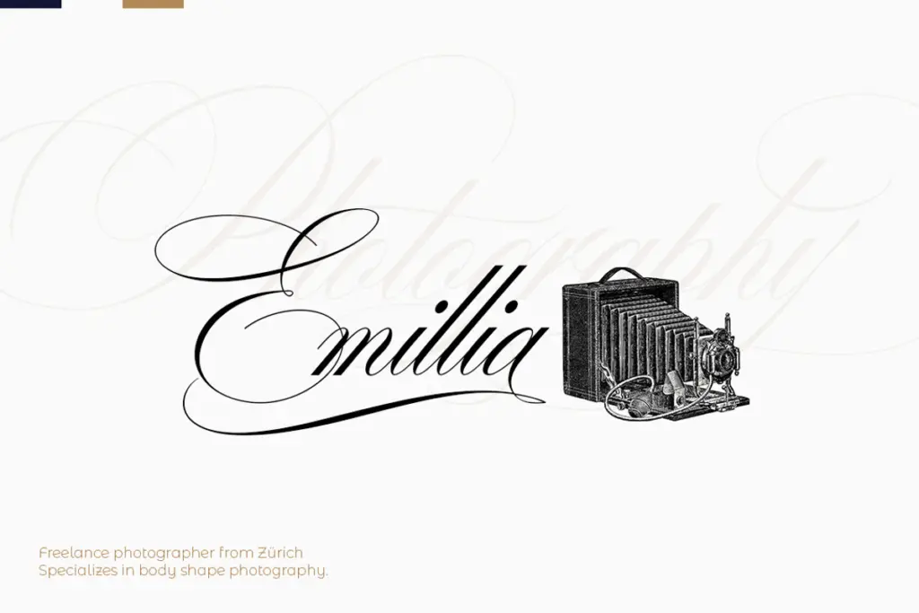
This is a font for short, formal lines: a couple’s names on a wedding invitation, a certificate recipient’s name, a monogram, the header on a book cover or a luxury product label. It is not built for paragraphs — the joining strokes and swash capitals will fight legibility if pushed into anything longer than a sentence, and at small sizes the finer hairlines can thin out or disappear depending on print or screen rendering.
Pair it with a plain sans or a restrained serif for body text and let Desirable Calligraphy carry the one or two lines that need weight and ceremony. It suits branding work that wants to signal tradition and formality — anniversary cards, bridal shower signage, certificates — more than it suits anything aiming for casual or contemporary.
What we liked, and what we didn’t
Strengths
- Consistent calligraphic rhythm with restrained, well-controlled contrast
- Swash capitals give it genuine presence on names and titles
- OpenType ligatures produce clean joins when used in supporting software
Trade-offs
- Without OpenType support, accessing alternates is manual and slow
- Not built for anything beyond short lines — legibility drops fast in longer text
Desirable Calligraphy does one job — formal, ceremonial script lines — competently and without much surprise. It needs OpenType-aware software and manual spacing care to look its best, and it won't stretch beyond short-line use, but for wedding and certificate work it's a solid, unfussy choice.
Verdict

Tantype reviews typefaces in depth — every font is tested in real branding, editorial and screen layouts before a word gets written. 555+ fonts reviewed and counting.