
Brachetto Script: a flourished calligraphy font for premium branding work
Design style
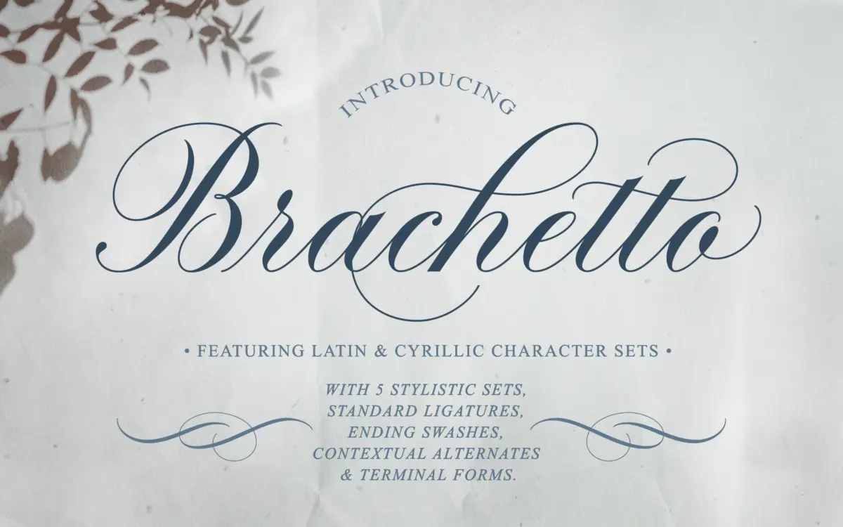
Brachetto sits in the copperplate-adjacent lineage of calligraphy scripts, but it doesn’t try to be a strict historical revival. The contrast between hairline entry strokes and thicker body strokes gives it a formal backbone, while the looser, more expressive flourishes on ascenders and descenders pull it toward something more contemporary. It reads as considered rather than casual — the kind of script that’s been drawn slowly, letter by letter, rather than dashed off.
What stands out is the balance between restraint and ornament. The lowercase skeleton is fairly economical, with tight loops and controlled bowls, so the letters don’t collapse into decoration for its own sake. The flourishes are there when you want them, layered on top through alternates rather than baked into every glyph. That’s a smart choice: it means the font can be dialled up for a wedding suite or dialled back for a wordmark without redrawing anything.
Character set and features
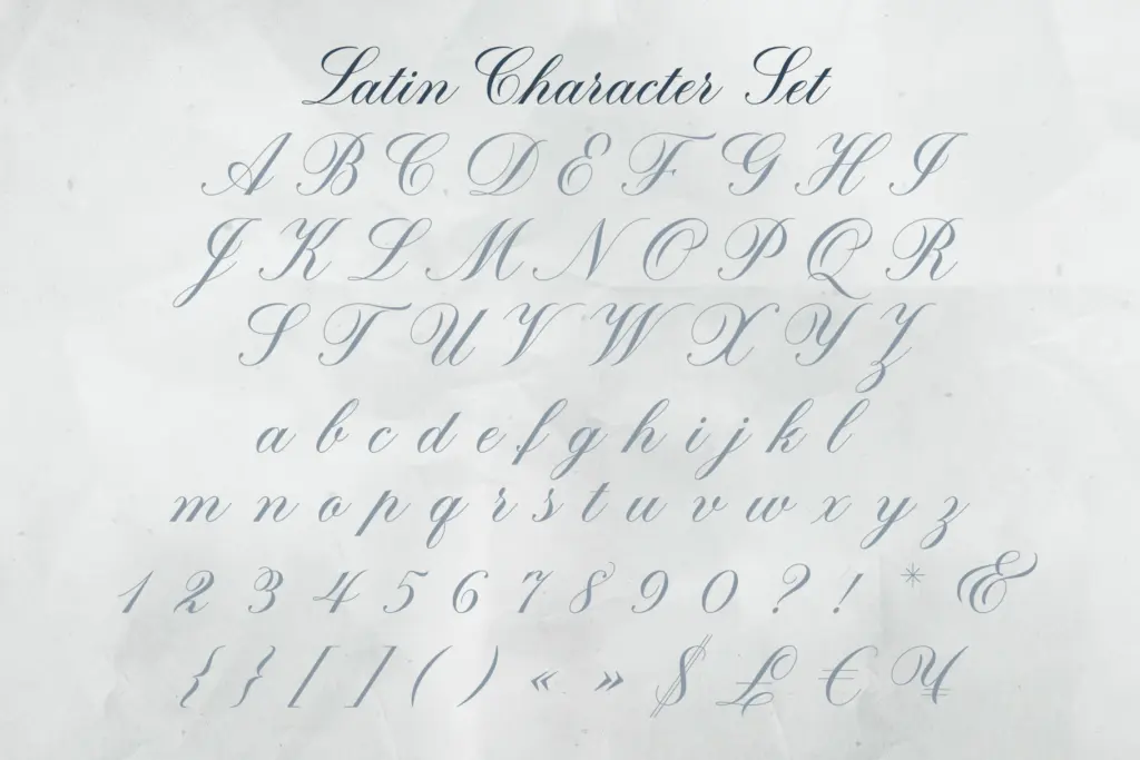
The feature set is the real substance here. Stylistic alternates give you multiple takes on the same letter — useful for breaking up repeated characters in a word or matching mood to context. Contextual alternates do some of that work automatically, swapping connecting forms so consecutive letters join more naturally, which matters a great deal in a script this connected. Standard ligatures handle the more awkward letter pairs, and there are dedicated terminal forms for word-ending letters, which is often where scripts start to look untidy if left unaddressed.
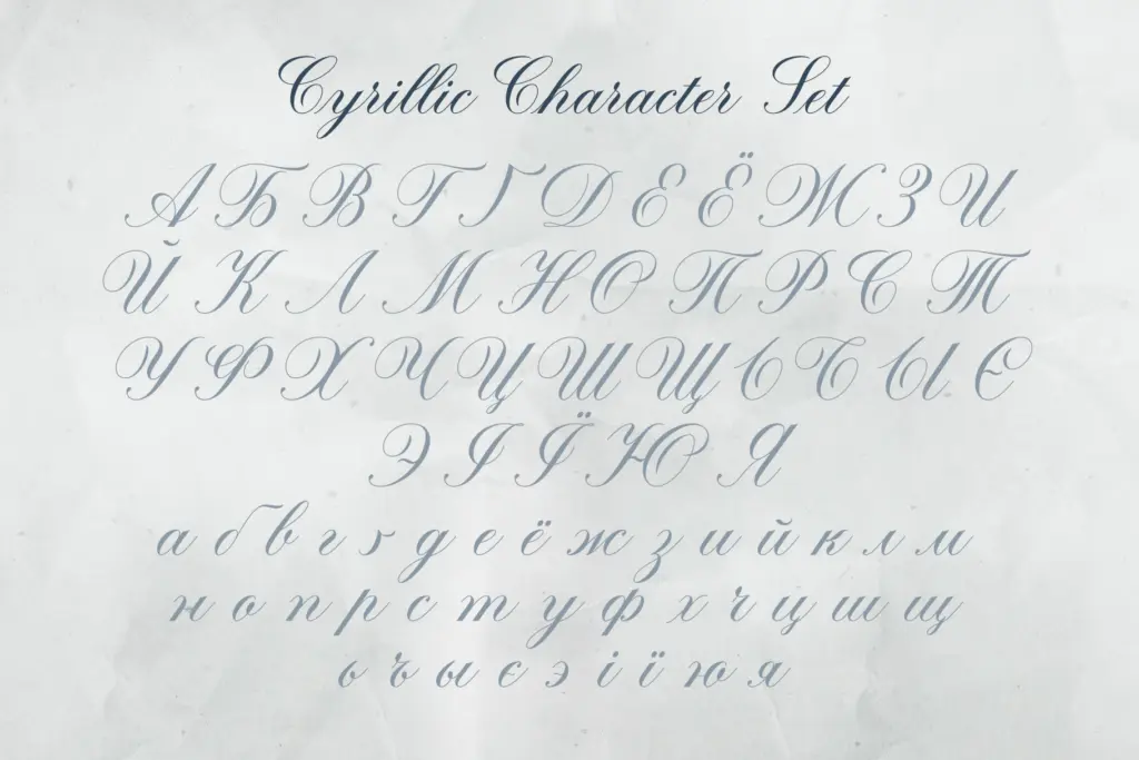
Cyrillic support is included alongside the Latin set, with its own alternates rather than a bolted-on afterthought. That’s a genuine point of difference for a script font at this level of detail, and it opens the typeface to a wider set of markets without a separate purchase.
None of this is automatic, though. A script with this many stylistic and contextual layers needs an application that reads OpenType features properly, and a user willing to go into the glyphs panel and choose alternates by hand for anything beyond default settings. Straight out of the box, in an app with no OpenType support, you’ll get a competent but flatter version of the font — the ligatures and swashes are where the design actually lives.
Use cases
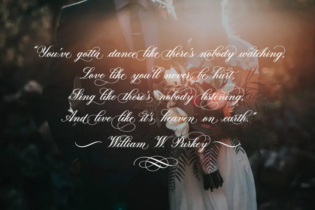
Brachetto is built for the upscale end of things: packaging, invitations, stationery, logotypes, posters, and lifestyle branding where a hand-lettered signature adds warmth to an otherwise polished layout. It works best set large — headlines, monograms, cover lines — where the contrast and flourish detail can register. At small sizes the hairlines thin out and the connecting strokes start to compete with each other, so it’s not a font for body copy or dense paragraphs.
It pairs naturally with a plain, quiet sans or serif for supporting text, letting the script carry the emotional weight while a workhorse typeface handles the practical reading. Used that way, in short bursts rather than long stretches, it does exactly the job it was drawn for.
What we liked, and what we didn’t
Strengths
- Contextual alternates and terminal forms keep connected letters from looking mechanical
- Cyrillic character set with matching alternates, not a token addition
- Flourishes are optional layers rather than fixed into every glyph, so the font scales from restrained to ornate
Trade-offs
- Requires an OpenType-savvy application to access its best features, or it reads flatter than intended
- Not legible at small sizes or in long text due to hairline contrast and heavy joining
Brachetto is a well-drawn calligraphy script with genuine depth in its alternates and welcome Cyrillic support, but it needs an OpenType-aware workflow to show its best side. It's built for headlines and short-form branding work, not paragraphs, and it delivers there with real polish.
Verdict

Tantype reviews typefaces in depth — every font is tested in real branding, editorial and screen layouts before a word gets written. 555+ fonts reviewed and counting.