
Catchy Mager: a ligature-heavy script for logotypes and label work
Design style
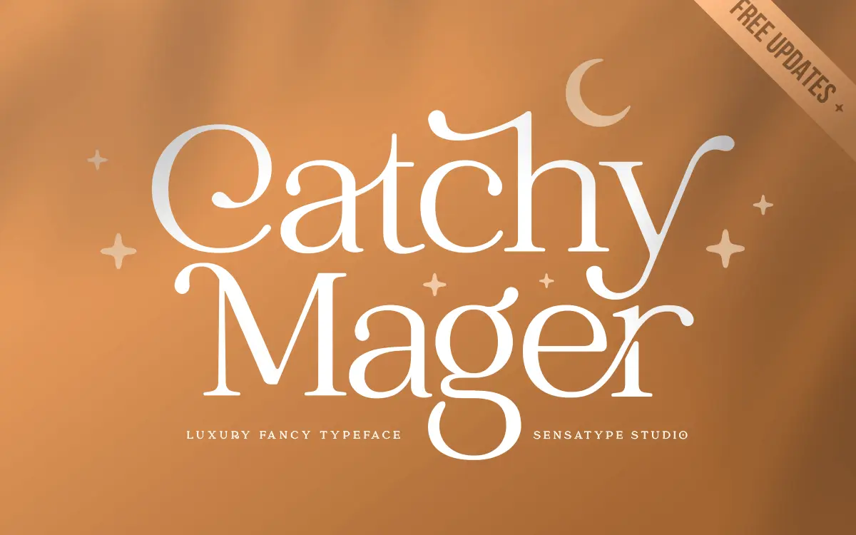
Catchy Mager reads as a connected script built for short bursts of text rather than paragraphs. The letterforms lean into flourish: uppercase characters carry extended swashes and looping entry strokes, while lowercase letters stay narrower and more restrained so the two don’t compete for attention. The contrast is moderate — enough to give the strokes some life without tipping into the fragile hairlines you get in more calligraphic scripts. It sits closer to a hand-lettered logotype than a formal script typeface, which explains why the marketplace listing calls it a serif but the actual behaviour is closer to display lettering.
The baseline has some natural bounce to it, which is typical of this genre but worth flagging: letters aren’t perfectly level, so setting long runs of text will produce a slightly uneven rhythm. That’s a feature if you’re after a handmade look, a liability if you need something that reads as neutral and controlled.
Character set and features
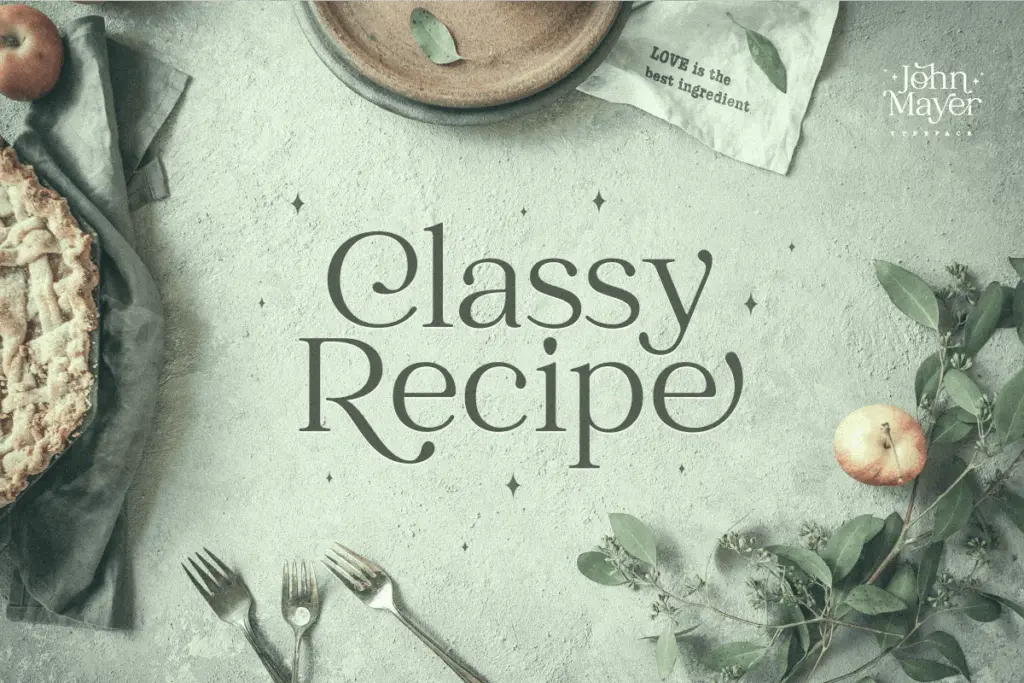
The headline feature here is the ligature set. Sensatype has built in a substantial list of letter pairs — ab, ah, am, ch, fl, fi, ff and similar combinations — that swap in decorated joins when the right letters land next to each other. Most uppercase letters and a handful of lowercase ones get this fancier treatment automatically or through OpenType alternates, which means the same word can look noticeably different depending on which software and settings you’re using. That’s worth testing before you commit to a layout, since not every app will trigger the ligatures the same way.
Beyond the ligatures, the font includes a standard set of uppercase and lowercase letters, numerals, punctuation, and multilingual symbol support, so basic diacritics are covered for languages that need them. There’s no mention of multiple weights or a companion sans, so this is a single-style release — what you see is the full range you get to work with.
Use cases
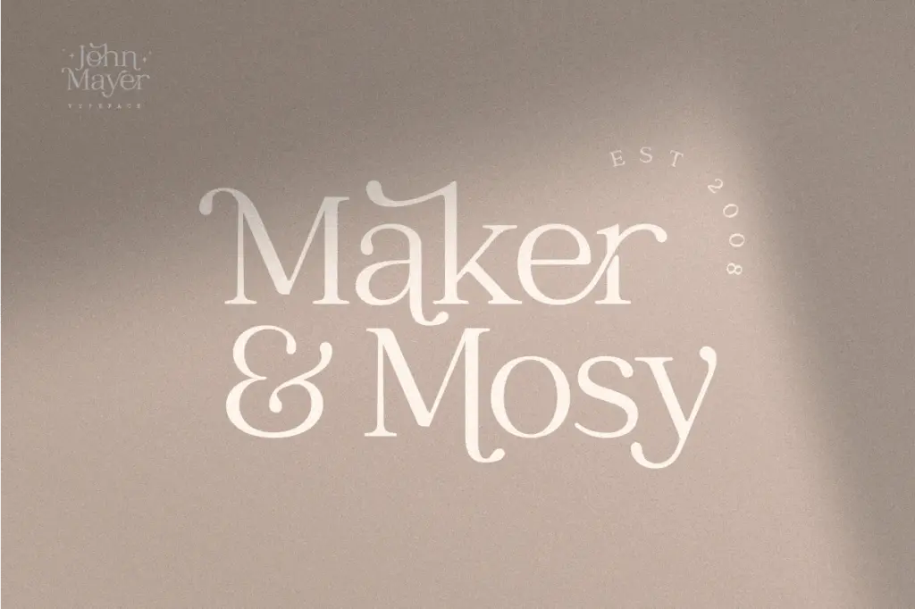
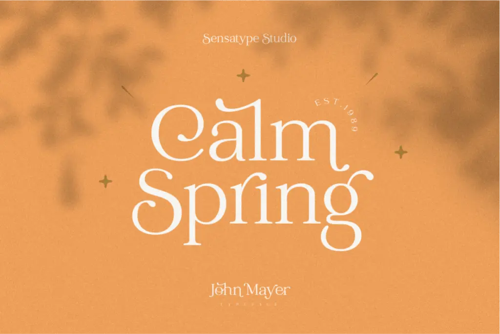
This is a font built for short, deliberate uses: a brand name across a logo, a product label, an invitation headline, a single line on packaging. The ligatures and swash capitals do real work at that scale, adding personality to a wordmark without needing extra ornamentation around it. It also suits stationery and social graphics where a few words need to feel considered rather than typed.
It’s not built for body copy, and pushing it there will expose the uneven baseline and the visual noise of the ligatures fighting each other in dense text. Treat it as a display and branding tool: pick your ligature combinations deliberately, check how they render in your specific software, and keep the surrounding type quiet so this one has room to be the loud element in the layout.
What we liked, and what we didn’t
Strengths
- Extensive ligature set gives short wordmarks real character without extra ornamentation
- Uppercase swashes and lowercase restraint keep the two cases from competing
- Multilingual symbol support extends its reach beyond a single language market
Trade-offs
- Uneven baseline and dense ligatures make it unsuitable for anything longer than a headline
- Ligature rendering depends on software support, so results vary across apps
Catchy Mager is a competent logotype script with a genuinely useful ligature system, best kept to short brand names and headline moments. It struggles outside that lane, and the bouncy baseline means every ligature pairing needs a visual check before it ships. Buy it for wordmarks and packaging, not for setting sentences.
Verdict

Tantype reviews typefaces in depth — every font is tested in real branding, editorial and screen layouts before a word gets written. 555+ fonts reviewed and counting.