
Hazel Shore: a high-contrast serif and script duo built to trade letters
Design style
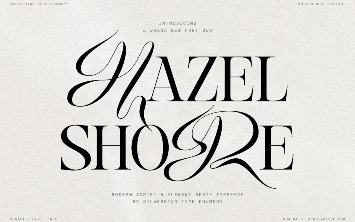
Hazel Shore pairs a high-contrast display serif with a script drawn to the same skeleton, and that shared construction is the point. Most serif-script duos are two separate typefaces bundled together and sold as a pair; here the x-height, cap height and general proportions line up closely enough that you can drop a script capital into a word set in the serif and the word doesn’t wobble. The serif itself has the thin hairlines and thick stems you’d expect from a fashion-adjacent display face — sharp bracketing, fine serifs that would disappear at small sizes, and an italic companion that leans rather than reinvents the letters. It’s a recognisable genre: the kind of serif that shows up on skincare packaging and editorial mastheads, drawn competently rather than radically. Nothing here reinvents contrast serifs as a category, but the execution is clean and the proportions are consistent across the three faces, which is the harder trick to pull off.
Character set and features
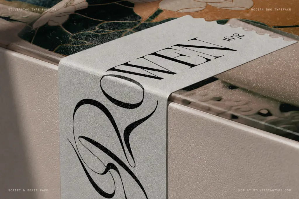
The serif is the workhorse of the set, with 901 glyphs and 124 ligatures, old style and tabular figures, fractions, and super/subscripts — the kind of depth that lets a font handle a full editorial layout, not just a headline. The italic carries its own 111 ligatures rather than borrowing the roman’s, which matters if you’re setting long passages in italic for pull quotes or captions. The script is positioned as the display partner rather than a body-text option, with long entry and exit strokes and contextual alternates that adjust the joins depending on what precedes or follows a letter — standard practice for connected scripts now, but it’s implemented here with enough alternates that the joins don’t repeat obviously across a short word. The headline trick — swapping a single serif letter for its script equivalent — works because of the shared metrics, and it’s genuinely useful for logotypes where you want one letter to carry personality without breaking the word’s rhythm. It’s a narrower feature than a fully mixable script, but it does what it claims.
Use cases
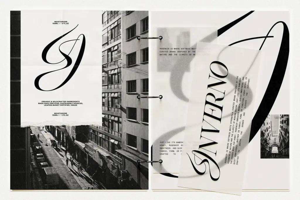
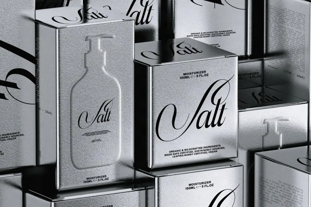
This is a branding and packaging font first. The high contrast puts a hard floor on legibility at small sizes, so it belongs on labels, covers, and headline-scale layouts rather than running text — the serif’s body-text capable glyph set is really about supporting longer captions and editorial blocks at a reasonable size, not paragraphs of copy. Fashion and beauty branding is the obvious fit, along with stationery, invitations and boutique packaging where a single elevated word or logotype is doing the work. The script needs care in tracking and kerning around its long entry and exit strokes, particularly at small sizes where the flourishes can collide with neighbouring letters. If your project needs a workable body-text serif as its main job, this isn’t that; it’s built to be decorative and specific, and it does that job well within a narrow height range.
What we liked, and what we didn’t
Strengths
- Serif, italic and script share consistent metrics, so mixing letters within a word actually works
- Deep glyph set on the serif, including old style figures, fractions and its own italic ligature set
- Contextual alternates on the script vary the joins enough to avoid obvious repetition
Trade-offs
- High contrast limits the serif to headline and label sizes rather than running text
- The script's long entry and exit strokes need careful tracking to avoid collisions at small sizes
Hazel Shore does one thing well: letting a script letter drop into a serif word without breaking stride, thanks to genuinely shared proportions rather than a loose pairing. It's a display and branding tool through and through, not a body-text serif, and the high contrast means it needs room to breathe.
Verdict

Tantype reviews typefaces in depth — every font is tested in real branding, editorial and screen layouts before a word gets written. 555+ fonts reviewed and counting.