
Blissful Radiance: a pencil-texture script for warm, informal branding
Design style
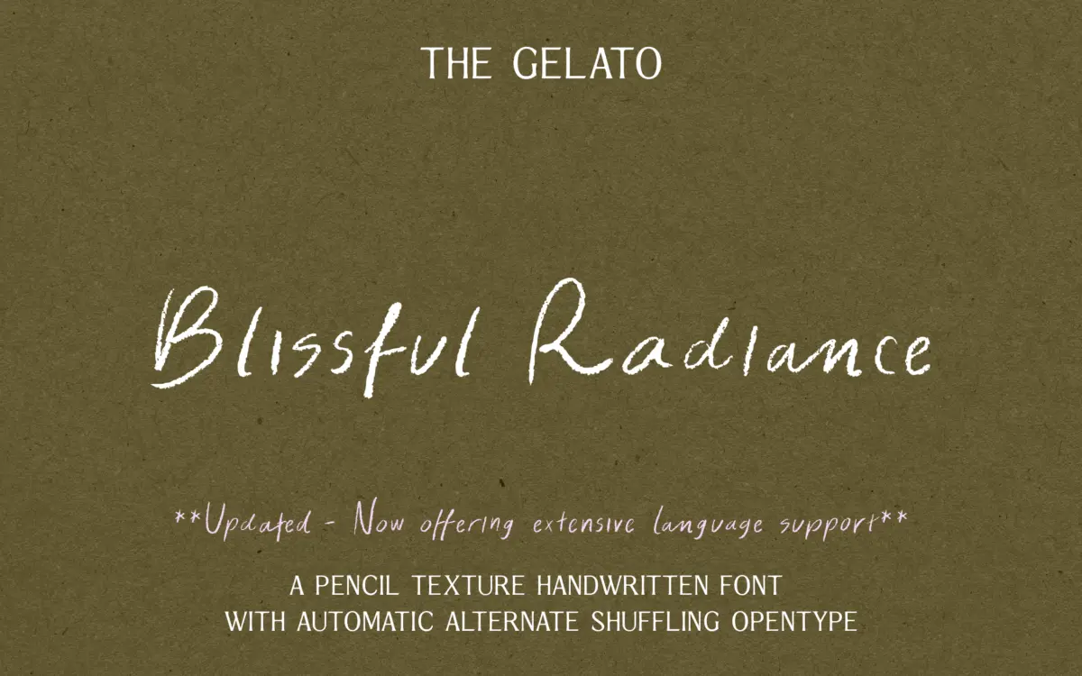
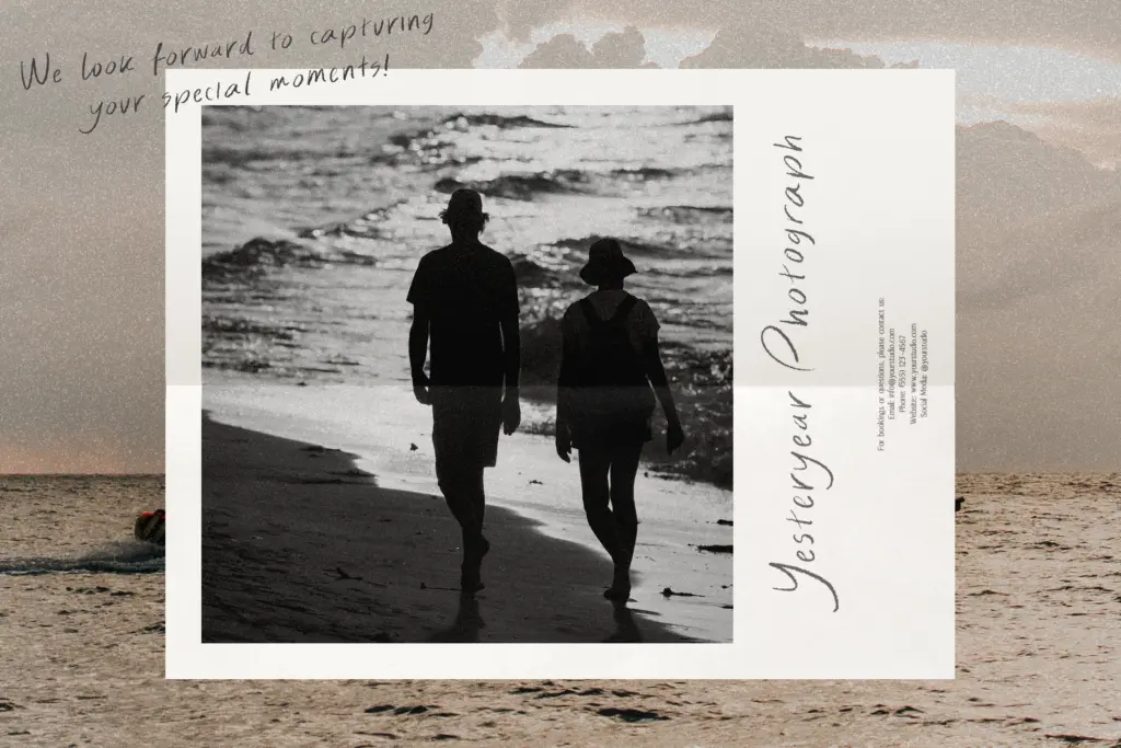
Blissful Radiance is a casual handwritten script built around the idea of a pencil dragged across paper rather than a pen. The strokes carry a soft, slightly broken edge, and the texture is consistent enough to read as a deliberate effect rather than noise or scanning artefacts. Letters lean gently forward with a loose, unforced rhythm — this isn’t a formal calligraphic script chasing elegance, it’s closer to a note scrawled by someone with decent handwriting and a bit of flourish in reserve.
Where it earns its keep is in the joins. Connections between letters feel plausible rather than mechanically stitched, and the baseline wanders just enough to avoid the stamped-out look that plagues a lot of script fonts built from a single alphabet pass. The x-height sits fairly generous against the ascenders and descenders, which keeps the texture legible even though the strokes themselves are irregular.
Character set and features
The headline feature is contextual alternates — two sets that swap in as you type, aimed at breaking up repeated letters so a word like “mississippi” doesn’t read as a stutter of identical shapes. It works as advertised in short bursts: headlines, names, single words on a card. The effect is more subtle than dramatic, which is the right call for a font meant to feel handwritten rather than gimmicky.
The seller notes broad multilingual support, though the brief doesn’t specify which language sets are covered, so anyone working outside basic Latin should check the glyph list before committing a layout to it. Standard punctuation and basic ligatures appear to be present, in keeping with what a script font at this level typically ships with.
Use cases
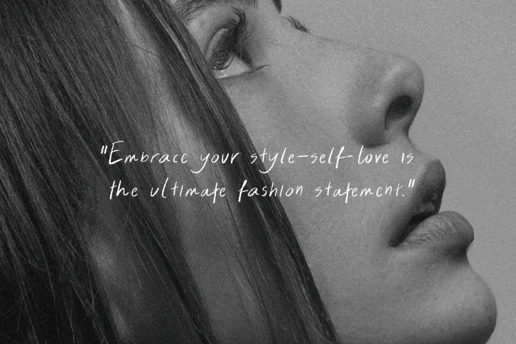
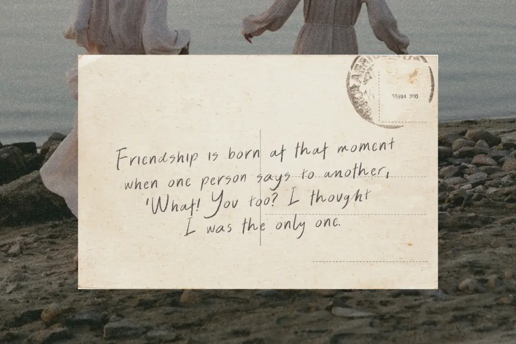
This is a font for small, personal-feeling jobs: wedding invitations, place cards, greeting cards, packaging labels for a small-batch product, or a logotype that wants to feel handmade rather than corporate. The pencil texture does real work here — it signals craft and informality in a way a clean script can’t, and it pairs naturally with kraft paper, muted palettes, and other rustic or DIY-adjacent branding.
It is less suited to anything that needs to run at small sizes or across long stretches of text. The texture that reads as charming in a 60pt headline turns muddy fast once you drop below display sizes, and the irregular baseline that gives it personality also makes paragraph-length setting tiring to read. Treat it as a headline or accent face, not a body script.
Digital use needs a little care too — texture fonts like this can render inconsistently across screen resolutions, so proofing at the actual output size (print or web) before finalising a design is worth the extra step. Used within its lane — short lines, generous size, informal context — it does the job cleanly and without pretension.
What we liked, and what we didn’t
Strengths
- Pencil texture reads as genuine and organic rather than filtered-on
- Contextual alternates break up repeated letters without overdoing the effect
- Loose baseline and natural-feeling joins avoid the stamped-out script look
Trade-offs
- Texture turns muddy at small sizes, so it's unsuited to body copy
- Multilingual character support isn't specified in detail, so non-Latin coverage needs checking before use
Blissful Radiance is a competent pencil-style script that does one job well: informal, handmade-feeling headlines and short lines. It loses clarity at small sizes and isn't built for paragraphs, so it should stay in its lane as a display and accent face.
Verdict

Tantype reviews typefaces in depth — every font is tested in real branding, editorial and screen layouts before a word gets written. 555+ fonts reviewed and counting.