
Circus Fonts: 12 Best Circus Fonts for Posters, Parties and Carnival Designs
A circus font is display lettering borrowed from 19th-century circus posters and fairground signs: big wood-type capitals, split Tuscan serifs, top-heavy French Clarendon slabs, drop shadows and letters printed in stacked colours. It’s also what people mean by a carnival font, big top font or sideshow font.
Our top three picks are Circus Freak for authentic layered poster type, Dusty Circus for a five-layer system you can rebuild into many effects, and Petit Carnaval for softer party and kids’ designs. Every font in the main list is a commercial Creative Market font and needs a licence. Six free fonts that allow commercial use are further down.
Browse circus fonts on Creative Market Commercial fonts: one-seat desktop licences from $15 (October 2026)
What is a circus font?
A circus font is a decorative display typeface modelled on 19th- and early 20th-century circus and carnival advertising. It usually has wood-type capitals, forked Tuscan serifs, reverse-contrast slab serifs, shadows or stacked colour layers, and it is made for posters, signs and headlines rather than body text.
No single typeface was “the” circus font. The look comes from several printing and painting traditions.
Wood type and the show printers
Big poster headlines in the 1800s were set in wood type, which was cheaper and lighter than metal at large sizes, as Wikipedia’s reverse-contrast typeface article notes. The best-known American maker, the Hamilton Holly Wood Type Company, was founded in Two Rivers, Wisconsin, in 1880 and became the largest wood type manufacturer in the United States within about twenty years. A board member quoted on its history page lists circus posters among wood type’s everyday jobs. Its museum now holds the Enquirer Printing collection from Cincinnati: nearly 500 circus, fair and carnival posters, about 1,500 hand-carved plates and more than 5,000 pieces of large wood type. Nashville’s Hatch Show Print (1879) printed posters for carnivals, circuses and tent shows. See our vintage fonts guide for more letterpress-era type.
The giant picture posters were colour lithographs. Cincinnati’s Strobridge Lithographing Company was “the leading printer for the major circuses of the time”, says the Cincinnati Art Museum. On a lithograph the lettering was drawn, not set, so Barnum & Bailey posters show freer versions of the same Victorian styles.
Tuscan, French Clarendon and ornamented letters
Tuscans are the split-serif letters most people picture. Type historian David Shields at Wood Type Research describes their “bi- or trifurcated (branched) serifs”, often with a spur in the middle of the stroke. Vincent Figgins showed an ornamented Tuscan in 1817, and the full-face American Tuscan, first shown by Wells & Webb in 1849, became “ubiquitous throughout the second half of the nineteenth century in America.”
French Clarendons flip normal contrast, so the serifs and horizontals are heavier than the stems. The same Wikipedia article says they were “seen on circus posters and wanted notices” and that the style is sometimes called “circus letter”. The Museum of Printing says W. Page introduced French Clarendon in the U.S. in 1865 and that it was popular in the 1870s and 1880s, from P.T. Barnum’s circus posters to Old West wanted posters. That’s why circus and western fonts overlap; our Clarendon font guide covers the normal-contrast original.
Ornamented and shaded letters added dots, inlines and deep shadows. Adobe’s Zebrawood revives an 1854 Wells and Webb design with a solid top, open bottom, graduated dots and deep shadow, a style Adobe says was common on circus posters.
Chromatic printing: one letter, several colours
Chromatic type is printed by overprinting two or three colour versions of each letter, Adobe explains. William H. Page’s Connecticut foundry published Specimens of Chromatic Wood Type, Borders, &c. in 1874; Rizzoli’s facsimile describes its display types as “meant to announce tent revivals and circuses.” (Page “did not invent chromatic type, he improved it”, notes Eye magazine.) Modern layered fonts work the same way: each layer is a separate font you stack and colour.
Sideshow banners and sign painting
Carnival sideshows were advertised with huge painted canvas banners; the American Folk Art Museum holds examples by Fred G. Johnson, one of the best-known banner painters. Because the lettering was brush-painted, sideshow fonts look looser than poster type; our sign painter fonts guide covers that tradition.
Traits to look for:
- Split Tuscan serifs and middle spurs
- Reverse contrast: heavy slab serifs, thinner stems
- Drop shadows, inlines, dots and engraved hatching
- Layer fonts for two- or three-colour effects
- Wide or condensed all-caps proportions
The best circus fonts at a glance
| Font | Best for | Styles | Desktop price* |
|---|---|---|---|
| Circus Freak | Chromatic poster headlines | 4 layering styles | $29 |
| Dusty Circus | Custom layered effects | 5 layers | $49 |
| Humoresque Layered Mini | Victorian ornamented signs | 12 styles | $20 |
| CS Gleam Stippled | Tuscan titles with print texture | Regular, Italic | $20 |
| Wood Type Font Collection | A full poster type kit | 5 families, 9 styles | $18 |
| Carousel Typeface | Engraved-style labels and logos | Not listed | $30 |
| Mystery Tour | Americana packaging | 3 layers + bonus sans | $15 |
| Crazy Circus | Vintage labels | 5 effect fonts + aged | $15 |
| Carnavonts | 3D carnival titles | 4 layers | $15 |
| Le Cirque – Parade Type | Retro 60s and 70s circus | 1, with swashes | $17 |
| Petit Carnaval | Kids’ parties, soft branding | Not listed | $19 |
| The Freaky Circus | Creepy carnival and Halloween | 1 (wide and narrow letters) | $15 |
*One-seat desktop licence on Creative Market, checked October 2026.
How we chose these fonts
We checked every Creative Market listing on 16–17 October 2026 and kept only live fonts clearly drawn from circus, carnival or Victorian poster lettering, favouring the historical traits above and adding softer and spookier styles for modern uses. We compared styles, layers, extras and language support, read the licence terms, noted buyer ratings where shown and recorded the regular desktop price. We have not used these fonts ourselves; details come from each listing.
Best circus fonts on Creative Market
1. Circus Freak
Simon Stratford’s Circus Freak is the closest thing here to a real chromatic wood-type poster. Its four styles, Regular, Lines, Shadow and Shadow Stroke, “can be layered one on top of the other to get a chromatic colour effect”, says the listing, and the thick slab serifs give a period look. It is caps-only, with 345 glyphs covering Eastern, Central and Western European languages, plus four high-resolution letterpress textures. Use it for show posters, festival headlines and labels that should look printed.
See Circus Freak on Creative Market
2. Dusty Circus
Dusty Circus, by Nathan Williams of Baseline Fonts, is a “five layer stacking display face designed to be infinitely morphed.” MyFonts lists the layers as Main, Fill, Top, Backlines and Back. Leaving one out, or stacking extra copies of another, gives a 3D bevel or an inline style, so one purchase covers many effects. It is the most flexible, and priciest, layered font here. Baseline also sells a cheaper Dusty Circus LTD, which MyFonts describes as a short set for non-commercial use only, so buy the full system for client work.
See Dusty Circus on Creative Market
3. Humoresque Layered Mini
Humoresque calls itself a “wisecracking sign painter mini-font family”, but its 12 styles make it closer to a full Victorian kit: Plain, Decorative, Center, Chisel, Filigree, Dots, Woodcut, Inset, Engraved, Hatched Shadow, Line Shadow and Shadow. Every style except Plain has an alternate set for layering, so you can build the dotted, engraved and shaded letters of Victorian show bills. It includes extended Latin, and the listing says it works best in OpenType-savvy apps such as Illustrator and InDesign. Use it for signs and menus.
See Humoresque Layered Mini on Creative Market
4. CS Gleam Stippled
Craft Supply Co. sells CS Gleam Stippled as a “Classic Tuscan Display Font with Stippled Texture” for “vintage signage, circus posters, and traditional letterpress design.” It is the most direct Tuscan in this list: forked serifs with a stippled texture that gives it a printed feel. It has Regular and Italic, upper and lower case, numerals, punctuation and accented letters, plus PUA encoding, which helps in apps without OpenType menus. The listing shows 4.0 out of 5 from 52 ratings. Use it for poster titles, tickets and bottle labels.
See CS Gleam Stippled on Creative Market
5. Wood Type Font Collection
Anugraha Design’s collection is a small poster shop in one download: five families and nine styles “reminiscent of eclectic 1900s wood type printing.” The circus piece is Prize, “an ornate slab serif with a circus / carnival vibe”, in regular and ornate versions. Four more families cover supporting lines, and the pack adds 18 vector ornaments, 10 textures and 5 Illustrator graphic styles. The fonts have capitals, numbers and basic punctuation only. Rated 4.6 from 112 ratings, it is the best value here for full poster layouts.
See Wood Type Font Collection on Creative Market
6. Carousel Typeface
Tugcu Design Co.’s Carousel, released in January 2026, is a “vintage ornamental serif font” inspired by circus posters and Victorian engraving. It suits the label side of circus design: logos, packaging, signage and heritage branding, where a fine engraved serif looks more polished than a heavy slab. The listing gives no style count or language list, so check the character preview before buying. The shop, Tugcu Design Co., lists more than 53,000 sales. Pair Carousel with a layered title font and use it for smaller lines.
See Carousel Typeface on Creative Market
7. Mystery Tour
Vintage Type Co.’s Mystery Tour is an “americana-inspired, layered display face” with Clean, Decorative and Shadow layers that you can recolour separately. Its bonus font, Mystery Tour Sans, solves the pairing problem in the same purchase. It is one of the few picks with stated language support: 23 languages, including French, German, Spanish, Polish, Turkish and Welsh. The designer suggests packaging, covers, posters and logos. It suits popcorn boxes, candy wrappers and festival merchandise that need a loud title and readable small print.
See Mystery Tour on Creative Market
8. Crazy Circus
Oleg Voznyy, whose VozzyStock shop lists over 7,000 sales, designed Crazy Circus as “a vintage look label typeface”, and the label focus shows. The download has five fonts with special effects plus an aged version, and the listing says you can “mix texture and shadow effects.” It ships as OTF and WOFF, with EPS files of the graphics shown in the previews. Language support isn’t stated. It is a cheap way to get layered shadows for jar labels, stickers and sideshow tickets.
See Crazy Circus on Creative Market
9. Carnavonts
Heroglyphs Studio built Carnavonts around a 1900s travelling-carnival theme, with a red-striped tent in the preview. It is a four-layer family with uppercase, lowercase, ligatures and stylistic alternates, plus a 3D extrude, a gradient and a slender outlined version. The extrude layer gives the deep block shadow of fairground signs. Language support isn’t listed, and the product has no reviews yet. Use it for game-booth signs, carnival party banners and event titles where a 3D look matters more than period accuracy.
See Carnavonts on Creative Market
10. Le Cirque – Parade Type
ikiiko’s Le Cirque moves the circus into the 1960s and 1970s. The listing pitches it for “60s or 70s design projects” and lists upper and lower case, a complete stylistic set, swashes and alternates, and multilingual support. The swashes give it a bouncy, retro rhythm that the Victorian picks don’t have. With 5,605 sales and a 4.3 rating from 10 buyers, it is one of the most popular fonts here. Use it for retro event branding, children’s book covers and party signs.
See Le Cirque – Parade Type on Creative Market
11. Petit Carnaval
Struvictory.art describes Petit Carnaval as a “soft, wide display serif inspired by classic carnival lettering”, with “gently melted shapes” and rounded details. It keeps the wide carnival proportions but drops the hard edges, which makes it the friendliest pick for kids’ birthday invitations, bakery packaging and circus-themed baby showers. The listing says it supports the most popular Latin-based languages, and the shop sells a matching handwritten script as a bundle. For more soft display options, see our kids fonts and whimsical fonts guides.
See Petit Carnaval on Creative Market · Read our Petit Carnaval review
12. The Freaky Circus
Gleb Guralnyk’s The Freaky Circus has a “dirty handmade textured effect” that suits the creepy-carnival side of the style. Typing capitals switches between wide and narrow letters, and 15 automatic ligatures make repeated letters look less uniform. The download includes OTF, TTF and WOFF files plus vector EPS graphics from the previews. It supports basic Latin only, so check accented names before you commit. Use it for Halloween flyers, haunted-house signs and horror-themed packaging; our scary fonts guide goes further in that direction.
See The Freaky Circus on Creative Market
How to choose a circus font
Pick the era first. For a vintage circus font with an 1880s big-top feel, choose a Tuscan or French Clarendon with layers (Circus Freak, CS Gleam Stippled, Dusty Circus). For a mid-century or storybook circus, choose something rounder (Le Cirque, Petit Carnaval). For a sideshow or dark carnival, choose texture and irregular letters (The Freaky Circus).
Decide whether you need layers. Layered fonts give the most authentic colour effects, but you must stack and align each layer by hand. That is easy in Illustrator or InDesign and fiddly in Canva or Word, where a font with a built-in shadow is simpler.
Keep it big and short. Most circus fonts are caps-only and busy, so keep them to names and headlines.
Pairing a circus font with a simple sans
Use the circus font once, at the largest size, then set everything else in one simple sans such as Work Sans or the condensed Oswald. Mystery Tour includes its own matching sans. Never pair two decorative faces.
Circus fonts for invitations, packaging and Halloween
- Kids’ birthdays and party invitations: Petit Carnaval or Le Cirque.
- Popcorn and candy packaging: Mystery Tour, Crazy Circus or the Wood Type Font Collection, with ingredients in a plain sans.
- Festivals and fairs: Circus Freak or Dusty Circus in bold colour layers.
- Halloween “creepy carnival”: The Freaky Circus, or any layered font in muddy colours.
- Marquee lights: popskraft’s Layered font set 3D Bulb lamp ($29) adds light-bulb layers for theatre-style signs.
Using circus fonts in Word, Canva and Cricut
- Word: install the font through Windows or macOS and Office picks it up, says Microsoft. Word also includes Playbill, a 1938 revival of the reverse-contrast “French Antique” style, which Microsoft says “is available within Office applications”.
- Canva: Canva’s upload fonts page says Pro, Teams and similar plans can add OTF, TTF or WOFF files to a Brand Kit; fonts should be licensed for embedding. For layered fonts, stack duplicated text boxes.
- Cricut: Design Space uses fonts installed on your computer, and Cricut’s font guide warns that intricate fonts can be hard to cut. Cut each layer of a layered font in its own vinyl colour, then stack them.
Colour fonts only show their colours in apps that support them; buyers of Ink Drop’s Showtime report it showing blank outside Adobe apps.
Free circus fonts
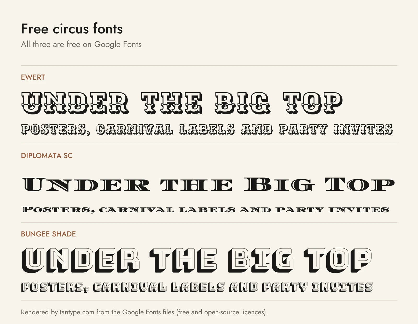
These six Google Fonts use open licences that allow personal and commercial work. None is one of the paid fonts above.
- Ewert by Johan Kallas and Mihkel Virkus is a slab-serif wood type that keeps the “ornamental leg” of its source, maps by the Estonian artist Olev Soans. It is the closest free match to ornamented poster letters.
- Diplomata SC by Eduardo Tunni is a very wide, Bodoni-like display face for the stretched-out ringmaster headline, in one small-caps style.
- Bungee Shade by David Jonathan Ross is the shaded layer of Bungee, which “celebrates the urban sign”. Its Regular, Inline, Outline and Shade layers stack like a free, modern chromatic system.
- Sancreek by Vernon Adams is “a contemporary take on some of the large wooden poster fonts of the nineteenth century”, best in capitals.
- Rye by Nicole Fally is “inspired by posters using wood type.” It leans western but fits circus tickets and labels.
- Ultra by Astigmatic is an ultra-bold slab “with nods to wood type styles like Clarendon and Egyptian”, for heavy, plain headlines.
Carnivalee Freakshow, often suggested for sideshows, is not on Google Fonts; check its licence first.
Free download: Ewert (Google Fonts) SIL Open Font License, free for commercial use
| Font | Source | Licence | Commercial use |
|---|---|---|---|
| Ewert | Google Fonts | SIL Open Font License | Yes |
| Diplomata SC | Google Fonts | SIL Open Font License | Yes |
| Bungee Shade | Google Fonts | SIL Open Font License | Yes |
| Sancreek | Google Fonts | SIL Open Font License | Yes |
| Rye | Google Fonts | SIL Open Font License | Yes |
| Ultra | Google Fonts | Apache License 2.0 | Yes |
Licensing: personal vs commercial use
Creative Market’s font licences come in four types:
- Desktop: unlimited personal and commercial projects, including products and packaging; on websites only as an image. One seat per user.
- Webfont: embedding on websites you own, up to the pageview limit chosen at checkout.
- App: embedding in one app or game, if the font can’t be extracted.
- E-pub: embedding in one ebook.
Only the licensee may use the font to make a finished product, so print-on-demand tools where customers type their own text aren’t covered. In a trademarked logo the font must be modified, not the dominant element, and disclaimed. Dusty Circus LTD is non-commercial, per MyFonts. Designers can add their own terms, so read each listing. This is a summary, not legal advice.
Circus font FAQ
What font is used on circus posters?
No single font was used on circus posters. Letterpress bills used whatever wood type the printer owned, usually Tuscans, French Clarendons and ornamented or shaded letters, while big lithographed posters had hand-drawn lettering.
What is the difference between a circus font and a western font?
They share the same 19th-century wood type, especially French Clarendon. Circus fonts lean on colour, shadows, ornaments and layers, while western fonts tend toward plain, worn slabs.
Are carnival fonts and circus fonts the same?
Mostly, yes. “Carnival font”, “big top font” and “sideshow font” describe the same family of decorative poster styles. Carnival and sideshow designs often look more hand-painted, because that lettering came from banners and signs.
Is there a free circus font for commercial use?
Yes. Ewert, Diplomata SC, Bungee Shade, Sancreek, Rye and Ultra are on Google Fonts under the SIL Open Font License or Apache License, which allow commercial use.
How do layered or chromatic fonts work?
A layered font is a set of fonts that line up exactly, such as a fill, an outline and a shadow. You colour each copy of the text and stack them, the digital version of chromatic wood type.
Is there a circus font generator?
Circus font generators don’t give you a font. They swap your letters for decorative Unicode characters or make an image of your text. For print, Cricut or logos you need a real, licensed font.
Is Zebrawood free?
Not on its own. Zebrawood is on Adobe Fonts, so it costs nothing extra if your Creative Cloud plan includes the full library, which Adobe clears for personal and commercial use.
