
Tomato Pasta: a casual handwritten script for social posts and quick branding
Design style
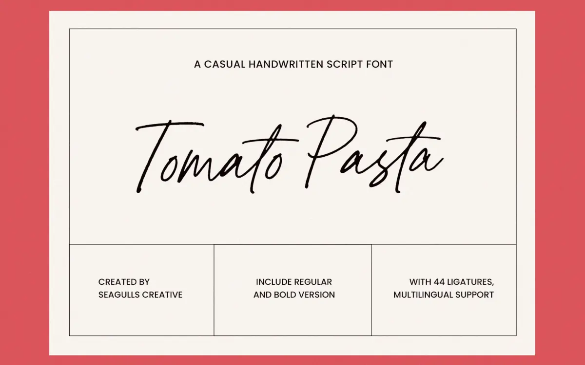
Tomato Pasta is a loose, casual script pitched squarely at the informal end of handwriting fonts. The letters lean forward slightly and connect in a relaxed, unforced way, with the kind of variable pressure you’d expect from a felt-tip pen rather than a brush. There’s no attempt at calligraphic polish here — no dramatic swells, no formal entry strokes. Instead the appeal is in the looseness: baseline wobble, inconsistent letter widths, a general sense that someone wrote this quickly and didn’t go back to tidy it up.
That’s a legitimate design choice, and it’s consistent across the alphabet, which matters more than people give it credit for. A lot of handwriting fonts fake spontaneity in a few showcase letters and then flatten out everywhere else. Tomato Pasta keeps the same energy in the mundane letters too — the m’s and n’s, the connecting strokes into ascenders — so it doesn’t read as a font pretending to be handwriting so much as an actual handwriting sample turned into a font, in the tradition that category is built on.
The Bold weight is worth a mention: it doesn’t just thicken the strokes, it makes the whole thing feel more like a marker than a pen, which gives you a second register without buying a different typeface.
Character set and features
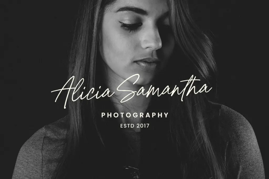
The package covers upper and lowercase, numerals, punctuation, and a set of ligatures, which is where a script font like this either earns its keep or falls apart. Ligatures let common letter pairs merge the way real handwriting does — an ‘th’ or an ‘ing’ that flows as one gesture instead of two separate glyphs jammed together. Given the format includes them, expect the font to need some manual kerning attention on longer setting, as handwritten scripts generally do; this isn’t a typeface you drop in and walk away from without checking the word spacing.
Multilingual support is included, so extended character coverage should be there for accented Latin languages beyond a base English set, though the brief doesn’t specify exactly which. Two weights — Regular and Bold — is a modest but sensible range for a script; it’s not trying to be a full family, just a font with a companion.
Use cases
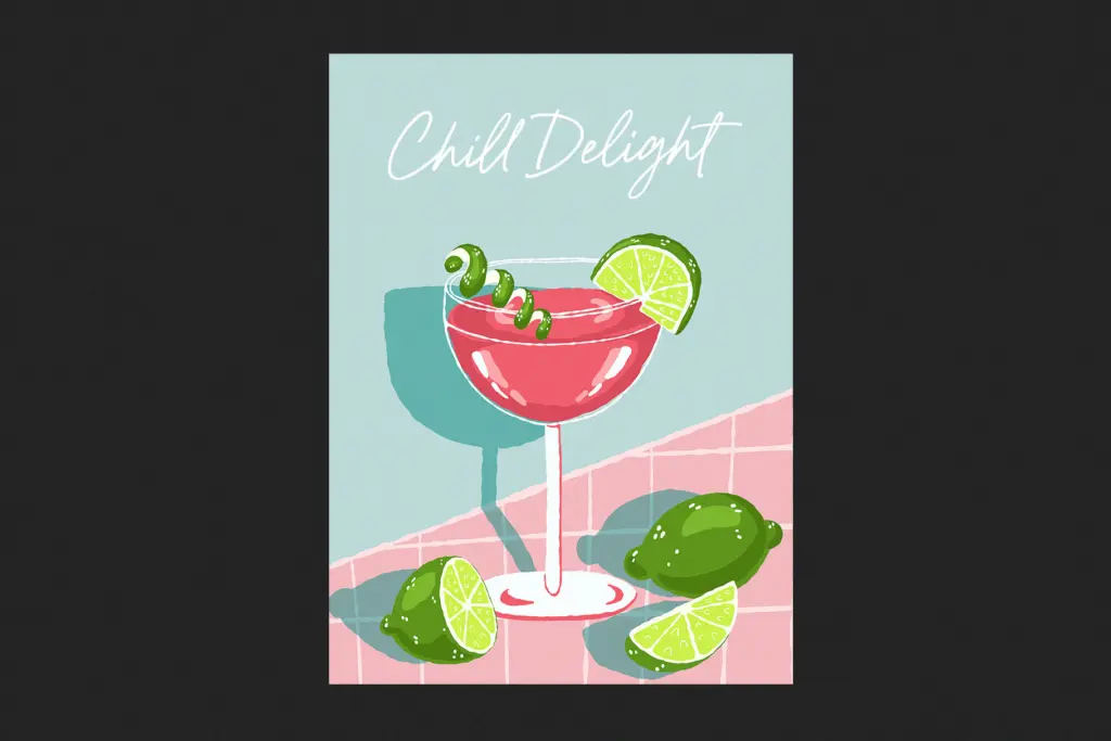
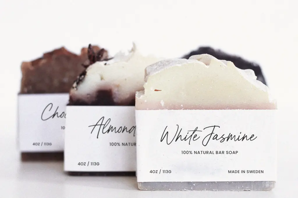
This is a font built for short bursts of text, not paragraphs. Instagram captions, a signature line on a wedding invite, a handwritten-style callout on packaging, a quote graphic — anywhere the brief wants
What we liked, and what we didn’t
Strengths
- Consistent casual energy across the full alphabet, not just showcase letters
- Ligatures included for more natural letter connections
- Bold weight gives a second, marker-like register without extra cost
Trade-offs
- Word spacing needs manual adjustment for longer lines of text
- Only two weights, so range is limited if a project needs more variety
Tomato Pasta does one thing — casual, marker-style handwriting — competently and consistently. It's better suited to headlines and social graphics than to running text, and buyers should budget time for kerning.
Verdict

Tantype reviews typefaces in depth — every font is tested in real branding, editorial and screen layouts before a word gets written. 555+ fonts reviewed and counting.