Sans Serif
3.6
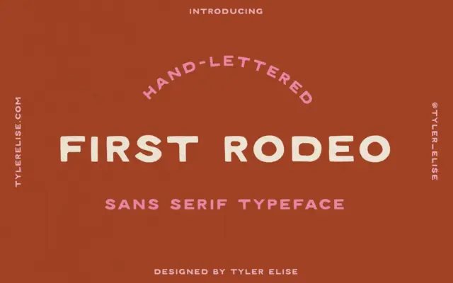
First Rodeo: a textured, hand-lettered sans for western-leaning branding
Design style First Rodeo is a hand-lettered sans serif built around a rough, inked texture rather than clean vector edges.…
 Tantype

Design style First Rodeo is a hand-lettered sans serif built around a rough, inked texture rather than clean vector edges.…
Tantype
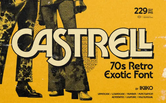
Design style Castrell sits in that familiar territory of 70s revival lettering — rounded terminals, bold even weight, and a…
Tantype
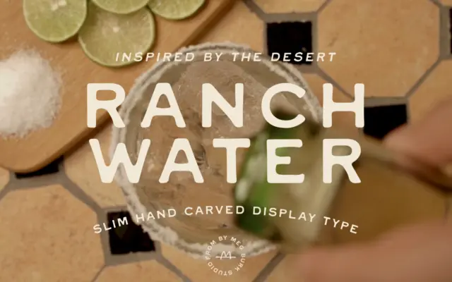
Design style Ranch Water belongs to that family of display sans that look cut rather than drawn — the kind…
Tantype
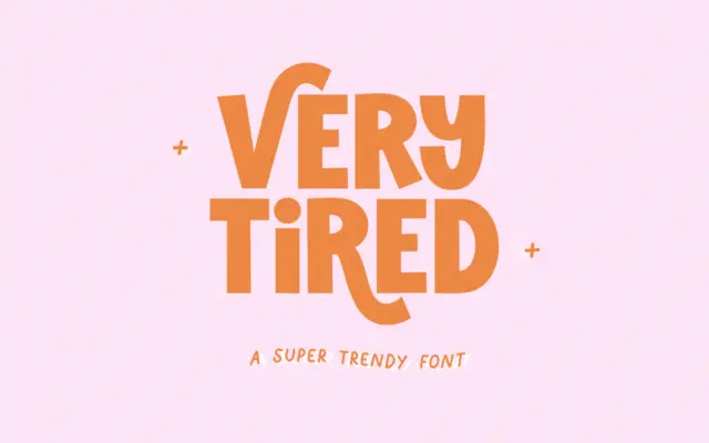
Design style Very Tired is a blocky, all-caps display font that pairs heavy, squared-off letterforms with a handful of swooping…
Tantype
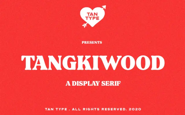
Design style Tangkiwood is a heavyweight display serif built around the thick, rounded slab shapes that signal 1970s print design…
Tantype
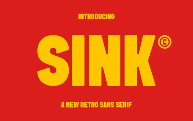
Design style Sink is a heavyweight sans with its roots in mid-century signage lettering. The strokes are thick and even,…
Tantype
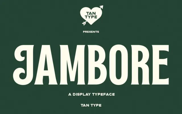
Design style Jambore sits in that familiar territory of bold display serifs built for attention rather than reading. The strokes…
Tantype
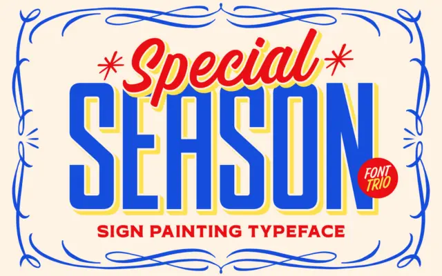
Design style TNSC Special Season is built on the look of hand-lettered signage rather than any single letterform tradition, which…
Tantype
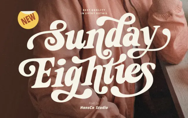
Design style Sunday Eighties is a slab-leaning display serif built around thick, confident strokes and a slightly bouncy baseline feel.…
Tantype