Serif
3.9
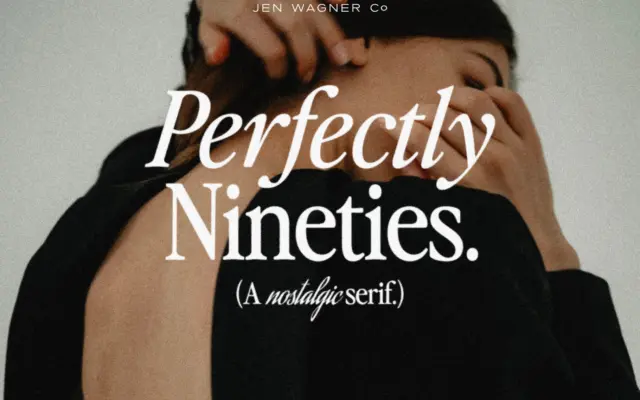
Perfectly Nineties: a tightly spaced revival serif for retro editorial work
Design style Perfectly Nineties draws on the particular flavour of serif that showed up in magazine mastheads and catalogue copy…
 Tantype

Design style Perfectly Nineties draws on the particular flavour of serif that showed up in magazine mastheads and catalogue copy…
Tantype
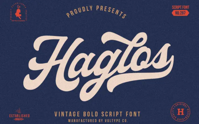
Design style Haglos Bold is the heaviest of a three-weight script family built around an old American sign-painting feel, filtered…
Tantype
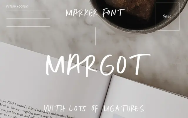
Design style Margot Marker Font is built around a single idea: capital letters drawn with a dry marker, not a…
Tantype
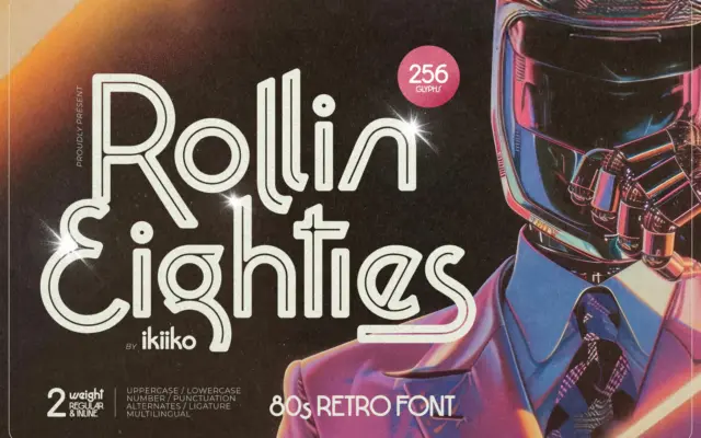
Design style Rollin Eighties is a display sans built squarely on retrowave and disco-era signage rather than on any functional…
Tantype
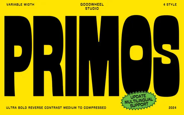
Design style GW Primos is built around a single, blunt idea: reverse contrast taken to an ultra-bold extreme. Where most…
Tantype
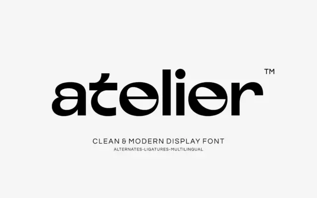
Design style Atelier sits in that familiar territory between geometric sans and display face, built around circular bowls, even stroke…
Tantype
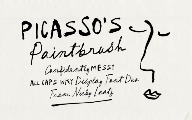
Design style Picasso’s Paintbrush leans hard into deliberate imperfection. This is a script built to look like it was dragged…
Tantype
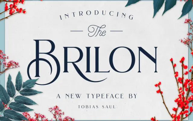
Design style Brilon leans on the geometric serif vocabulary of Art Deco signage without going full pastiche. The uppercase carries…
Tantype
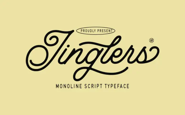
Design style Jinglers is a connected script built on a single stroke weight, which puts it in the same family…
Tantype