
Fairy Garden Font Free Download
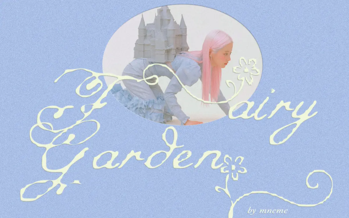
Is Fairy Garden free to download?
Fairy Garden is a commercial font sold on Creative Market, so the full version needs a paid license. Get it from the official listing: Fairy Garden font download.
Need something free? These script fonts from Google Fonts are free for personal and commercial use:
Design style
Fairy Garden sits in the crowded field of whimsical fantasy scripts, but it earns its place with a looser, less calculated hand than most. The baseline wanders rather than holds a strict line, strokes thin out into trailing swashes, and the overall impression is of something written quickly on good paper rather than built letter by letter in a type editor. That looseness is the point: this isn’t a calligraphic script aiming for formal elegance, it’s a storybook hand aiming for charm.
The floral touches are kept light. Rather than dense ornament packed into every letter, small blooming details appear at terminals and ascenders, giving the font a decorative lift without turning every word into a bouquet. Letter joins are soft and rounded, apertures are generous, and the x-height sits low enough that ascenders and descenders get real room to do their looping. The result reads as feminine and dreamy without tipping into the overly sweet territory a lot of fantasy scripts fall into.
Character set and features
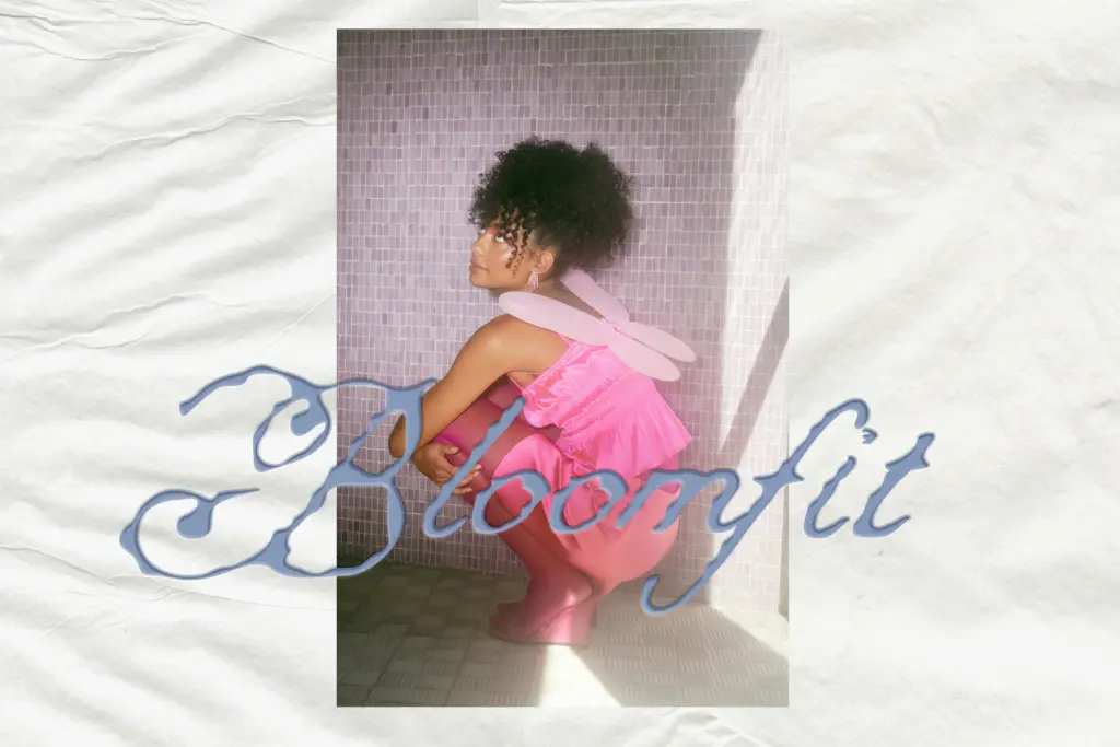
The OTF includes uppercase and lowercase letters, numerals, and standard punctuation, along with decorative alternates for adding variation to repeated letters. The alternates are where the font does its best work — swapped into a name or short phrase, they break up monotony and give the impression of a hand-lettered piece rather than a typed one. Given the exuberance of the base swashes, some letter combinations will need manual kerning adjustments, particularly where tall ascenders or long swashes from one letter collide with the bowl or crossbar of the next. This is common territory for swash-heavy scripts, but it means Fairy Garden rewards someone willing to nudge letterforms in a design app rather than trusting autoflow to get it right first time.
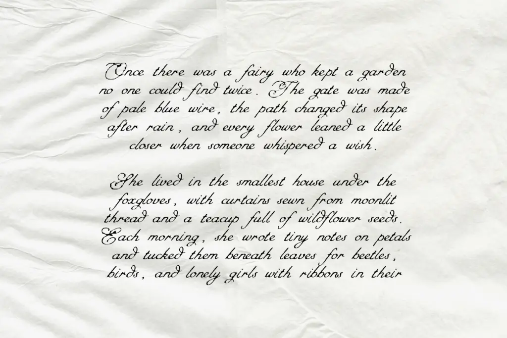
At small sizes the delicacy of the strokes works against it — thin hairlines and trailing curls lose definition quickly once a word drops below a few centimetres or gets compressed into a narrow label. This is a font built for generous space, not dense paragraphs or tiny print runs.
Use cases
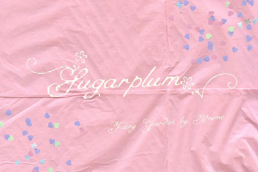
Fairy Garden is suited to short-form, high-impact text: a name across an invitation, a brand wordmark, a product label, a single line on a social graphic. It fits naturally into fairycore and cottagecore visual language, pastel palettes, and any identity leaning into a soft, magical, slightly nostalgic register. Children’s book covers, party invitations, boutique packaging, and wedding stationery with a fantasy or fairy-tale theme are all reasonable homes for it.
It is less suited to anything requiring body copy, dense layouts, or strict legibility at small scale — long passages will tire the eye and the swashes will start to compete with each other. Used as intended, for a headline, a logotype, or a single evocative line, it does its job well. Pushed into paragraph duty, the same looseness that gives it charm becomes a liability.
We included Fairy Garden in our roundup of the best whimsical fonts, alongside other picks in the same style.
What we liked, and what we didn’t
Strengths
- Loose, wandering baseline gives it a genuinely handwritten feel rather than a templated fantasy look
- Decorative alternates add real variation when lettering names or short phrases
- Floral details are restrained enough to stay elegant rather than cluttered
Trade-offs
- Thin hairline strokes lose definition at small sizes or in tight layouts
- Swash collisions between letters often require manual kerning rather than working straight out of the box
Fairy Garden delivers genuine charm through its loose, wandering swashes and floral alternates, making it a strong pick for short, decorative lines of text. It is not built for body copy or small-scale legibility, and the swash collisions will need manual attention. Used where it belongs — names, headlines, labels — it earns its fantasy-script billing.

Tantype writes independent reviews of typefaces: what each font does well, where it falls short, what it suits, and where it is sold.