
ED Venta Nueva: a script-and-sans duo for wedding suites and soft branding
Design style
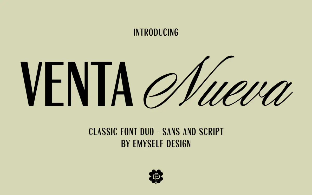
Venta Nueva is a two-face bundle built for the pairing itself rather than for either face standing alone. The script half is a casual, connected hand style with a moderate slant and a relaxed baseline — letters lean into each other without the exaggerated swash work that turns some wedding scripts into decoration first and text second. Stroke contrast is gentle rather than calligraphic, which keeps the script from feeling fussy, though it also means it doesn’t have much drama at large display sizes on its own.
The sans companion is a plain capital-led design: simple, upright, minimal contrast, and geometric enough to sit quietly under the script without competing for attention. It reads as a support face rather than a headline face in its own right — its job is to add structure and legibility next to the looser script, and it does that job without much personality of its own.
Character set and features
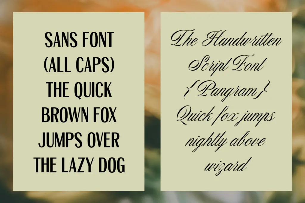
Both fonts ship with a reasonably full glyph count — 379 in the script, 363 in the sans — covering upper and lower case, punctuation, and a set of symbols and marks. That’s enough for the pairing to handle full sentences, not just single words or monograms, which matters if you’re setting invitation copy or short quotes rather than just a name.
There’s no mention of contextual alternates, ligatures, or swash variants in the spec, so this reads as a duo built for straightforward setting rather than one with a deep OpenType feature set to dig into. If your workflow depends on stylistic alternates to vary repeated letters in a script, you’ll want to check for that before committing — on the evidence given, this is a font that does one job cleanly rather than offering a toolbox of variants.
Use cases
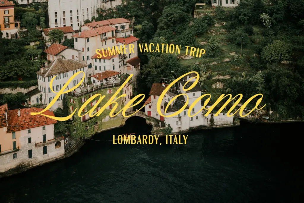
This duo sits comfortably in the wedding-stationery and soft-branding space it’s clearly aimed at: invitation suites, save-the-dates, quote cards, and feminine-leaning logo lockups where a script signature line needs a plain capital line underneath for clarity. The sans is useful as a subhead or address line, the script carries the emotional weight — names, dates, short phrases.
It’s less suited to anything that needs a strong, ownable headline face — packaging that needs shelf presence, or branding that wants a distinctive wordmark, will find the sans too plain and the script too soft to hold up as a standalone lockup. Treat this as a supporting pair for occasion-based design work rather than a foundation for a full brand system, and it does what it sets out to do.

What we liked, and what we didn’t
Strengths
- Generous glyph count in both faces supports full sentences, not just names or monograms
- The plain capital sans keeps the pairing legible at small sizes where the script alone would blur
- Gentle, non-calligraphic contrast in the script keeps it usable in body-length invitation copy
Trade-offs
- No stylistic alternates or ligatures mentioned, so repeated letters in the script won't vary
- The sans is plain enough that it struggles as a standalone headline or logo face
Venta Nueva is a competent, unfussy script-and-sans pairing aimed squarely at wedding stationery and soft branding. It does what it promises without surprising you, but neither face has enough personality to anchor a brand identity on its own.
Verdict

Tantype reviews typefaces in depth — every font is tested in real branding, editorial and screen layouts before a word gets written. 555+ fonts reviewed and counting.