
Des Montilles Handwritten Script: casual signature style for cards and branding
Design style
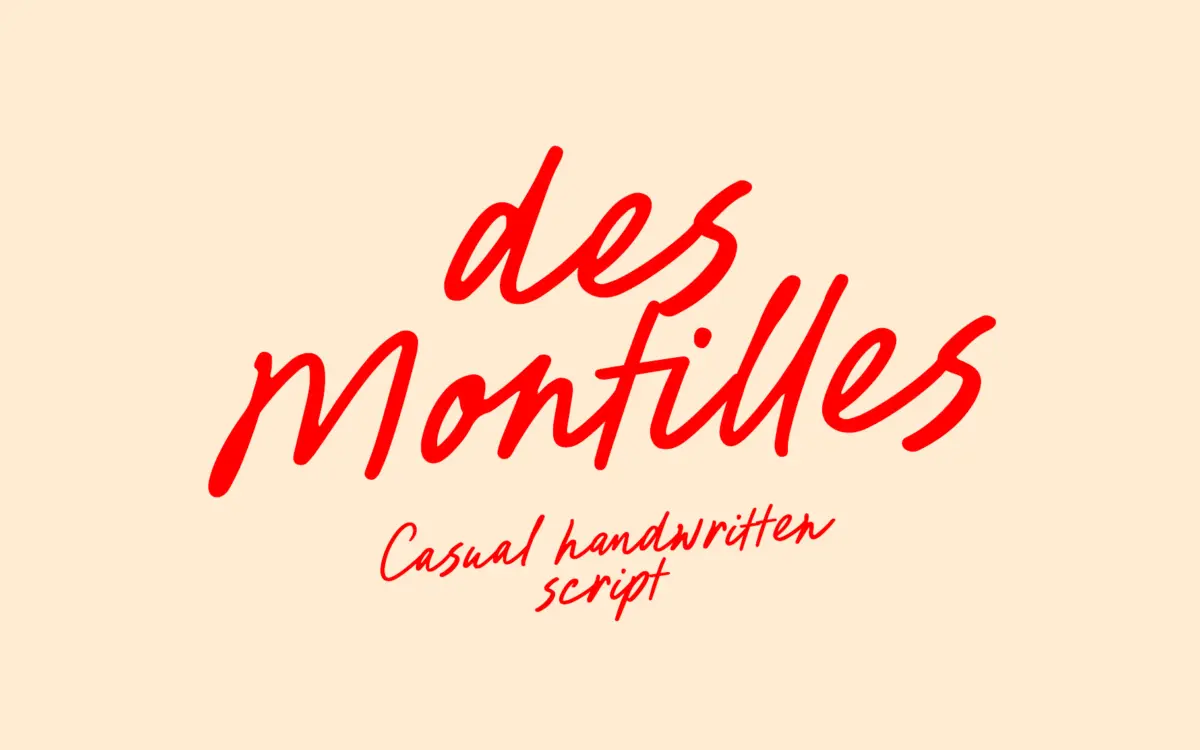
Des Montilles reads as a quick, casual signature script rather than a formal calligraphic one. The strokes have the loose, slightly uneven pressure of a felt-tip pen rather than the tapered thick-thin contrast you get from a brush or pointed pen. Baselines drift a little from letter to letter, which is intentional here — it gives the words a handwritten, unrehearsed feel rather than a mechanically repeated one. Ascenders and descenders loop generously, and the connecting strokes between letters are built to feel continuous, as if written in one pass.
The heart connections and beginning/end swashes are the most distinctive part of the design. They’re used sparingly enough that the font doesn’t tip into novelty territory, but they’re there if you want a flourish on a capital or a closing word. It sits comfortably in the casual end of the handwritten category — closer to a note scrawled on a gift tag than a wedding invitation script with formal pretensions, though it can be pushed toward either depending on how it’s set.
Character set and features
The alphabet, punctuation and multilingual character set are extensive, covering a long list of accented Latin characters across both cases. That’s a genuine practical strength for anyone setting copy in French, German, Scandinavian languages, or other diacritic-heavy Latin scripts — a lot of handwritten scripts skip this entirely and fall apart the moment an accent is needed.
The ligatures and swash characters are PUA-encoded, meaning they sit on their own keycodes and don’t require a glyphs panel or OpenType-savvy software to reach. That’s convenient for anyone working in a program with limited typographic controls, though it does mean you’re typing specific characters to get specific ligature effects rather than having them trigger automatically as you type — worth knowing before you commit a layout to it.
Use cases
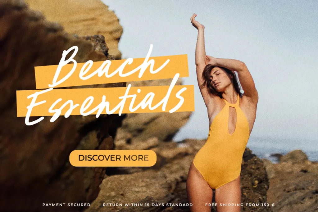
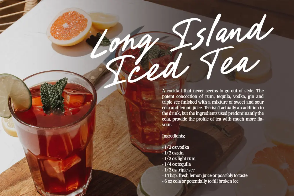
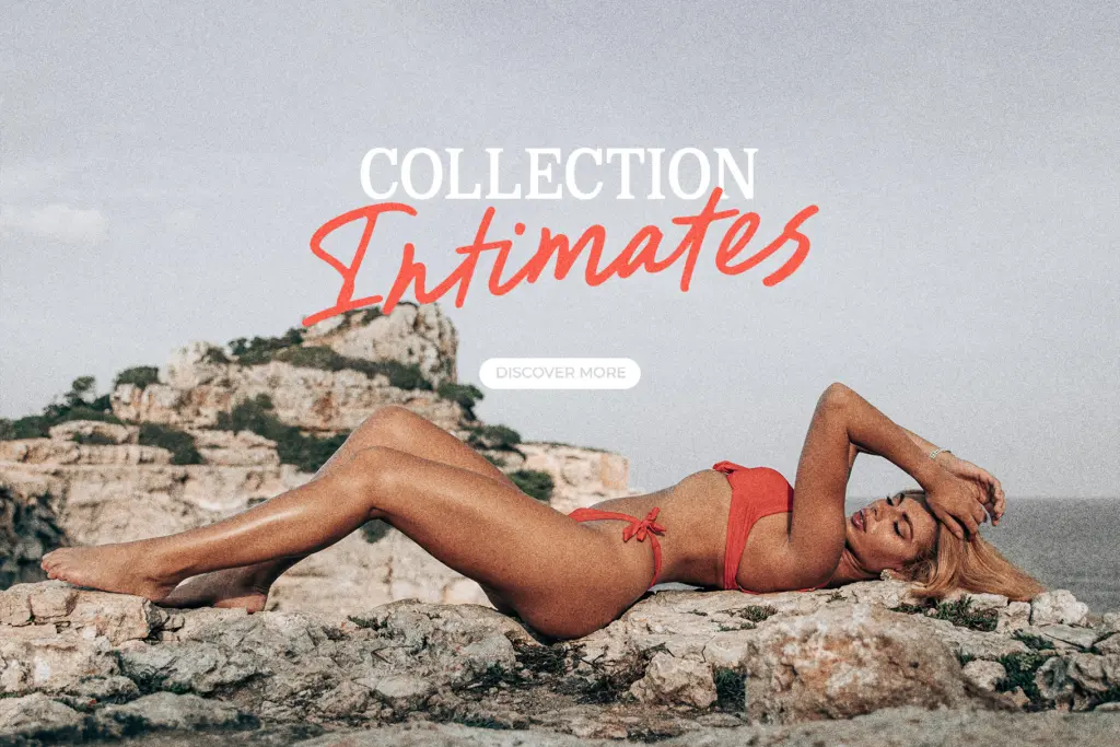
This is a font built for short, expressive lines rather than paragraphs. A name on a wedding invitation, a line of copy on a greeting card, a signature-style logotype for a photographer or small brand, a word or two on packaging or apparel — all of this plays to its strengths. The baseline movement and the swashes read as charm at that scale.
Push it into body copy or long-form text and the same qualities become liabilities: the irregular baseline and connecting strokes slow reading down, and at small sizes the swashes can clot together. Keep it to headlines, short phrases, and standalone words, pair it with a plain, quiet sans or serif for any supporting text, and it does its job well. Ask more of it than that and it starts working against you.
What we liked, and what we didn’t
Strengths
- Extensive multilingual character set covers accented Latin languages many handwritten fonts skip
- PUA-encoded ligatures and swashes are accessible without OpenType-aware software
- Swash and heart-connection details add charm without overwhelming the base letterforms
Trade-offs
- Irregular baseline and connecting strokes make it unsuitable for anything beyond short lines
- Ligature access is manual via specific keystrokes rather than automatic as you type
Des Montilles is a solid casual signature script that earns its keep on short lines — logos, greeting cards, invitation names. It's not built for long text and shouldn't be asked to carry it, but within its lane the swashes and heart connections give it real personality without tipping into gimmick.
Verdict

Tantype reviews typefaces in depth — every font is tested in real branding, editorial and screen layouts before a word gets written. 555+ fonts reviewed and counting.