
Branch: a ligature serif for quiet, editorial-leaning branding work
Design style
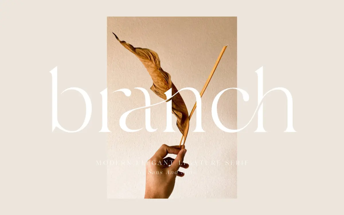
Branch sits in the crowded field of serif faces built around ligatures and alternates, but it leans toward restraint rather than flourish. The stroke contrast is moderate — enough to give the letters some warmth, not so much that it reads as a display headline font at every size. Terminals are gently tapered rather than sharp, and the serifs themselves are short and unbracketed in places, which keeps the overall texture light on the page. It’s closer to a refined text serif with connective tendencies than a full script-serif hybrid, and that middle ground is really its identity. It doesn’t commit fully to calligraphic gesture, which some buyers looking for a swoopy wedding face may find underwhelming, but it also means the letters stay legible where a more theatrical ligature font would start to blur.
The rhythm across a line is even. Letters don’t compete with each other for attention, which suggests the drawing was done with paragraph-level use in mind rather than purely as a logotype generator.
Character set and features
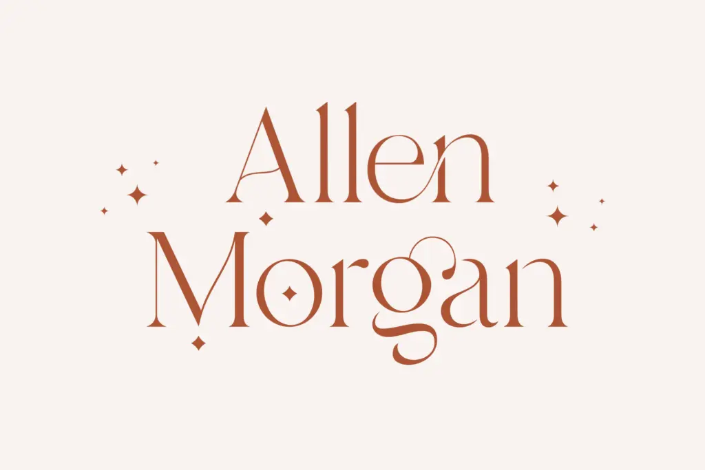
The set includes alternate letterforms, ligatures, and PUA encoding, so the fancier characters are reachable even in software without OpenType feature support — a practical inclusion, since a lot of ligature fonts quietly assume everyone is working in Illustrator or InDesign. Multilanguage support is mentioned, though the brief doesn’t specify which scripts or diacritics are covered, so anyone with non-English requirements should check the glyph list before committing rather than assume broad coverage. Files are provided in OTF, TTF and WOFF, covering desktop and web use without extra conversion.
The ligatures themselves do what ligatures in this category usually do: smooth over awkward letter pairs and add a handwritten connective feel to short words. They work best used sparingly — a name, a headline, a monogram — rather than across a whole paragraph, where the joins can start to look busy if overused. This is standard behaviour for the genre, not a flaw specific to Branch, but it’s worth flagging for anyone new to ligature-heavy serifs.
Use cases
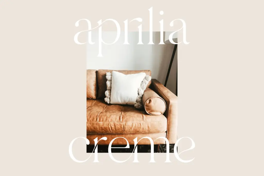
Branch’s obvious home is short-form branding: logotypes, wordmarks, packaging headers, and the kind of invitation or stationery work where a name or a few words need to feel considered rather than shouted. It has enough serif structure to hold up in a masthead or a product label, and enough ligature character to avoid feeling generic next to a plain serif.
It is less suited to long-form text — body copy, editorial paragraphs, anything set below display size — where the connective details either disappear or start to fight the reading rhythm. Treat it as a display and short-headline face rather than a workhorse text font, and pair it with a plainer serif or sans for supporting copy. For anyone building a small brand identity, a wedding suite, or packaging that needs one elegant line of type rather than a paragraph, Branch does that job cleanly without overreaching.
What we liked, and what we didn’t
Strengths
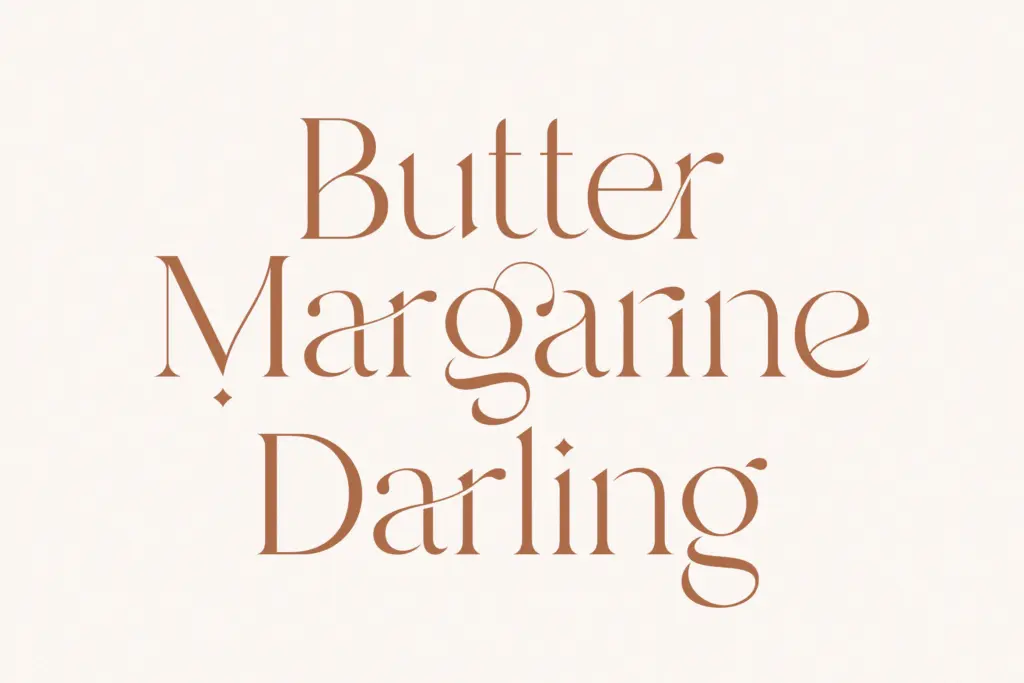
- Moderate contrast and short serifs keep it legible at smaller display sizes than most ligature fonts manage
- PUA encoding means the alternates are usable even without OpenType-aware software
- Even letter rhythm makes it work well for short lines like logotypes and monograms
Trade-offs
- Not built for body text — the connective details lose clarity below display size
- Multilanguage claims aren't specific, so non-English users should verify glyph coverage before relying on it
Branch is a competent, moderately restrained ligature serif suited to short branding and invitation work rather than long-form text. It doesn't reinvent the ligature-serif genre, but it's drawn carefully enough to avoid the over-decorated feel that plagues a lot of competitors in this space.
Verdict

Tantype reviews typefaces in depth — every font is tested in real branding, editorial and screen layouts before a word gets written. 555+ fonts reviewed and counting.