
Sunday Eighties: a bold retro serif for logos and packaging
Design style
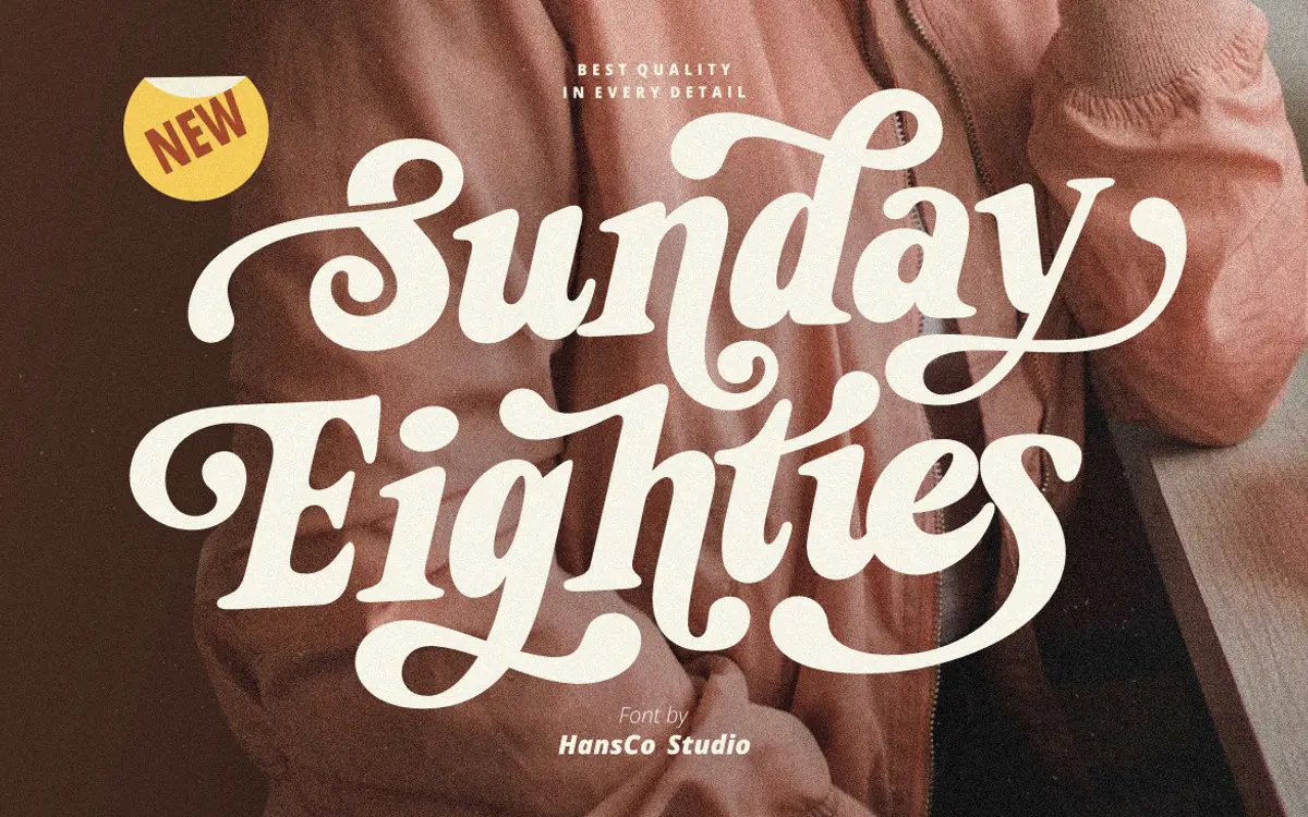
Sunday Eighties is a slab-leaning display serif built around thick, confident strokes and a slightly bouncy baseline feel. The letterforms carry that flattened, chunky serif look associated with seventies and eighties signage and product labels, rather than anything drawn from book typography. Contrast is kept low across the family, so the weight stays even from stem to serif, which is part of what makes it read as bold rather than refined.
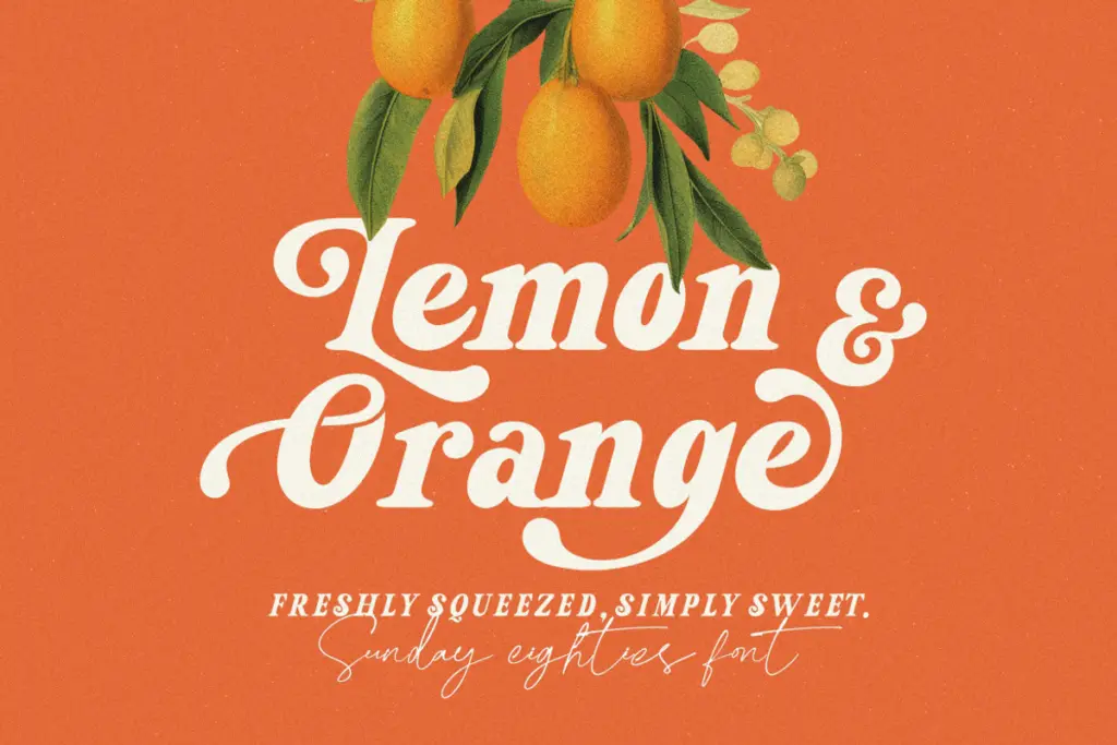
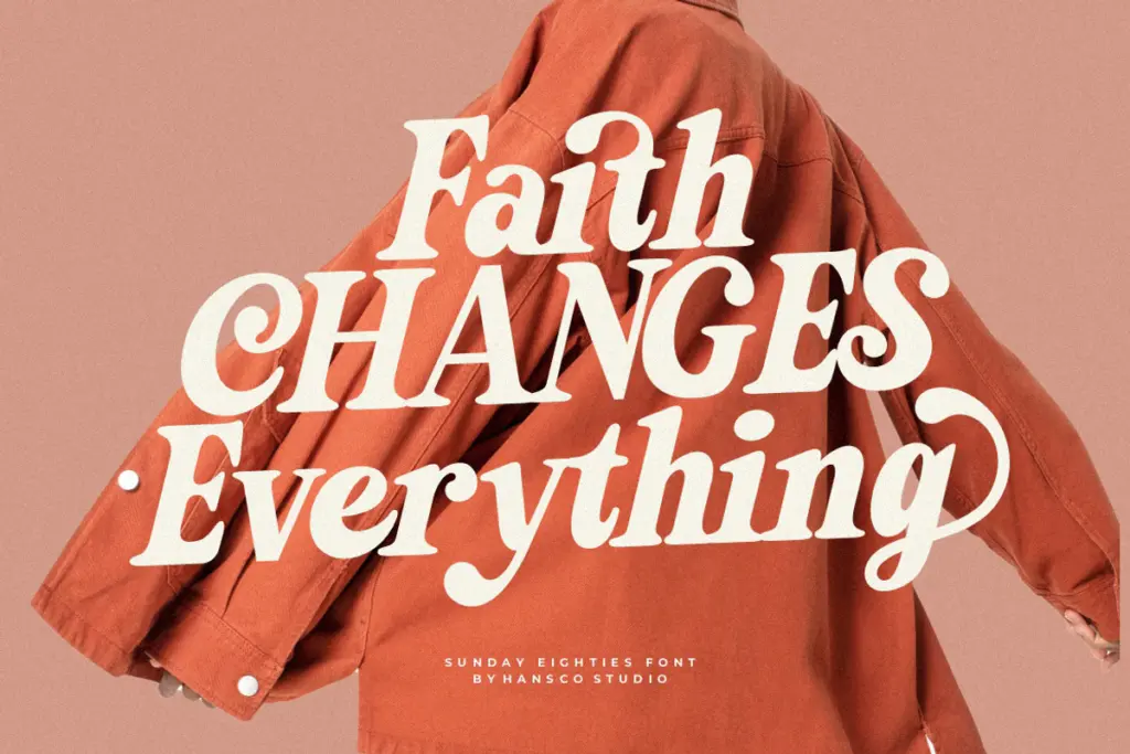
The alternate swash characters are where the personality actually lives. Swap in a handful of the alt caps or lowercase tails and the word takes on the loose, hand-lettered quality that separates it from a plain retro slab. Used straight, without alternates, it’s a solid, blunt display face; used with the swashes, it starts to feel more like lettering than type. That gap between the two modes is worth knowing about before you commit to a layout, because the swash forms need extra tracking and generous line spacing to avoid colliding with neighbouring letters.
Character set and features
The set covers uppercase and lowercase, numerals, punctuation, and multilingual support, so it’s not limited to English-only branding work. Ligatures and alternates are included and accessed through OpenType features, which means you’ll want software with a Glyphs panel — Illustrator, InDesign, Photoshop, CorelDraw — to actually reach the alternate swash characters. In apps without OpenType support, you’re stuck with the default glyphs only, and the font loses a good part of its appeal.
Spacing is generous by default, built for headline-size use rather than dense text. That’s appropriate for a display serif like this, but it does mean the font needs manual kerning attention in longer lines, particularly once swashes are mixed with straight letters — the tails don’t always sit flush with what follows.
Use cases
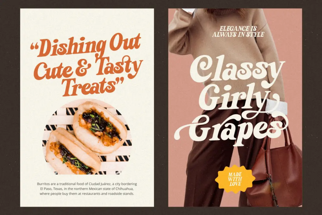
This is a font for short bursts of type: logotypes, product labels, packaging, stickers, t-shirt graphics, poster headlines. The retro slab structure gives it enough weight to hold up on a shelf or a shirt at a distance, and the swash alternates give it the
What we liked, and what we didn’t
Strengths
- The swash alternates add genuine retro character beyond the base letterforms
- Even, low-contrast weight gives it strong shelf and screen presence at small sizes
- Multilingual support extends its use beyond English-only branding work
Trade-offs
- Alternates are locked behind OpenType features, so non-supporting apps only show the plain default set
- Swash forms need manual kerning and spacing adjustments to avoid awkward collisions
Sunday Eighties does one job well: loud, retro-flavoured branding type for short words. It needs OpenType-aware software to show its best side, and it isn't built for anything beyond headline-length use.
Verdict

Tantype reviews typefaces in depth — every font is tested in real branding, editorial and screen layouts before a word gets written. 555+ fonts reviewed and counting.