
Little Promises: a dip-pen script for intimate, handwritten-feeling work
Design style
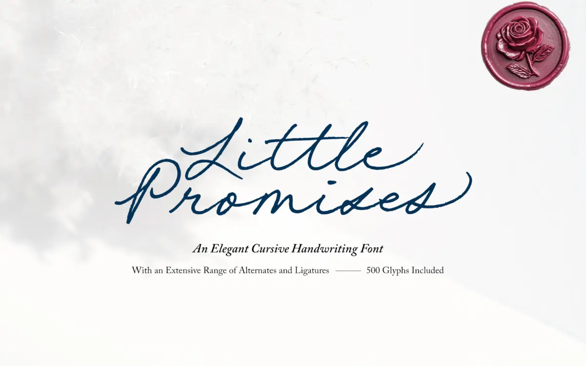
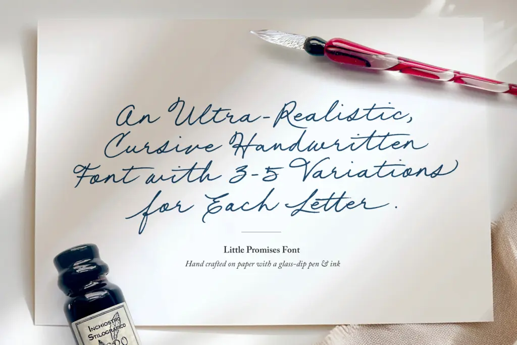
Little Promises sits in the dip-pen tradition of handwritten scripts — thin upstrokes, ink-loaded downstrokes, and a baseline that wanders just enough to feel like a hand actually moved across paper. The letters lean forward at a casual, unforced angle rather than the steep rake of formal copperplate, and the joins are loose rather than engineered, which is exactly where its charm sits. You can see the tool in the texture: the ink pools slightly at stroke ends, and there’s a faint graininess to the edges that reads as ink-on-paper rather than vector-perfect calligraphy. It won’t be mistaken for a precision script. That’s the point.
Character set and features
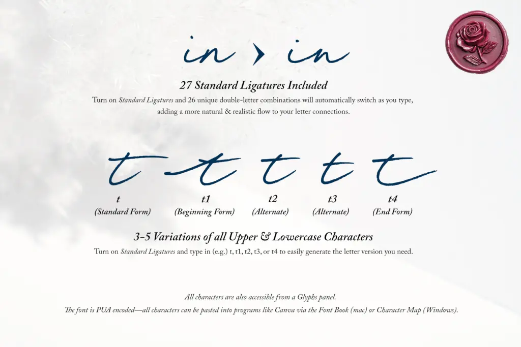
The headline feature is the sheer quantity of alternates — three to five variants for every upper and lowercase letter, reportedly around 500 glyphs in total. Practically, this means repeated letters within a word or across a line of text don’t need to look identical, which is the single biggest giveaway in most script fonts when they’re set at display sizes. Turning on Standard Ligatures and typing a number after a letter (t1, t2, and so on) cycles through the variants, and a set of custom ligatures smooths over awkward double-letter pairings that would otherwise look stiff. For anyone not working in OpenType-aware software, the glyphs are also reachable through the Glyphs panel, and PUA encoding means they can be pasted in from Font Book or Character Map into places like Canva that don’t support ligature substitution. That’s a genuinely useful accommodation — a lot of handwritten fonts with rich alternate sets become unusable the moment someone opens them in a tool that can’t trigger OpenType features, and this one has thought about that failure point.
The trade-off is effort. Getting the realism the font is built for means manually swapping letters rather than just typing and walking away, which is more work than most buyers expect from a script font. Left untouched, it still looks like a competent handwritten script — just a less distinctive one than the alternates are capable of producing.
Use cases
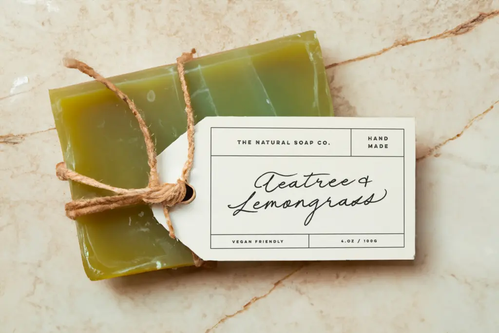
This is a script built for short, personal-feeling lines rather than paragraphs: invitation wording, signatures, logotypes, packaging flourishes, a line of copy on a greeting card. The looseness and the ink texture read well at the sizes those jobs use — a few words, generously spaced, given room to breathe. It is not a font for body text or dense layouts; the variation in stroke weight and baseline that gives it character also makes long passages tiring to read and inconsistent-looking at small sizes.
It pairs naturally with simple, quiet typefaces — a plain serif or sans for supporting text will let the script carry the personality without competing with it. Wedding stationery, boutique packaging, and branding projects after an informal, handmade signature mark are the obvious fits. Anyone expecting a plug-and-play script that looks perfect straight out of the box should budget time for the alternate-swapping; anyone willing to put that time in gets a script with more texture and variation than most in its category.
What we liked, and what we didn’t
Strengths
- Three to five alternates per letter genuinely reduce repetition across a line of text
- Ligatures and PUA encoding make it workable even in apps without OpenType feature support
- Ink texture and baseline variation give it a believably handwritten, unpolished feel
Trade-offs
- Realistic results require manually swapping alternates rather than typing and leaving it alone
- Not suited to body copy or small sizes — legibility drops quickly outside short display lines
Little Promises is a well-observed dip-pen script with an unusually deep set of alternates for avoiding repetition. It rewards manual effort more than most buyers will expect, and it's strictly a short-line, display-size font, but within that lane it's convincing and generously built.
Verdict

Tantype reviews typefaces in depth — every font is tested in real branding, editorial and screen layouts before a word gets written. 555+ fonts reviewed and counting.