
TAN Pearl: a curvy serif for classy but playful branding
Design style
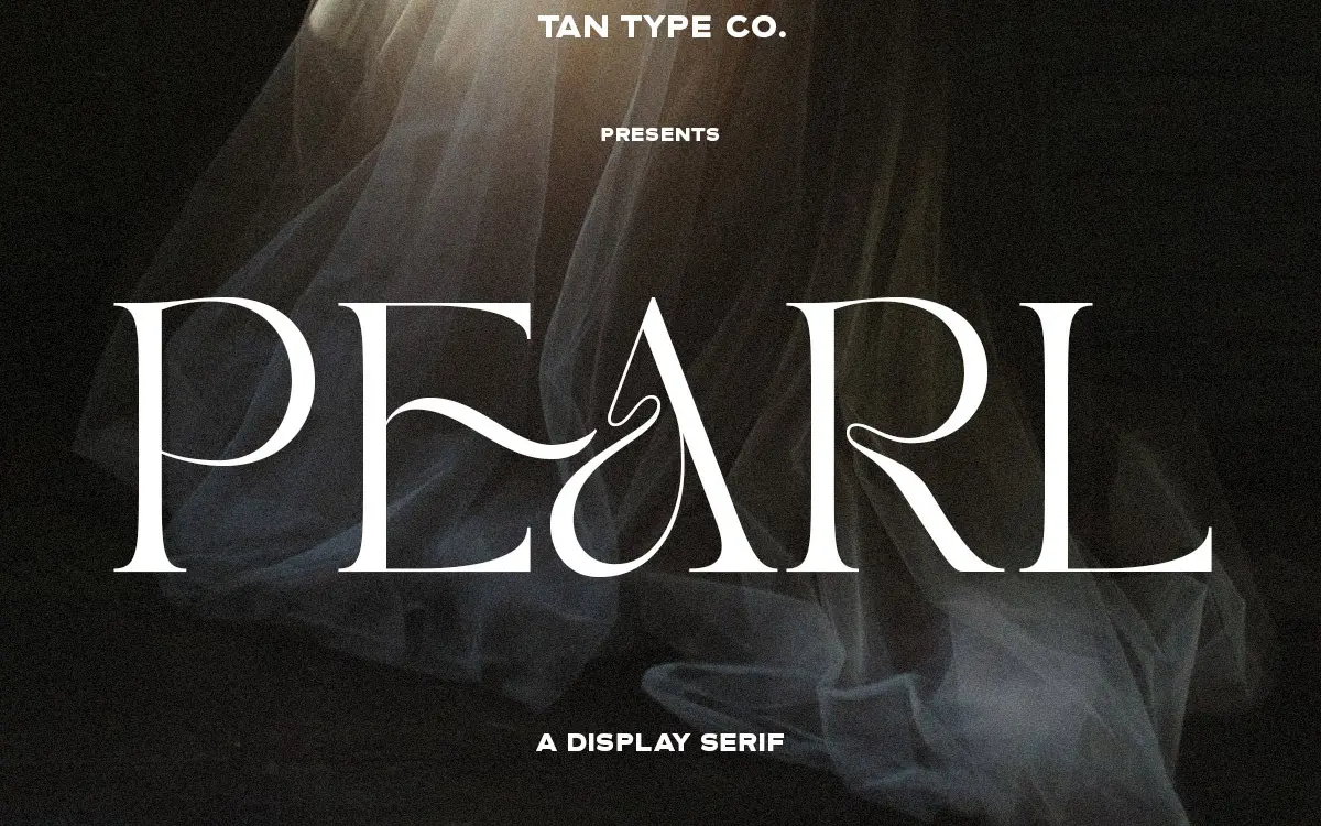
TAN Pearl sits in that overcrowded corner of the serif market that tries to be both refined and a little cheeky. What separates it from the pack is how far it pushes its curves without losing the vertical stress you expect from a serif. The bowls on letters like b, p and g swell more than a standard text serif would allow, and the terminals often curl back on themselves rather than stopping cleanly. It reads as a display serif that has borrowed some of its posture from calligraphy without going full script.
The contrast between thick and thin strokes is moderate rather than extreme, which keeps the letterforms from feeling fragile. Serifs are bracketed and slightly asymmetric in places, giving the face a hand-finished quality rather than a mechanical one. It is not a neutral serif you’d reach for when you want the type to disappear. It has opinions, and those opinions are mostly about warmth and a bit of flirtation.
Character set and features
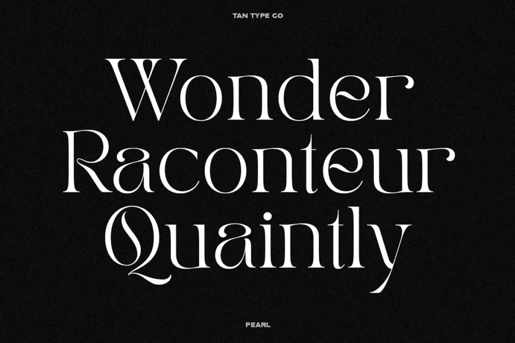
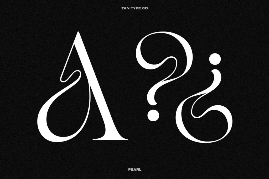
TAN Pearl ships as OTF, TTF and WOFF, and the seller notes multilingual support, which should cover a reasonable range of Latin-based languages beyond basic English — worth checking against your specific diacritic needs before committing to a project. There are alternate letterforms built in as OpenType features, accessible through software that supports stylistic alternates or discretionary ligatures. These alternates matter here: the default character set is already expressive, but the alternates let you dial the personality up or down letter by letter, which is useful when a swash-heavy capital works for a logotype but is too much for a paragraph of body copy.
Because the alternates are opt-in rather than baked into the base glyphs, you get a fair amount of control without needing a second weight or a companion font. That said, the family appears to come as a single style rather than a full range of weights, so anyone needing a true light-to-bold system for a larger brand identity will need to look elsewhere or pair it manually.
Use cases
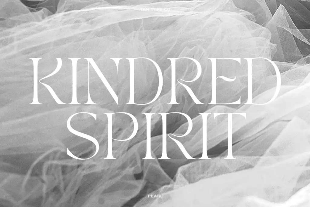
This is a headline and short-copy typeface, not a body-text workhorse. The curl in the terminals and the exaggerated bowls are legible at large sizes — think logotypes, packaging headers, fashion lookbooks, invitation lettering — but they start to muddy at small point sizes where the extra flourish competes with basic letter recognition. Keep it above the sizes you’d use for a caption or footnote.
It suits brands that want to feel established but not stiff: boutique retail, beauty, small-batch food and drink, anything trading on a sense of craft rather than corporate polish. Wedding stationery is a reasonable fit too, particularly for couples who want something with more personality than a straight script but still formal enough for a printed invitation. Where it will struggle is anywhere the brand needs strict neutrality — annual reports, dense UI, technical documentation. Pearl wants to be noticed, and forcing it into a role that demands restraint will fight the letterforms rather than flatter them.
What we liked, and what we didn’t
Strengths
- Exaggerated bowls and curling terminals give it a distinct, hand-finished character
- OpenType alternates offer real control over how playful or restrained each word looks
- Works comfortably across logotypes, packaging, and formal invitation lettering
Trade-offs
- Legibility drops off at small sizes, limiting it to headline and short-copy use
- Offered as a single style, so brands needing a full weight range must pair it manually
TAN Pearl is a confident, curvy display serif with enough personality to carry logos, packaging and invitation work. It's not built for small sizes or neutral corporate use, and it comes as a single style rather than a full weight system, so treat it as a specialist headline face rather than an all-purpose family.
Verdict

Tantype reviews typefaces in depth — every font is tested in real branding, editorial and screen layouts before a word gets written. 555+ fonts reviewed and counting.