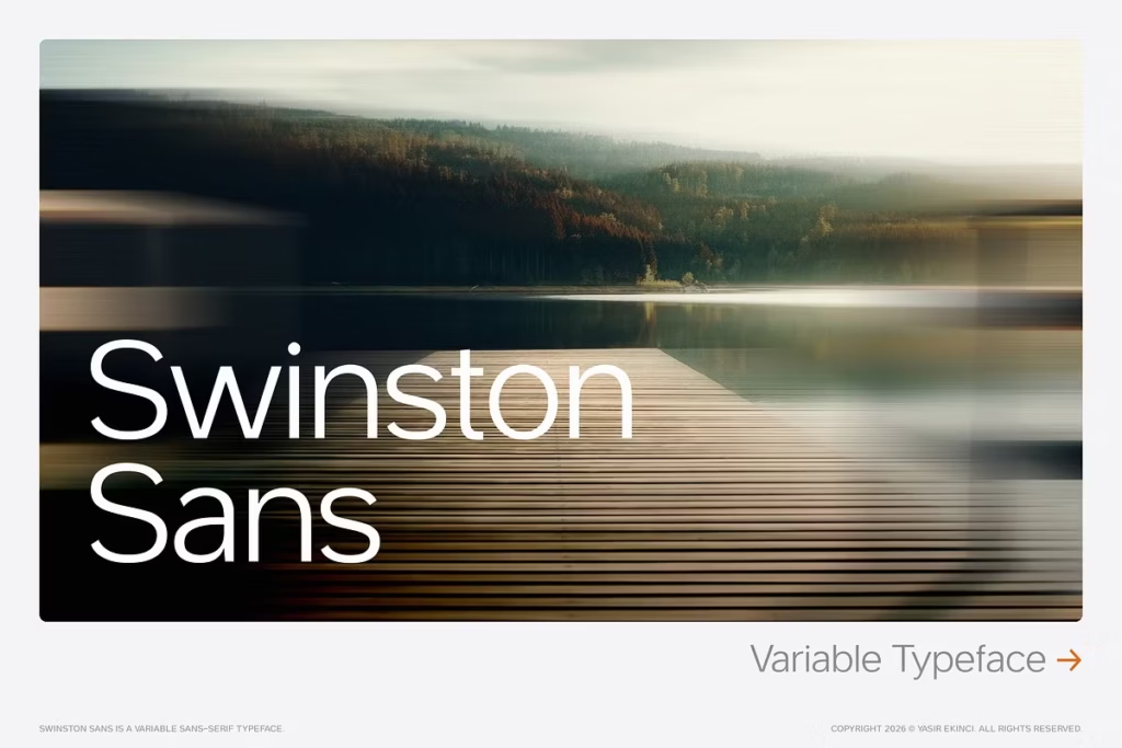
Swinston Sans Variable Typeface: Innovative Typeface for Digital Design
Introduction to Swinston Sans Variable Typeface
In today’s fast-changing world of digital design, the Swinston Sans Variable Typeface stands out as a pioneer of new ideas. It’s a typeface that combines precise engineering with a human touch, making it a flexible tool for modern designers. Unlike other sans-serif fonts that focus on being neutral, Swinston Sans aims to bring clarity and personality to the table. This typeface is not just a font, it’s a game-changer that can adapt to the different needs of creatives.
By doing so, it challenges the traditional idea of what a sans-serif font should be, and instead offers a fresh perspective on typography. With its unique blend of style and functionality, Swinston Sans is poised to make a significant impact in the world of digital design.
When you look closer at Swinston Sans, you’ll see what makes it different from other fonts like Inter and Helvetica. It gives designers a new way to make their work stand out. This font is great for people who want to try something new and exciting in their designs. With Swinston Sans, you can add a unique touch to your work and make it more interesting. It’s a good choice for designers who want to make a statement and be different from others. By using Swinston Sans, you can create designs that are fresh and attention-grabbing.
Design Style: The Unique Aesthetic of Swinston Sans
The idea behind Swinston Sans comes from the unique cultures of three European cities – Rotterdam, Amsterdam, and Lisbon. Each of these cities added its own special touch to the font, making it a typeface that works well and looks great too.
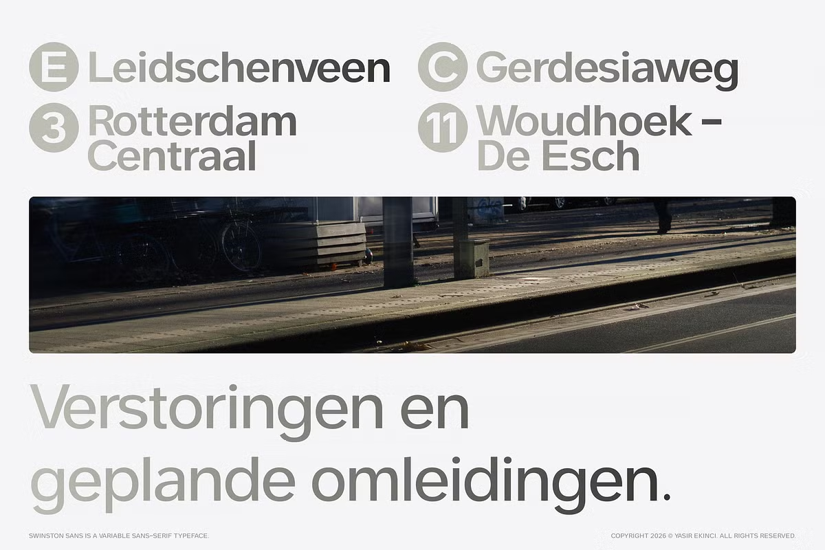
Rotterdam – The Grid
The story of Swinston Sans started in Rotterdam, where its designer fell in love with the signs used for the RET tram lines. These signs are super clear and easy to read, even in a busy city, because they’re designed to be glanced at quickly. This idea of being clear and easy to understand became the core of Swinston Sans, and it works really well for digital brands because it helps people navigate and find their way.
Amsterdam – The Lean
The famous “dancing houses” in Amsterdam were a big inspiration for the italic style of Swinston Sans. These buildings are known for being built on purpose with a lean, which gives them a lot of character and makes them really interesting. This unique way of building is reflected in the typeface, where the italic letters don’t just slope to the side, but actually lean in a way that looks like they’re moving.
This leaning effect makes the typeface look more dynamic and stylish, while still being easy to read. The designers of Swinston Sans wanted to capture the spirit of these special buildings in their font, and they did a great job of making it look like the letters are dancing across the page.
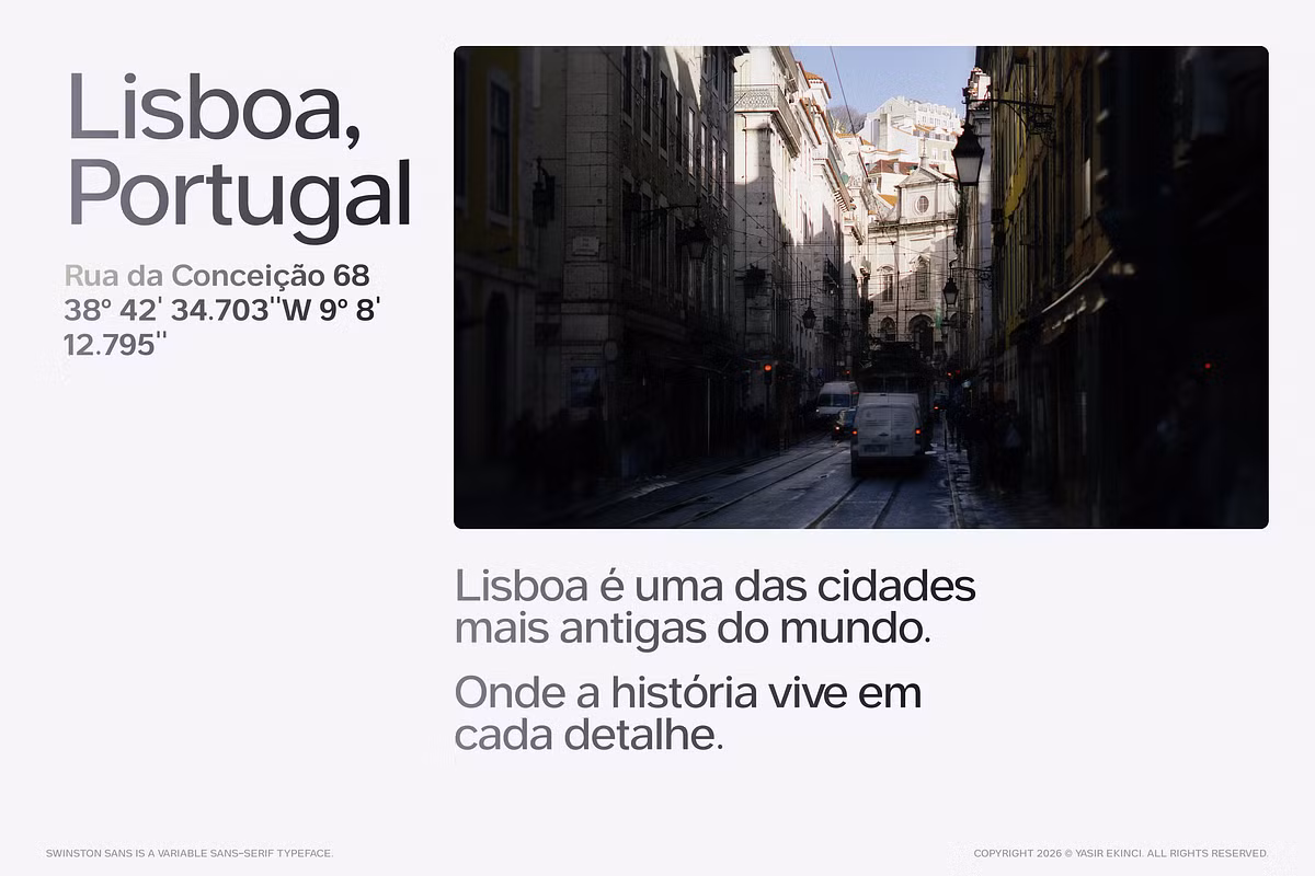
Lisbon – The Density
Lisbon’s narrow streets taught the designer about working in confined spaces. Swinston Sans features a generous x-height and open apertures, ensuring legibility even at smaller sizes—perfect for applications ranging from smartwatches to billboards. The design embraces density without sacrificing clarity, making it a versatile choice for various digital and print environments.
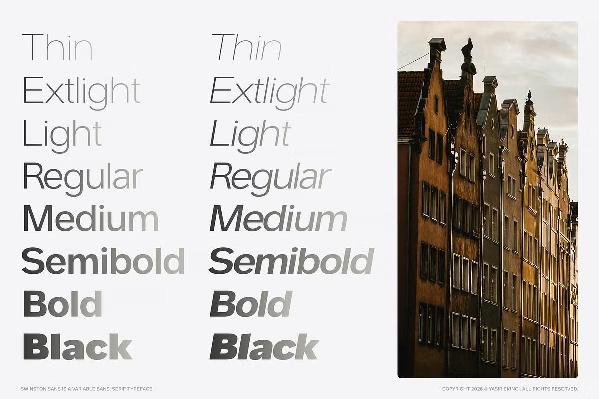
Character Sets and Technical Specifications
Swinston Sans is more than just how it looks – it’s also really good at what it does. It’s made to work well for people all around the world. One of the things that makes it special is that it has a huge collection of characters, which means it can say things in many different languages and be understood by lots of different people.
Extended Latin Character Set
The font is great for projects that need to be used in many different languages, because it has all the extra marks that are needed for over 200 languages. This is really important now, because the world is so connected and designs often need to work for people from different cultures.
OpenType Features
Swinston Sans has lots of special features that make it really useful. It’s got things like stylistic alternates, which let you get creative with your text, and tabular figures, which help you line up numbers perfectly in tables and charts. It also has true-drawn fractions, which are great for math and science stuff. Plus, it’s got superscript and subscript characters that are actually designed to work well, so you can use them to add all sorts of cool effects to your text. This makes it a really versatile font that you can use in lots of different ways.
Screen Optimization
The font is really clear on computers and phones, no matter how good or bad the screen is. It’s been specially made to look good on all kinds of devices, from super sharp ones to older ones. The people who made it paid close attention to all the little details, so it’s easy to read and works well for both online and printed things.
Versatility in Use Cases
One of the standout features of Swinston Sans is its versatility. This variable typeface system is designed to adapt seamlessly across different design contexts, making it suitable for a wide range of applications.
Tech & Startups
For companies that make technology and new startups, Swinston Sans is a great choice for designing user interfaces and experiences. It’s easy to read, which makes it perfect for things like dashboards, products that are sold as a service, and apps that deal with money. When you’re showing complicated information in a visual way or making mobile apps that are easy to use, Swinston Sans gives you the clarity and style that you need in the world of technology.
Branding & Identity
In creating a brand’s image, Swinston Sans is a key part of making a company’s identity look good. It works well with the rules that guide a brand’s look and feel, and it’s great for making presentations and marketing materials that all match and look sharp. This helps to create a consistent visual style that people will remember.
Editorial & Publishing
Swinston Sans is a great choice for editorial design because it looks clean and modern. It’s easy to read and fun to look at, which makes it perfect for magazines, books, and online publications. This font helps make the reading experience better, which is why many art directors and designers like to use it.
Web & Digital
When it comes to designing websites, Swinston Sans is a great choice because it works well on all kinds of devices. Whether you’re making graphics for social media or templates for emails, this font helps your online presence look modern and stylish, and its classic feel means it won’t go out of style anytime soon. It’s a good option if you want to reach a lot of people, as it’s easy to read and looks good on everything from phones to computers.
Display & Advertising
Swinston Sans is a great font for getting your message across. It’s bold and eye-catching, making it perfect for things like posters, billboards, and ads. When you use it, your words really stand out and grab people’s attention. It’s also super clear and stylish, so you can say what you want to say with confidence. Whether you’re designing something for a big campaign or just a small project, Swinston Sans is a great choice because it helps you communicate your ideas in a strong and beautiful way.
Pairing Suggestions for Swinston Sans
Your choice of typeface can greatly influence the overall design aesthetic, and Swinston Sans pairs well with various fonts to create harmonious compositions. Here are some pairing suggestions:
Complementary Pairings
- Swinston Sans & Merriweather: The contrast of Swinston Sans’ modernity with Merriweather’s classic serif style creates a balanced and engaging visual hierarchy, ideal for editorial layouts.
- Swinston Sans & Playfair Display: Combining the geometric forms of Swinston Sans with the elegance of Playfair Display results in a sophisticated look, perfect for luxury branding and high-end publications.
- Source Sans Pro: Using Swinston Sans and Source Sans Pro together can make your company’s messages look clean and simple, which is great for business talks.
- Swinston Sans & Raleway: The combination gives a really modern look, perfect for tech projects and fresh website designs.
Licensing and Accessibility
When you buy Swinston Sans, you get a Desktop License. This means you can use it for as many personal and commercial projects as you want. You also get a web font license, which lets you embed the font on your website. This is really helpful for designers who want to use the font in different ways, like on their computer and on the web. It makes it easy to use the font in lots of different places, without having to worry about getting extra licenses.
Custom Licensing Options
If you need to use Swinston Sans in a special way, like putting it in an app or an eBook, it’s simple to get in touch with us for a custom plan. We want to make sure everyone can use Swinston Sans, so we’re happy to work with designers and developers to meet their unique needs.
Conclusion: The Ideal Typeface for Modern Designers
In today’s fast-paced world of design, trends come and go quickly. But Swinston Sans is different – it’s a typeface that has its own unique style and can be used in many different ways. This makes it perfect for designers who want the best and don’t want to settle for anything ordinary. With its European roots and modern approach to typography, Swinston Sans is more than just a typeface – it’s a way to start new trends and make a lasting impression online.
It’s great for designers who want to stand out from the crowd and try new things. Swinston Sans is a great tool for anyone who wants to make their mark in the digital world. When it comes to design, whether you’re working on user experience, branding, or editorial art, having the right font can make all the difference.