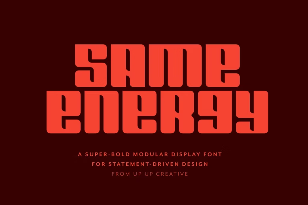
Same Energy: Bold Modular Sans Serif Font for Impactful Design
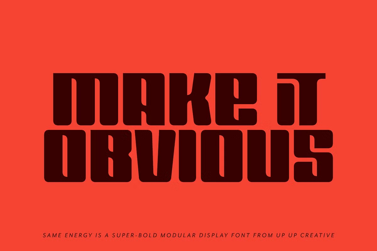
Same Energy is a really bold font that’s perfect for making a big impact in your designs. It’s been carefully created to help you make a statement and grab people’s attention. This font is great for anyone who wants to create bold and memorable designs that stand out. The letters are highly structured and spaced tightly together, which makes it look amazing in all sorts of contexts – like branding, headlines, posters, packaging, and even editorial layouts. Whether you’re working on a big project or just want to add some extra flair to your work, Same Energy is a fantastic tool to have in your toolkit. It’s all about creating designs that pack a punch and leave a lasting impression. With Same Energy, you can create something truly eye-catching and make your message heard loud and clear.
Design Style
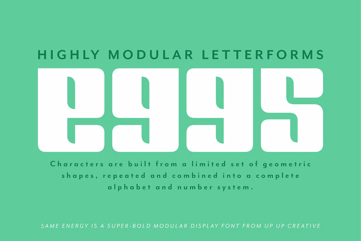
The essence of Same Energy lies in its graphic nature, confidence, and unapologetic loudness. The font is constructed from a limited set of geometric shapes that embrace repetition, contrast, and rhythm, forming a cohesive visual system. This design approach allows for a clean yet dynamic appearance, making your typography not just a communication tool but a visual statement.
The way the letters are arranged in Same Energy is really thoughtful and deliberate, making sure everything is clear and gets the point across. The font is super bold, which makes it perfect for big signs and things like that, where you need people to be able to read it easily and for it to really grab their attention. The people who designed it clearly put a lot of thought into making sure your message comes across loud and clear to the people you’re trying to reach.
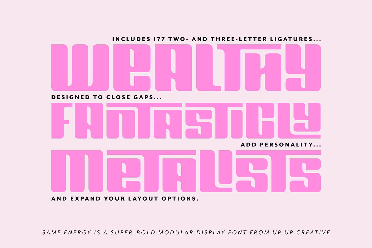
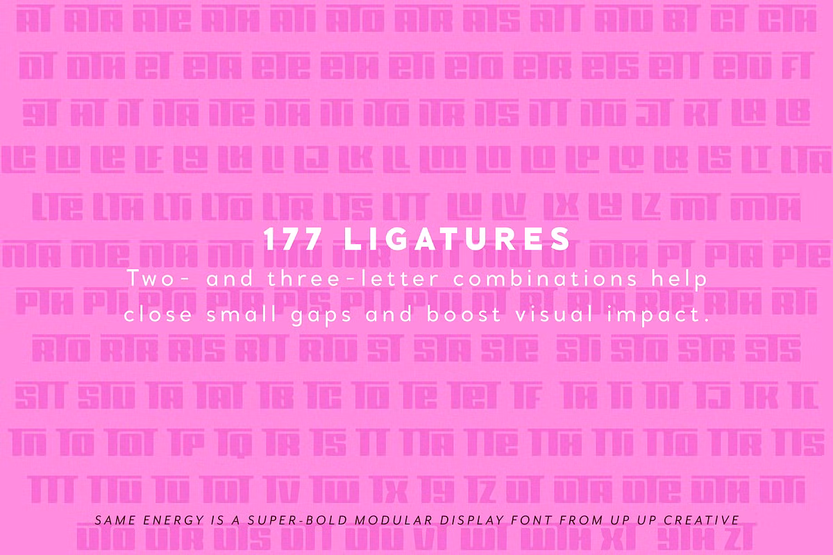
Character Sets and Ligatures
Same Energy has a lot of special features that make it really versatile. It comes with 177 different combinations of letters that can be used together, which is really cool. This means you can customize your text to make it look unique and interesting, without making it hard to read. The special letter combinations can help fix gaps between letters, add some personality to your design, or just make the whole thing look better. They can really help make your text stand out and look clean and organized at the same time.
Using ligatures effectively can elevate your typographic designs. For instance, in a branding project, incorporating ligatures can create a seamless and eye-catching logo design that captures attention. This versatility makes Same Energy a valuable asset in any designer’s toolkit.
Use Cases
The possibilities for using Same Energy are endless, and that’s what makes it so exciting. With its unique blend of boldness and playfulness, it can be used in a wide range of ways. Let’s take a look at some of the most interesting examples.
- Branding: Use Same Energy to craft memorable logos that stand out in competitive markets. Its boldness ensures that your brand identity is unmistakable.
- Posters: For event promotions or artistic displays, this font commands attention and effectively communicates your message from a distance.
- Packaging: Create striking packaging designs that not only attract consumers but also convey your brand’s personality through impactful typography.
- Editorial Layouts: In magazines or online articles, Same Energy can be used for headlines, drawing readers in with its confident presence.
- Social Media Graphics: The font’s vibrant and graphic nature makes it perfect for attention-grabbing posts and advertisements on social platforms.
Pairing Suggestions
To maximize the impact of Same Energy, consider pairing it with complementary fonts that enhance its boldness while maintaining readability.
Experimenting with various combinations can lead to unique and striking visual outcomes.