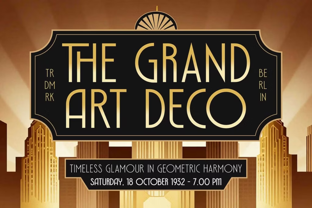
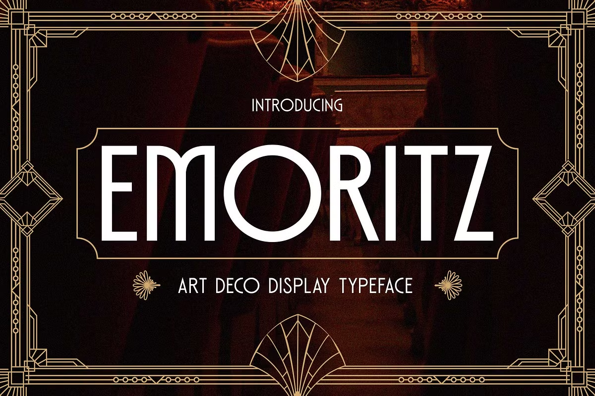
Emoritz: Luxurious Art Deco Display Font for Elegant Typography
Emoritz is a beautiful font that takes its cue from the classic Art Deco look of the 1920s. It’s all about luxury and sophistication, making it a great choice for designers who want to give their work a high-end feel. The font is all capital letters, with simple shapes and strong lines that make it look clean and easy to read. If you’re looking for a font that’s sleek and modern, but still has a touch of old-school glamour, Emoritz is a great option.
Its geometric style and minimalist vibe make it perfect for projects where you want to convey elegance and refinement. Whether you’re working on a design project that needs a bit of vintage flair or just want a font that’s easy on the eyes, Emoritz is definitely worth considering. With its unique blend of classic and modern elements, it’s a font that’s sure to add a touch of sophistication to any design.
Design Style of Emoritz
The Emoritz design takes a lot from the Art Deco style, which is famous for its bold shapes and fancy details. It has sharp lines and symmetrical shapes that work well together, making it look nice and balanced. This way of designing not only makes Emoritz look great, but it’s also useful for many different things.
The Art Deco influence gives Emoritz a unique feel, with its geometric forms and luxurious touches. Overall, the design of Emoritz is a good mix of style and function, making it a great choice for many projects.
Emoritz has a geometric style that makes it easy to use in many different design projects. It works well for creating a brand identity that looks high-end, or for designing layouts for editorials. Emoritz has a unique look that can make your design stand out.
Because it’s all caps, it’s especially bold, which makes it perfect for headlines and titles that need to grab people’s attention. This font can really add something special to your design, whether you’re working on a big project or just need a font that will make your words pop.
Geometric and Minimalist Elements
The minimalist approach of Emoritz ensures that it maintains clarity even in complex designs. The balanced proportions and consistent stroke weight allow for easy readability, which is crucial in any typography. Emoritz excels in environments where clarity and style are paramount, making it a preferred choice among professional designers.
Character Sets and OpenType Features
Emoritz has a wide range of characters that can be used by people all around the world. It includes lots of accented characters, which means it can be used to write in many different languages. This makes it really useful for companies that want to reach people in other countries, or for designers who work on international projects.
The font also includes numbers and punctuation marks, so you can use it to create designs that are both effective and look good.
Emoritz also has some extra features that can help you make your text look really special. For example, it has something called stylistic alternates and ligatures, which are like special tools that let you change the way your letters look. This means you can try out different versions of the same letter to see what works best for your brand’s personality and style.

Use Cases for Emoritz
Emoritz is an incredibly versatile font that can be employed in a multitude of design scenarios. Here are some of the most effective use cases for this luxurious display font:
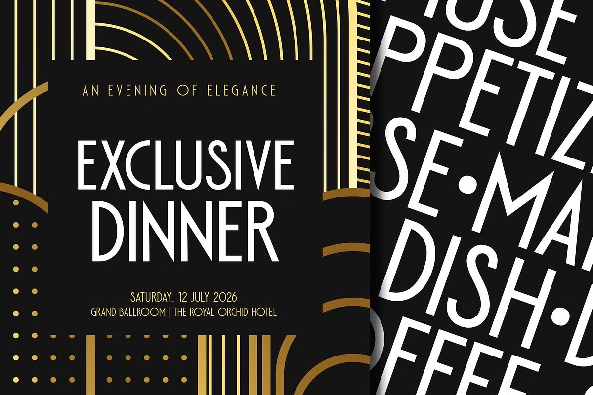
- Headlines and Titles: Emoritz is perfect for grabbing attention in editorial designs, advertisements, and website headers. Its bold, all-caps format ensures that your message is delivered with impact.
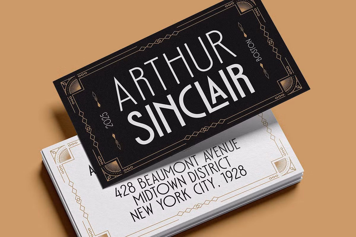
- Logotypes: The elegant and sophisticated appearance of Emoritz makes it an excellent choice for creating memorable logotypes that convey luxury and professionalism.
- Labels and Packaging: For high-end products, Emoritz can be used on labels and packaging to evoke a sense of exclusivity and style, attracting discerning customers.
- Quotes and Typography: Emoritz is also ideal for typography-focused designs, such as posters or social media graphics, where a striking quote can be visually emphasized.
Pairing Suggestions for Emoritz
When it comes to pairing Emoritz with other fonts, the goal is to create a harmonious balance that enhances the typography without overwhelming it. Here are some pairing suggestions:
- Sans-serif Fonts: Pair Emoritz with clean sans-serif fonts like Montserrat or Open Sans for a contemporary look. This combination allows Emoritz to shine as a display font while maintaining readability in body text.
- Serif Fonts: For a classic touch, consider pairing Emoritz with a serif font like Playfair Display. The contrast between the bold geometric forms of Emoritz and the elegance of serif fonts can create a sophisticated visual narrative.
- Script Fonts: For a more artistic approach, combine Emoritz with a script font like Great Vibes. This pairing can add a touch of whimsy and creativity, perfect for invitations or artistic projects.
Licensing and Availability
Emoritz is a versatile font that comes in several formats, such as TTF, OTF, and WOFF, which means it can be used with many different design programs and platforms. This font has three different weights to choose from: Light, Regular, and Medium, so you can pick the one that best fits your design project.
Whether you’re working on a website, a graphic design piece, or something else, Emoritz has the flexibility to meet your needs. With its range of weights, you can create a unique and visually appealing design that captures your audience’s attention.
When you use Emoritz in your projects, you need to think about the rules that come with it. Make sure you’re following the rules of the font’s license, whether it’s for your own stuff or for something you’re getting paid for.
You can usually find the licensing info on the website where you bought or downloaded the font. It’s pretty important to check this out, so you don’t get in trouble for using the font in a way that’s not allowed. This way, you can use Emoritz without any worries, and create some really cool things with it.
Conclusion
Emoritz is not just a font, it’s a way to show luxury and elegance through letters and numbers. Its style is inspired by Art Deco, with geometric shapes that make it look modern and sleek. This font is really useful for designers who want to make a big impact.
You can use it to create a brand’s identity, make magazine or newspaper pages look great, or design graphics that catch people’s attention. Emoritz has a lot of different characters, so you can use it in many different ways.
It’s perfect for designers who want to add some sophistication and style to their work. By using Emoritz, you can make your words stand out and say a lot about your design. It’s a great choice for anyone who wants to make a statement with their typography.
With Emoritz, you can create beautiful and eye-catching designs that will leave a lasting impression. Whether you’re working on a big project or just want to add some extra flair to your work, Emoritz is a great font to have in your toolkit.