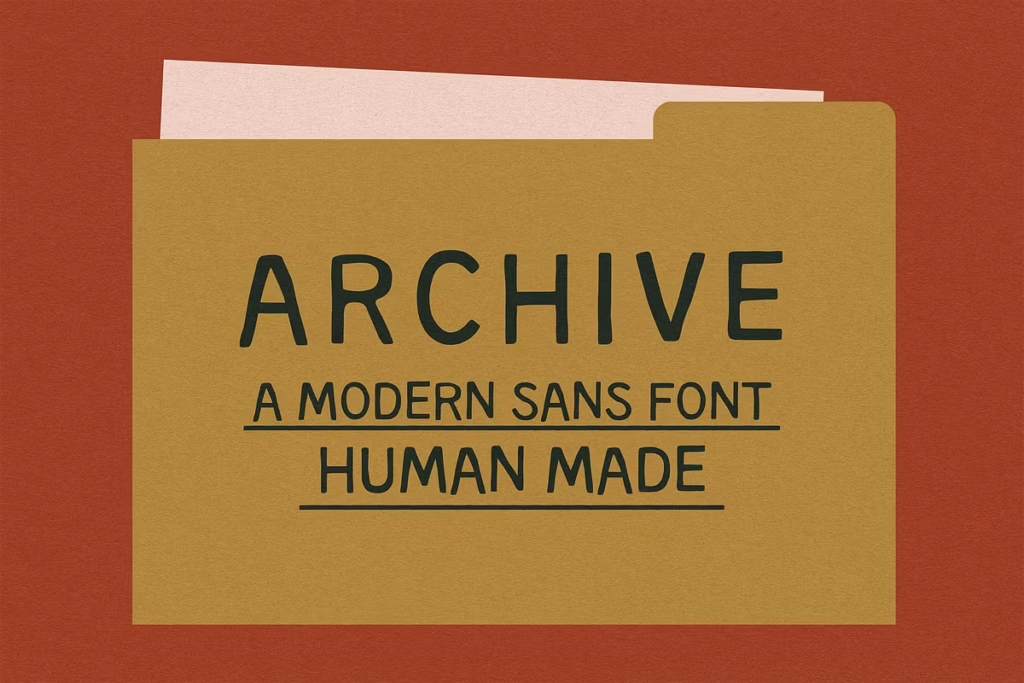
ARCHIVE: Versatile Hand-Drawn Sans Serif Font for Authentic Designs
Introducing ARCHIVE: A Hand-Drawn Sans Serif Font
ARCHIVE is a one-of-a-kind font that’s drawn by hand, with a simple and charming feel to it. The lines are a bit uneven, which gives it a really human touch. This font is great for people who want something a little different from the usual perfect fonts. It’s perfect for making brands, packages, and online content that feel more personal and friendly. The imperfections in ARCHIVE are what make it special, and it’s a great way to add some character to your designs.
Whether you’re working on a big project or just something small, ARCHIVE can help you create something that feels authentic and inviting. It’s a great choice for anyone who wants to stand out from the crowd and make a lasting impression. With its unique look and feel, ARCHIVE is sure to make your designs feel more approachable and engaging.

Design Style of ARCHIVE
The look of ARCHIVE is based on a classic font called The Golden Thread, but it’s a bit different. It has a slightly less curved shape, which makes it look softer and more delicate. This was a careful choice to make sure ARCHIVE gives a balanced look, so your text works well with other design elements and doesn’t overpower them.
The font has a natural, charming feel to it, which makes it perfect for projects that need a warm and welcoming tone.
Irregular Strokes and Authenticity
What makes ARCHIVE really special is the way its strokes aren’t perfectly uniform – they’re a bit quirky and irregular. This gives the font a lot of energy and a sense of being handmade, which is really nice. Even though it’s not perfect, it’s still really easy to read, and that’s what makes it so great.
When you use ARCHIVE, you can create designs that feel friendly and inviting, which is perfect for when you want to connect with your audience on a deeper level. It’s not just about conveying information, but also about evoking feelings and emotions.
Character Sets and Versatility
The ARCHIVE font is more than just nice to look at – it’s also really useful because it has a lot of different characters. This means it can be used for lots of languages and projects, so you don’t have to worry about not having the right letters or symbols.
With both big and small letters, numbers, and punctuation, you have everything you need to make your designs look great and work well. It’s versatile, which is great for designers who work on different kinds of projects and need a font that can keep up.
Testing the Font
When you’re thinking of buying a font, it’s a good idea to try out the characters in the preview tool first. This lets you see what your text will look like in ARCHIVE, so you can decide if it’s right for your project.
You can play around with different words and phrases to get a feel for the font’s special style and see if it fits with what you’re trying to do. By doing this, you can make a smart choice about whether or not to use the font.
Use Cases for ARCHIVE
ARCHIVE is a must-have font for a variety of design projects. Its versatility allows it to shine in numerous applications:
- Branding: Use ARCHIVE for logos and branding materials to create a memorable identity that resonates with your target audience.
- Packaging: The font’s organic charm makes it perfect for product packaging, especially for artisanal or handmade goods.
- Digital Content: Enhance your website or social media graphics with ARCHIVE to give your digital presence a unique and personal touch.
- Print Media: From brochures to flyers, incorporating ARCHIVE can elevate your print designs, making them stand out.
Pairing Suggestions for ARCHIVE
When it comes to typography, pairing fonts effectively can enhance your overall design. ARCHIVE works beautifully as a secondary typeface, complementing more expressive fonts without overpowering them. Here are a few pairing suggestions:
- With a Script Font: Pair ARCHIVE with a flowing script font for a warm and inviting look, perfect for invitations or personal branding.
- With a Bold Serif: Use a bold serif font alongside ARCHIVE to create a striking contrast, ideal for headlines and subheadings.
- With a Geometric Sans Serif: Combine ARCHIVE with a geometric sans serif font to achieve a modern and clean aesthetic.
Licensing and Availability
The ARCHIVE font is easy to use in different design programs because it comes as an OTF file. If you need it in a different format, like TTF, or have questions about how to use it, María Feliz Studio is there to help.
This means you can add ARCHIVE to your design work without any hassle, no matter what kind of design you like to do.
Conclusion
ARCHIVE is a pretty cool font – it’s a hand-drawn sans serif that’s simple, but also has a lot of character. The strokes are a bit uneven, which gives it a really authentic feel. This makes it perfect for designers who want to add a personal touch to their work.
One of the best things about ARCHIVE is that it comes with a huge range of characters, so you can use it for all sorts of projects. It’s also really versatile, so you can use it in lots of different contexts. Plus, it pairs well with other fonts, which makes it easy to use in your designs.
Overall, ARCHIVE is a great font to have in your toolkit – it can really help to bring your work to life and make it more visually appealing. So, why not give it a try in your next project and see what you can create?