Slightly Uneven Handwritten Font: Quirky Typeface with Multilingual Support
Introduction to Slightly Uneven Font
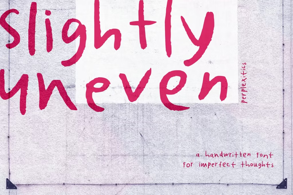
Slightly Uneven is a really nice, quirky font that’s handwritten, which makes it a great way to add some personality to your design projects. It’s got a bit of a messy, imperfect feel to it, which is actually really charming and makes it feel more like natural handwriting. This makes it a great choice if you want to add some warmth and make your work stand out. You can use it for all sorts of things, like making a greeting card, creating a logo, or building a website – it’s pretty versatile and can add a lot of style to your designs.
Design Style of Slightly Uneven
The Slightly Uneven font has a really fun and laid-back vibe. What makes it special is the way the lines are a bit uneven and the letters are all different from each other. This gives it a lot of character and helps it grab attention. It’s like the font is trying to look like it was written by hand, which makes you feel all warm and fuzzy inside, like you’re reading a note from someone you care about.
The Slightly Uneven font has a really casual and friendly feel to it. What makes it special is the little imperfections it has, like the lines being slightly different thicknesses and the baseline being a bit wobbly. This gives it a genuinely handwritten look that can really add to the emotional impact of what you’re trying to say. It’s great for projects where you want to come across as personal and relatable.
Features of the Slightly Uneven Typeface
Uppercase and Lowercase Letters: Slightly Uneven includes both uppercase and lowercase letters, providing you with a complete range of characters to express your thoughts.
The font has numbers and lots of punctuation marks, so you can format your text in a really complete way. This means you’ll have all the tools you need to make your writing look great, with everything from basic numbers to a wide range of punctuation marks.
The font Slightly Uneven comes with three alternate styles – Alt1, Alt2, and Alt3 – which can be used to add some extra flair to your designs. This means you’ve got a bit more flexibility when it comes to choosing the right look for your project. You can pick the one that works best for you, and make your design stand out.
Character Sets and Multilingual Support
The Slightly Uneven font has a really useful feature – it works with lots of different languages. This is great for projects that need to be used all around the world, because it means designers can communicate with more people without having to sacrifice the way their work looks.
The font has a wide range of characters, like letters with accents and special symbols from many languages. This means you can easily connect with people from different areas. For instance, it includes characters like:
- À, Á, Â, Ã, Ä, Å, Æ, Ç
- è, é, ê, ë, ì, í, î, ï
- ń, ò, ó, ô, õ, ö, ø
- Ś, Ź, Ż, ž, Ű, Ų
This feature of supporting multiple languages showcases how versatile Slightly Uneven is, which makes it really useful for designers who want to create designs that are inclusive and cater to different kinds of people.
Use Cases for Slightly Uneven Font
The Slightly Uneven typeface is really versatile, so it’s a great thing to have in your design toolbox. You can use it in lots of different ways, here are a few ideas:
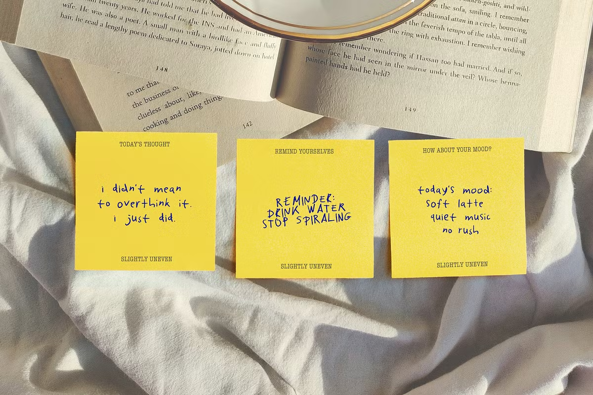
- Slightly Uneven has a casual feel that makes it great for things like greeting cards, invitations, and personal notes – it adds a special something to the messages you send.
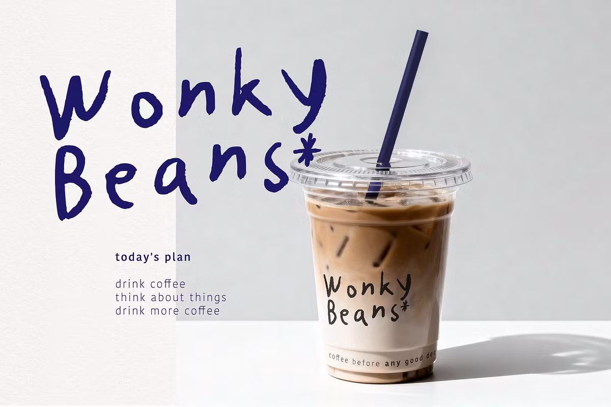
- Branding: If you’re looking to create a brand identity that feels approachable and relatable, this font can help convey that message effectively.
- Using slightly uneven graphics for your social media posts can make them really stand out and grab people’s attention. When your posts look a bit more personal and handmade, it can help you connect with your audience on a deeper level and make your content more interesting.
- Website Design: Incorporating this font into your website can create a welcoming atmosphere and enhance user experience through its natural, handwritten qualities.
Pairing Suggestions for Slightly Uneven
When you’re working with Slightly Uneven, it’s really important to think about how it works with other fonts. You want to create a balanced look that’s easy on the eyes. Here are some ideas for pairing Slightly Uneven with other typefaces to make your designs stand out.
- Sans Serif Fonts: Pair Slightly Uneven with a clean sans serif font, such as Helvetica or Open Sans, to create a modern contrast that highlights the handwritten charm.
- Using a serif font, like Times New Roman or Georgia, with something a bit uneven can create a really classic and sophisticated look. This is perfect for things like formal invitations or elegant branding, where you want to make a good impression. The combination of the two can add a lot of depth and interest to your design, making it stand out in a good way.
- For a quirky and techy feel, consider combining Slightly Uneven with a monospace font, such as Courier New – this can add a fun contrast to your designs, making them stand out in a unique way. The monospace font’s uniformity can also create an interesting balance with the unevenness of the other font, resulting in a visually appealing mix of styles.
Trying out different pairings can help you discover the ideal mix that fits your project and looks good too. You can experiment with various combinations to find the one that works best for you, and this will help you create a visually appealing result.
Licensing Information
When you use the Slightly Uneven font, you need to know the rules about how you can use it. This font is okay to use for personal stuff and for business, but there are some limits you should be aware of:
- You cannot resell the original font file.
- You cannot claim it as your own creation.
If you need help with licensing or have questions, the people who made Slightly Uneven are there to assist you with any issues you might be having.
Conclusion
The Slightly Uneven font has a certain charm to it, a bit quirky and handwritten, which can really make a design project stand out. One of the things that makes this font so great is its unique character set and the fact that it supports multiple languages. This means you can use it for all sorts of projects, from greeting cards to branding materials, and even social media graphics. What’s more, the font’s unevenness gives it a personal touch that’s hard to find in more traditional fonts. So, if you’re looking to add a bit of personality to your designs, Slightly Uneven is definitely worth considering. It’s all about embracing the beauty of imperfection and letting your creativity shine through. With this font, you can create designs that are truly one-of-a-kind and that will really grab people’s attention. Whether you’re a seasoned designer or just starting out, Slightly Uneven is a great choice for anyone looking to add a little something extra to their work.