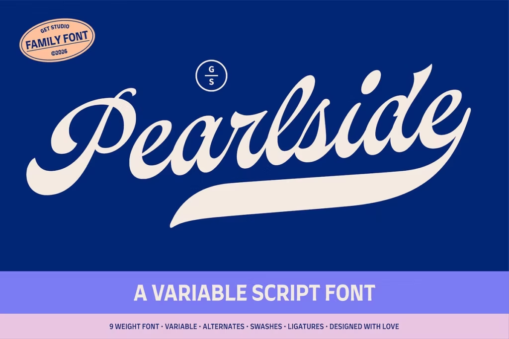
Pearlside: Versatile Variable Script Font for Creative Typography
Pearlside is a really flexible font that brings together old-school lettering and modern design. It’s inspired by the cool visuals of the past, and it stands out because of its bold letters that are actually made by hand. These letters have smooth curves and a slight lean to the right, which makes them look really nice together. This special mix of old and new makes the text flow nicely and gives it a lot of personality.
So, whether you’re making a logo, a wedding invite, or just posting something online, Pearlside gives you lots of ways to make your text look amazing. It’s perfect for anyone who wants to add a little extra something to their design. With Pearlside, you can create things that are both elegant and fun, which is pretty hard to find in a font. It’s like having a special tool that helps you make your words look as good as they sound.
Design Style of Pearlside
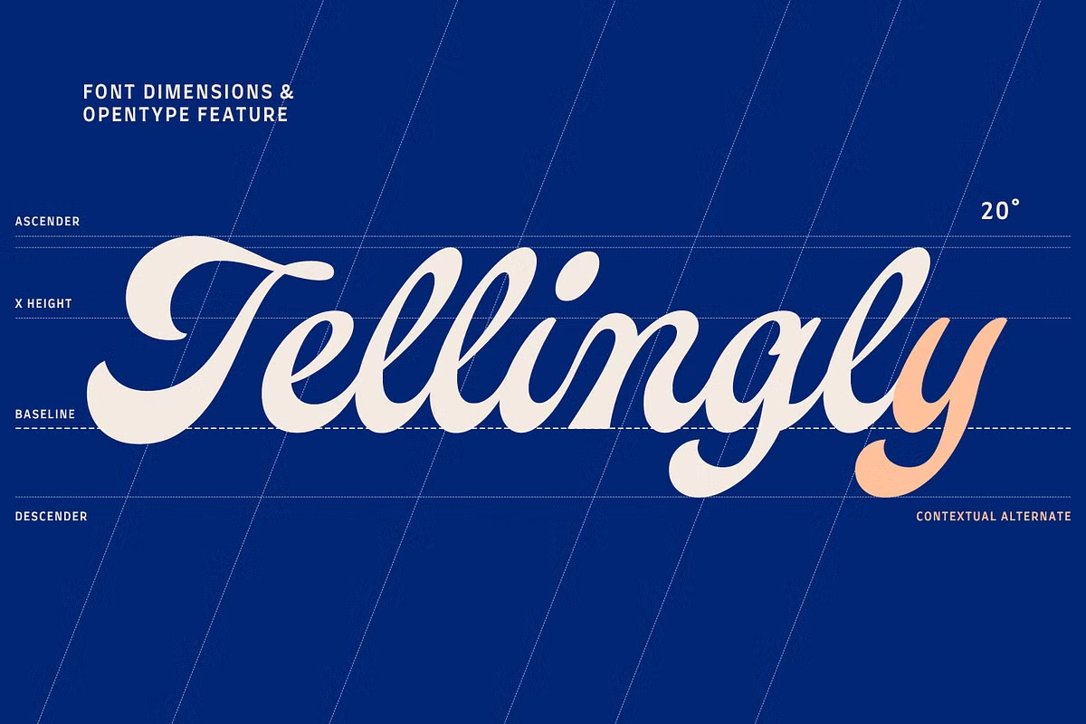
Pearlside’s style is all about classic script typography, but it’s also really good at fitting in with modern design. The letters in the font are slanted and have nice curves, which makes them feel warm and welcoming. Each character is carefully designed to be in proportion with the others, so when you read something written in Pearlside, it looks nice and flows well.
This makes it easy to read and nice to look at. The way the letters are designed creates a consistent rhythm, which is pleasing to the eye. Overall, Pearlside is a great choice for anyone who wants a font that’s both classic and contemporary. Pearlside’s design has a special something that makes it stand out.
The swashes and terminals add a bit of personality to the font without making it too much. This balance is key, as it means the font is still easy to read and understand, even with its unique touches. That’s what makes Pearlside so versatile – it can be used in lots of different situations.
Character Sets and Variability
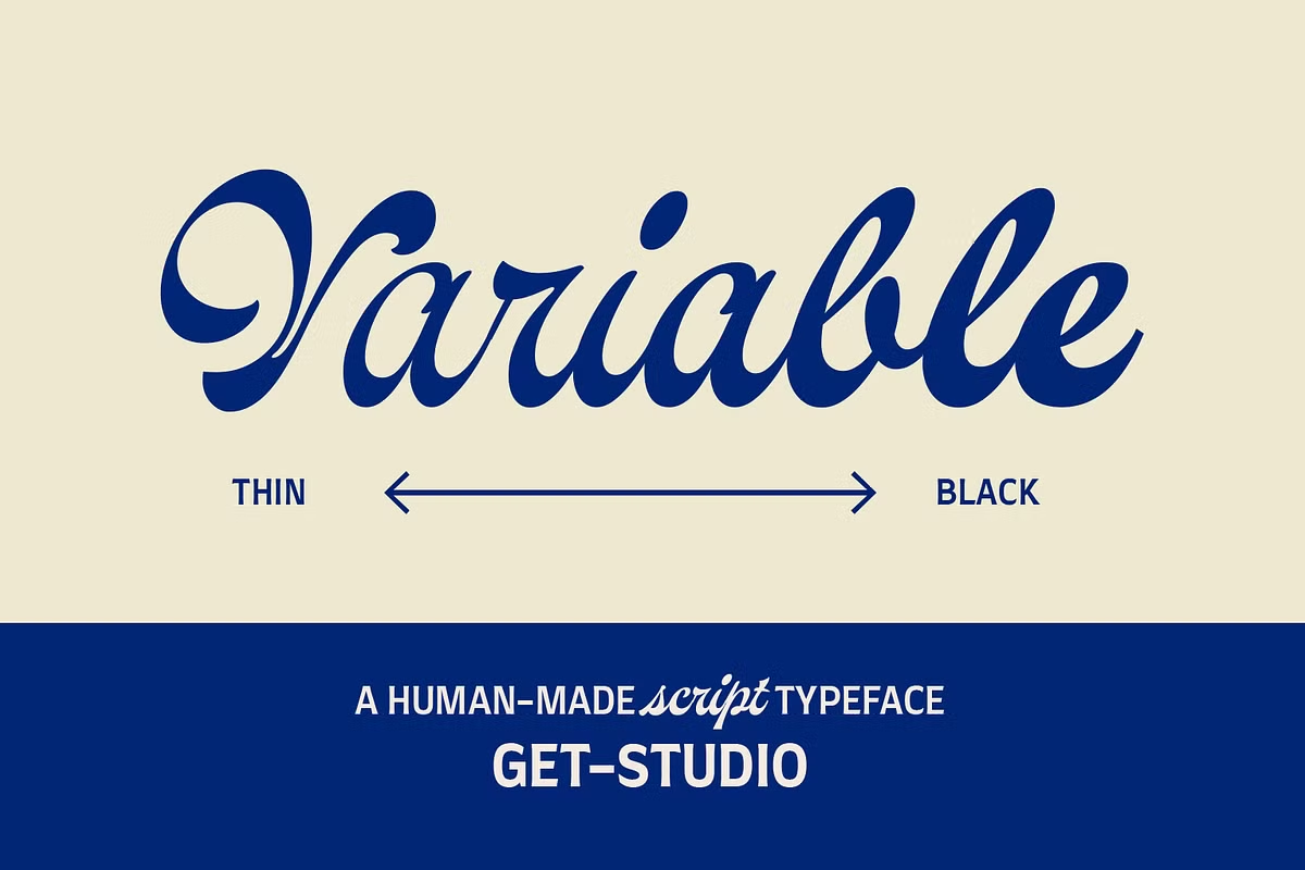
Pearlside is a really versatile font with 9 different styles to choose from, ranging from super thin to really bold. This means designers can pick the perfect style to fit their project, whether it’s a fancy website or a bold advertisement. The thinner styles, like Thin and Extra Light, are great for creating sleek and sophisticated designs that don’t overwhelm the viewer.
On the other hand, the bolder styles, like Bold and Black, really make a statement and grab your attention. With so many options, designers can experiment and find the perfect balance of style and functionality for their work.
Whether you’re going for a clean and minimalist look or a bold and eye-catching one, Pearlside’s got you covered. Its wide range of styles makes it a great choice for any project that needs a little extra typographic flair.
Use Cases for Pearlside
The versatility of Pearlside makes it suitable for a wide range of applications. Here are some notable use cases:
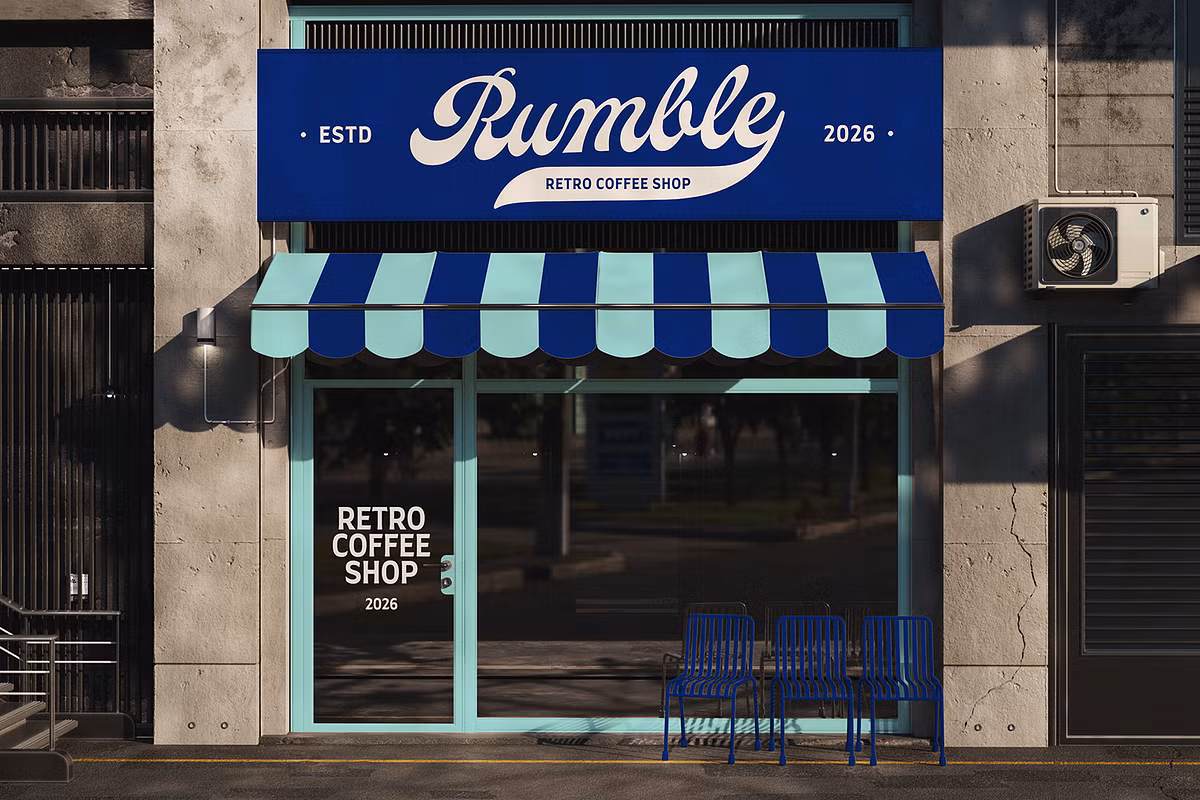
- Logos: Pearlside’s bold styles make it a great choice for creating logos that really grab your attention.
- Invitations and Greeting Cards: The elegant curves and flowing connections make Pearlside an excellent choice for invitations.
- Digital Content: Whether you’re designing a website, social media graphics, or digital advertisements, Pearlside enhances online engagement.
- Print Media: From magazines to brochures, Pearlside’s adaptability ensures it performs well in print.
By incorporating Pearlside into your design projects, you can achieve a balance between artistry and functionality, making it a go-to choice for any creative professional.
Pairing Suggestions
When it comes to typography, pairing fonts effectively can elevate your design to new heights. Here are some pairing suggestions that work harmoniously with Pearlside:
Pearlside and Sans Serif Fonts: Pairing Pearlside with a clean sans-serif typeface like Open Sans or Lato creates a striking contrast. The modern simplicity of sans-serif fonts complements the ornate nature of Pearlside, making it ideal for headings paired with body text.
For a timeless feel, try combining Pearlside with a traditional serif font like Merriweather or Playfair Display. This mix of script and serif elements brings a sense of refinement and poise to your design.
When you’re looking to create a design that’s a bit more fun and carefree, pairing Pearlside with other script fonts can be a great way to go. By finding that balance, you can create a design that’s playful, yet still easy on the eyes.
Licensing and Availability
Pearlside is now available for you to buy, and it’s really versatile because it comes with a bunch of different file formats. This means you can use it with all sorts of design software, which is really handy.
The files you’ll get with Pearlside are:
- Pearlside Variable.ttf
- Pearlside Thin.otf
- Pearlside Extra Light.otf
- Pearlside Light.otf
- Pearlside Regular.otf
- Pearlside Medium.otf
- Pearlside Semi Bold.otf
- Pearlside Bold.otf
- Pearlside Extra Bold.otf
- Pearlside Black.otf
- Pearlside WebFont (woff & woff2)
Pearlside is really versatile, so you can use it for all sorts of projects, whether it’s print or web-based. If you do happen to have any questions or need some help, the person who made Pearlside is more than happy to assist you.
Conclusion
Pearlside is not just a font, it’s a really useful tool for people who like to play around with typography. It takes old ideas and mixes them with modern needs, making it perfect for designers. The way it looks is really nice, with lots of different weights to choose from, and it works well in lots of different situations.
So, whether you’re making a brand, printing something, or working on a digital project, Pearlside is a great choice because it’s easy to read and looks really good. It’s a great addition to your toolkit and can help you be more creative in your next project. Give Pearlside a try and see what you can come up with!