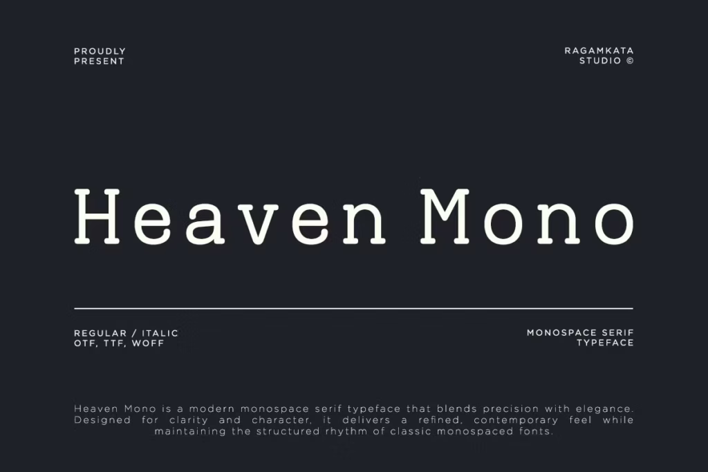
Introduction to Heaven Mono
Heaven Mono is more than just a font – it’s a modern take on the classic monospace serif style. What makes it special is how it balances technical precision with a touch of elegance. The designer has clearly paid attention to every detail, giving it proportions that are just right and details that are sharp and clear. The little serifs added to the letters give it a unique rhythm that feels both fresh and timeless. This font is perfect for a wide range of users, from designers and developers to creative studios and anyone making digital content.
It’s a great tool for anyone looking to create something modern and stylish. With its balanced look and feel, Heaven Mono is a great choice for anyone who wants a font that is both functional and beautiful. Whether you’re working on a new project or just need a font that can keep up with your creative vision, Heaven Mono is definitely worth considering. Its versatility and style make it a great addition to any design toolkit.
Design Style
The way Heaven Mono looks is a perfect blend of organization and imagination. It has strong, consistent shapes that make it great for lots of different uses. Adding serifs gives it a touch of sophistication, making each letter unique and stylish. Every letter is carefully made to stand out, whether you’re using it on a screen or on paper.
This font is designed to make your messages look better, with a clean and confident style that fits in with modern design trends. It’s a great choice when you want to make a good impression.
Balanced Proportions
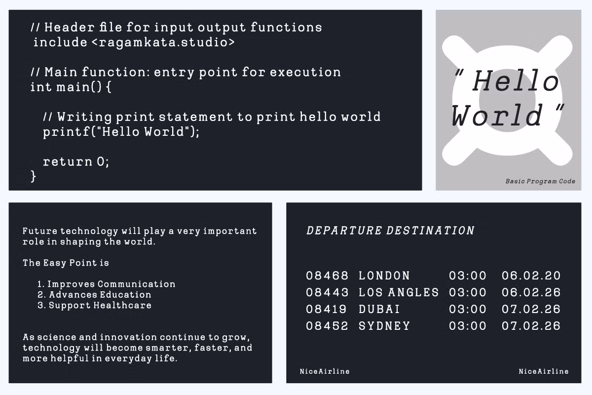
Heaven Mono is a great font because it’s easy to read and looks good. Each letter is designed to fit nicely in its own space, so it doesn’t overwhelm you when you’re reading a lot of text or looking at code. The way the letters are the same height and the lines are spaced just right makes everything clear, so you can get your point across without any confusion.
Serif Accents
The little details in Heaven Mono, like its subtle serifs, make a big difference. Most monospace fonts can look a bit cold and robotic, but the serifs in Heaven Mono add a warm and classy feel. This makes it a great choice for lots of different projects, like branding and editorial designs, where you want to add a bit of sophistication.
Character Sets
Heaven Mono has a big collection of characters, including all the regular Latin letters, plus lots of symbols and numbers. This means you can use it for lots of different languages and situations, and it will still look great and consistent.
Multilingual Support
Heaven Mono has a big advantage – it supports many languages. This makes it perfect for projects that involve people from all around the world, as it can handle different languages and scripts. So, if you’re creating something for a global audience or using multiple languages in your project, Heaven Mono is a great choice because it shows your text exactly as it should be, and it looks great too.
It’s really useful for international projects, and it helps you communicate your message clearly, no matter what language you’re using.
Use Cases
Heaven Mono is really good at lots of things, so it can be used in many different ways. Here are a few examples of what it can do:
- Coding Interfaces: Its monospace nature makes Heaven Mono perfect for coding environments, where clarity and precision are paramount.
- UI/UX Design: This typeface can enhance user interfaces with its clean lines and structured appearance, providing a seamless experience for users.
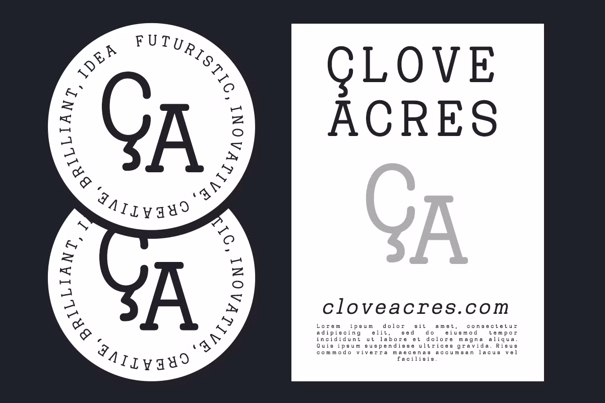
- Branding Systems: Heaven Mono can be utilized in branding projects, offering a modern touch that communicates professionalism and creativity.
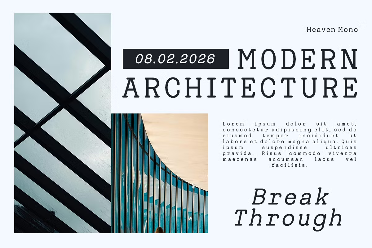
- Editorial Layouts: Its elegant design makes it suitable for editorial work, where text needs to be both engaging and readable.
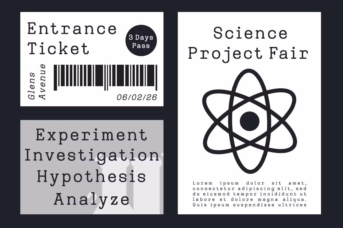
Heaven Mono is a great font to use for posters and packaging because it gives them a modern look that catches the eye. When you use this font, your designs will really stand out from the rest on store shelves.
Pairing Suggestions
To maximize the impact of Heaven Mono in your designs, consider pairing it with complementary typefaces. Here are a few suggestions:
- You can pair Heaven Mono with a simple sans-serif font like Helvetica or Arial for a look that’s both modern and elegant.
- To give your design a more elegant look, try pairing Heaven Mono with a traditional serif font like Georgia or Times New Roman.
- Incorporate a bold display typeface for headings or highlights, such as Futura or Montserrat, to create a striking visual hierarchy.
Licensing
Heaven Mono comes in a few different formats, like OTF, TTF, and WOFF, which makes it easy to use in your design work. You get both regular and italic versions in the font package, so you have some flexibility when it comes to choosing your typography.
Before you start using Heaven Mono, make sure to check out the licensing terms, because they’ll tell you exactly how you can use the font in your projects, whether it’s for personal stuff or commercial work. This way, you can make sure you’re using it correctly and avoid any potential issues.
Conclusion
Heaven Mono is a great font that mixes precision and style. It has a special rhythm that looks good in many design projects. You can use it for coding, making user interfaces, or creating brands – it works well for all these things.
The font is clear and looks strong, making it a great tool for designers and digital creators who want to make their work stand out. Its unique look and versatility make it very useful.