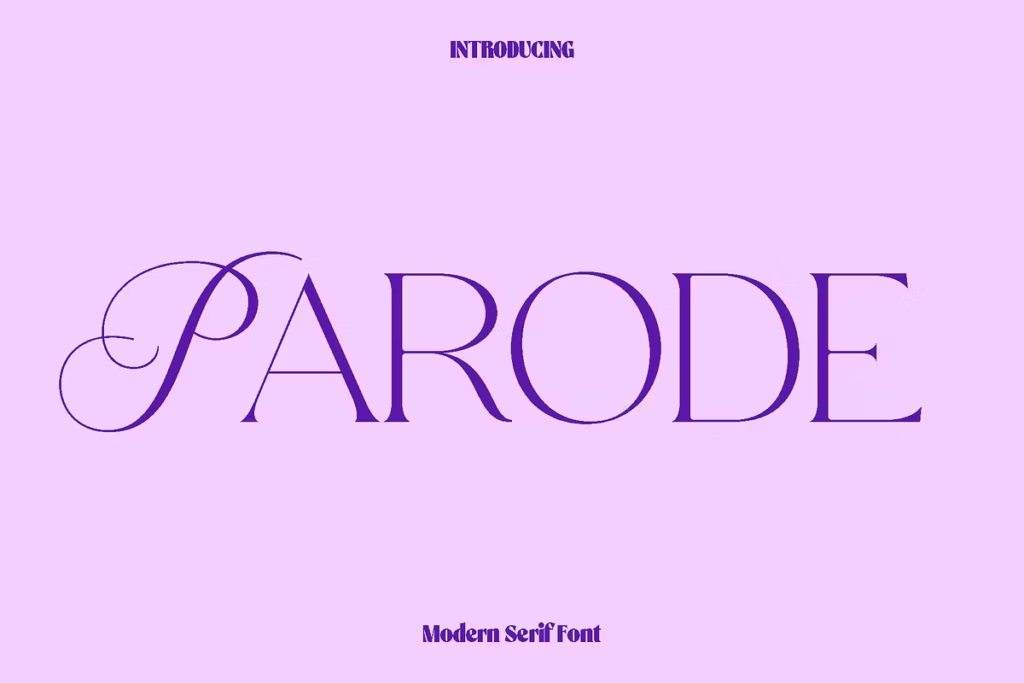
Parode: Elegant Modern Serif Font for Timeless Design Projects
Parode is a simple yet elegant font that looks great in any setting. It’s a modern serif font that balances being soft and structured, making it a perfect mix of old and new. The serifs are nice and smooth, and the letters are shaped in a way that’s easy on the eyes. This font is perfect for making your writing look classy and sophisticated. If you’re a designer, someone who manages a brand, or just someone who loves being creative, Parode is a great choice for projects that need a little extra luxury and clarity. It’s a great way to make your words stand out and look really good.
Design Style
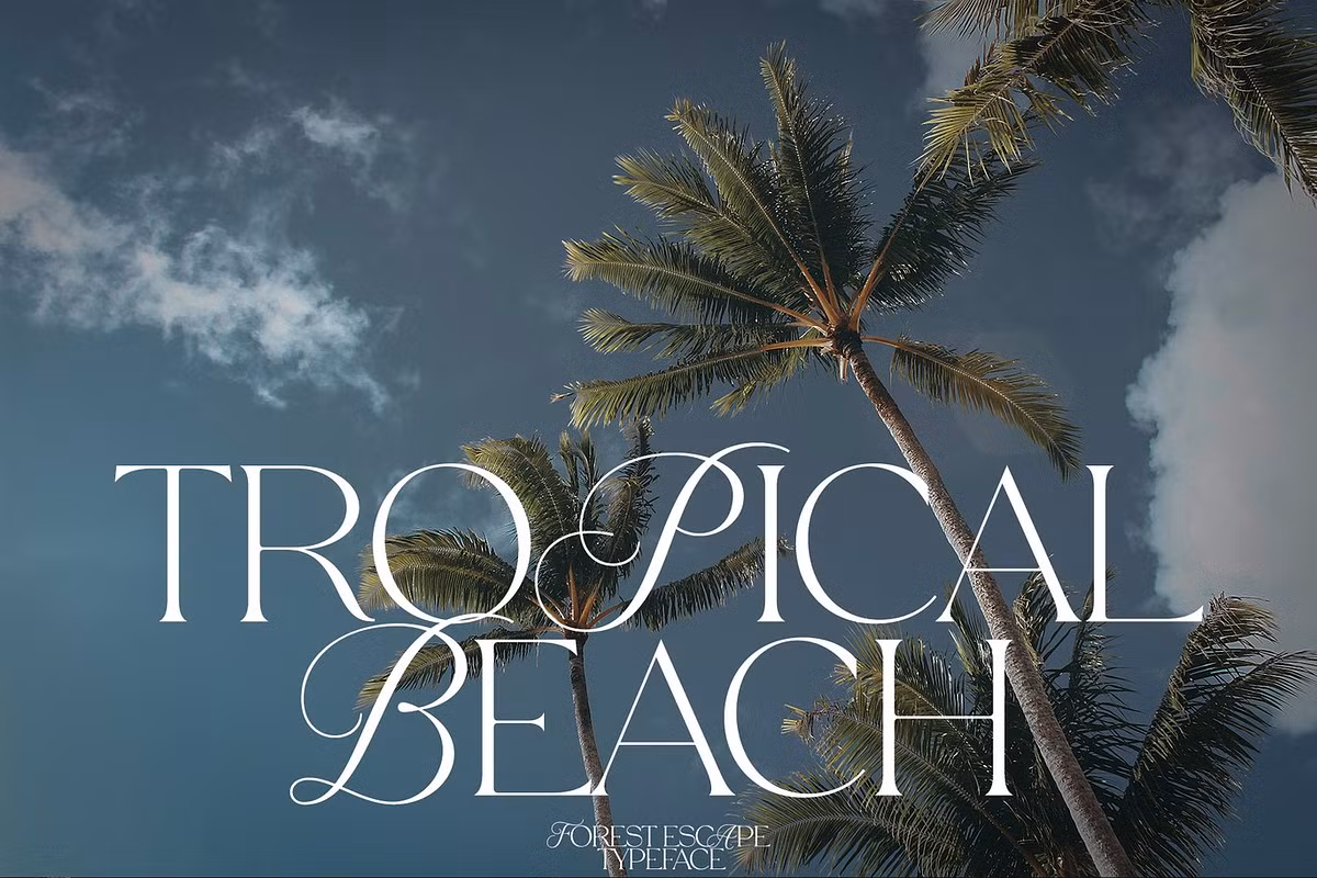
The style of Parode is a mix of modern and luxury design. It has a soft, feminine feel that sets it apart from other serif fonts. With its clean lines and modern look, Parode works well for many different design projects. The serifs are subtle, adding a touch of class without overpowering the overall look, making each letter look elegant and professional. This balance of style and simplicity makes Parode a great choice for designs that need to convey a sense of sophistication. Whether it’s used for a high-end brand or a modern editorial piece, Parode’s unique blend of modern and luxury elements makes it a versatile font. Its clean and contemporary appearance ensures that it will look great in a variety of contexts, from digital screens to print materials. Overall, Parode’s design is a perfect blend of modern style and classic elegance, making it a great choice for designers who want to add a touch of sophistication to their work.
Parode is really good at fitting into different design situations. It can easily switch from subtle to bold designs, which makes it great for all sorts of creative projects. The font has a modern look, but it’s based on a classic serif style, so it’s still easy to read. This balance is key for designers who want to create layouts that grab attention and are also easy on the eyes. Whether you’re working on a simple project or something more complex, Parode can help you achieve a great visual effect. Its versatility and readability make it a great choice for designers who want to create something that looks amazing and is also easy to understand.
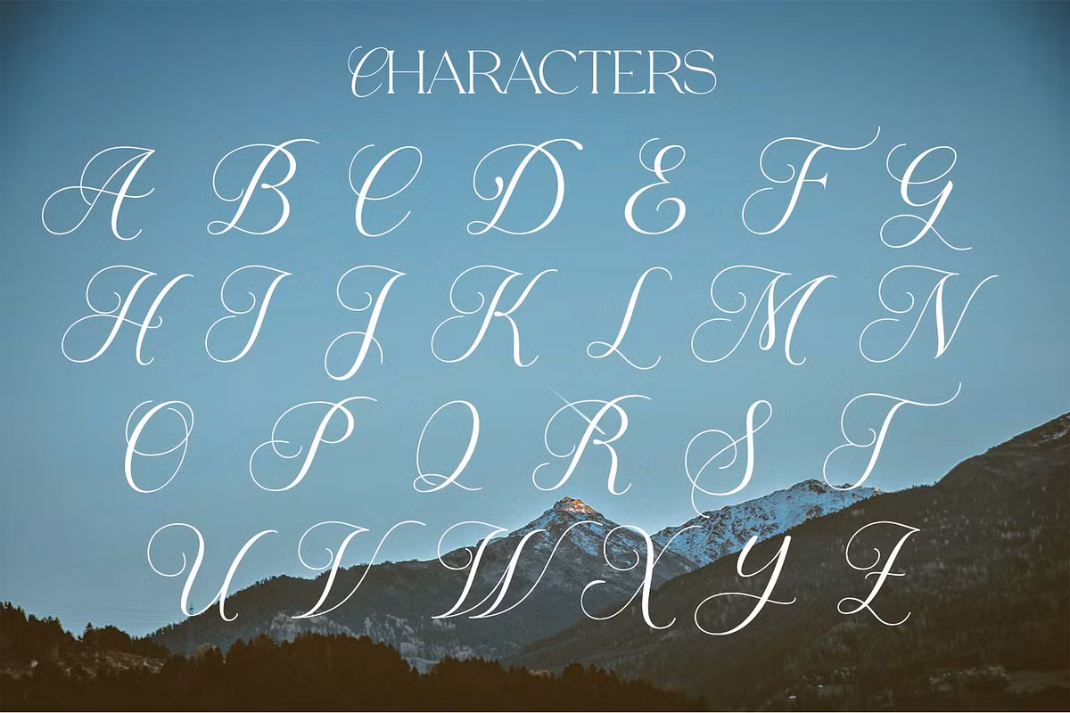
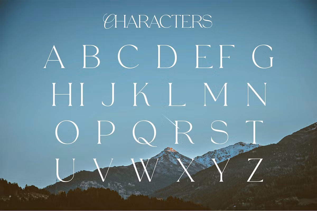
Character Sets
Parode comes equipped with a comprehensive character set that includes:
- Uppercase characters
- Lowercase characters
- Numerals
- Functional punctuation and symbols
- Multilingual support
The wide variety of characters in Parode means it can be used in many different languages and situations. You can use it to create a beautiful layout for a fashion magazine or to design lovely wedding stationery. The font has lots of characters, so you can be creative without worrying about it looking unclear or messy. Also, Parode comes in both OTF and TTF file formats, which makes it easy to use with different design programs, so you don’t have to worry about it not working.
Use Cases
Parode is a great choice for many design projects because it helps designers show their ideas in a clear and beautiful way. Here are some examples of when to use this stylish font:
- Logos: Parode’s refined style lends itself beautifully to branding, creating memorable logos that resonate with sophistication.
- Fashion Branding: In the competitive world of fashion, Parode stands out by enhancing the elegance of branding materials, making it perfect for lookbooks and promotional graphics.
- Wedding Stationery: The graceful serifs and polished appearance of Parode make it an excellent choice for invitations, programs, and other wedding-related materials.
- Magazine Layouts: Its contemporary style is ideal for editorial design, allowing for impactful headlines and body text that captivates readers.
- Social Media Graphics: Parode’s stylish yet minimal character makes it effective for creating eye-catching social media posts that engage audiences.
- Upscale Packaging: Brands looking to convey luxury and quality can rely on Parode to enhance the visual identity of their product packaging.
Pairing Suggestions
When using Parode in your designs, pairing it with complementary fonts can elevate your work and create a cohesive visual hierarchy. Here are some pairing suggestions:
- Sans-serif Companions: Pair Parode with a clean sans-serif font like Montserrat or Open Sans for a modern contrast. This combination works well in headings and body text, allowing for easy readability.
- Creative Projects: Try pairing Parode with a fancy font like Playfair Display for an energetic design, especially in editorial layouts.
- Script Fonts: For wedding stationery and elegant branding, a script font like Great Vibes can complement Parode beautifully, creating a romantic and sophisticated look.
Experimenting with these pairings can help you find the perfect balance for your design projects, enhancing the overall aesthetic while maintaining clarity and sophistication.
Licensing
When you’re working on a design project and you want to use Parode, you need to think about the licensing options. Luckily, Parode has a flexible licensing system that works for both personal and commercial projects. So, whether you’re using the font for a client or for your own creative stuff, it’s crucial to understand the licensing terms. This way, you can use the font without worrying about any legal issues. You can focus on your design, knowing that you’re using Parode in a way that’s allowed. The licensing terms are there to help you, so take a moment to read and understand them, and you’ll be all set to create amazing designs with Parode.
When you’re buying or downloading something, remember to check the licensing details. This is really important for keeping your design work professional and avoiding any copyright problems. You want to make sure you’re using things legally, so take a minute to look at the rules. It’s worth it to avoid any trouble down the line. By doing this, you can protect yourself and your work, and make sure you’re doing everything right.
Conclusion
So, Parode is not just a fancy font – it’s a really useful tool for designers. It’s elegant and sophisticated, and it works well for lots of different projects. The people who made it paid close attention to the details, so it looks great and is easy to read. You can use it for all sorts of things, like designing for fashion brands, weddings, or high-end companies. It adds a touch of luxury to whatever you’re working on, and it’s still easy to read. That’s what makes Parode such a great choice for designers who want to create something timeless and beautiful.
When you start creating, think about adding Parode to the tools you use. It can help you convey a sense of elegance and self-assurance that will really make an impact on the people who see your work. This can take your designs to a whole new level of sophistication and effectiveness. By using Parode, you can create something that is not only beautiful but also clear and easy to understand, which is really important for making a lasting impression.