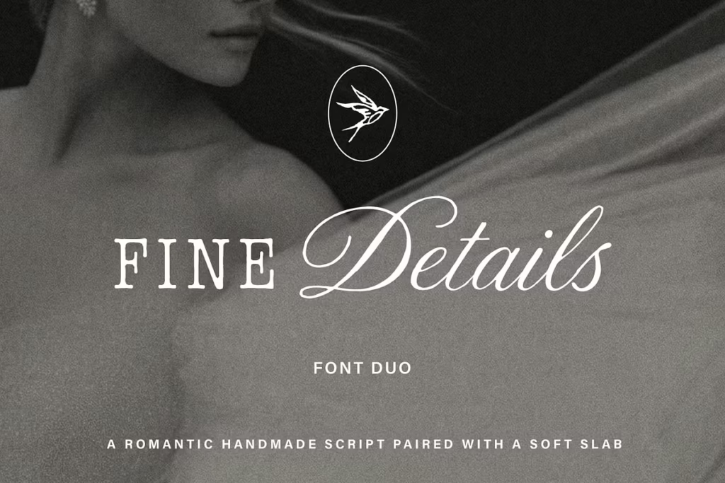
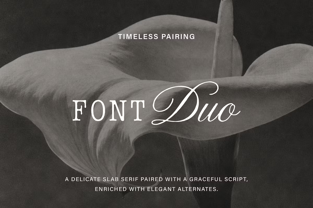
Introduction to Details Font Duo
The Details font duo is really something special – it’s all about mixing things up and making them work together in a beautiful way. You’ve got a script font that looks like it was drawn by hand, all flowing and nice, and then you’ve got a serif font that’s soft and slab-like. When you put them together, it’s like they were meant to be – it’s classy, but not too fancy, so it feels like something everyone can relate to. That’s what makes Details so great for designers – it’s good for lots of different projects, like making a brand look fancy or designing wedding invitations that feel friendly and inviting. It’s basically the perfect pair of fonts for anyone who wants to add a bit of elegance to their work without making it feel too posh.
Design Style of Details Font Duo
The Details font duo has a design style that’s all about contrast. It combines a hand-drawn script that adds a personal touch and makes things feel warm and cozy. This script doesn’t just look great, it also comes with custom alternates that let you make your typography one-of-a-kind. The result is a unique and tailored look that feels special. With its natural flow, the script creates a sense of character and flair, making it perfect for adding a personal touch to your designs.
The soft slab serif acts as a stabilizing force when paired with the other font. It has a simple design that makes it easy to read and helps to balance things out, which makes it a great match for the more decorative script. When you put these two styles together, you get a typography duo that looks like it was carefully chosen, and it works well for lots of different uses.
Character Sets and Features
The Details font duo has a lot to offer, with a big set of characters that makes it really useful for all sorts of design projects. The script part is handwritten and has lots of extra connections between letters, called ligatures, and different versions of the same character, which you can use to make your text look more personal and special. This is especially great for things like branding and invitations, where you want to stand out and show your own style.
The slab serif font has a full range of letters, numbers, and punctuation marks, which means your designs will look consistent. By combining these different character sets, designers can create unique and interesting typography that grabs people’s attention and is easy to read at the same time. This versatility allows designers to experiment with different styles and layouts, making their work more engaging and effective.
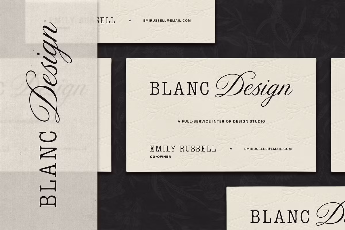
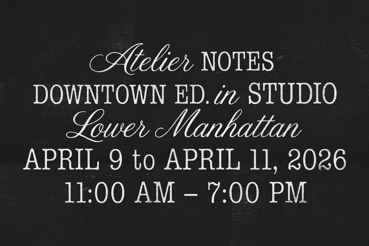
Use Cases for Details Font Duo
The Details font duo is really versatile, which means it can be used in lots of different ways. Some of the main ways to use it include:
- Creating editorial layouts for magazines and online publications.
- Designing logos and brand materials for strong identities.
- High-End Packaging to enhance perceived product value.
- Wedding and Event Stationery for beautiful invitations.
- Social Media Identities for eye-catching graphics.
When it comes to creating editorial layouts, you want something that looks great and helps get your message across. That’s where a nice mix of script and slab serif fonts comes in – it’s perfect for magazines and online publications that want to make a good impression. This combination is elegant and easy to read, making it ideal for sharing high-quality content in a way that’s visually appealing.